I’ve decided to start the new year off with a break.
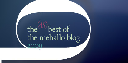
So . . . here’s (my) 45 favorite posts of 2009! Should be enough to keep you reading till I post again (which will be in about two weeks).

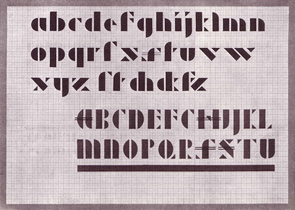
As a thank you to everyone who has been reading my blog, sending me emails, even clicking ‘like’ on the Facebook page – in general, supporting my antics online – I’d like to show my appreciation. I’ve decided it’s time for a good old fashioned Jeanne Moderno font giveaway!
To enter, all you have to do is leave a comment on this post. To comment, just click the ‘comment’ link below (and please fill out all the fields).
I will randomly select five winners from the comments. Each winner will receive a complete, licensed set of Jeanne Moderno fonts: All 9 OpenType fonts, $99 USD value. This is them here.
Contest ends 11 p.m. (pacific time) Saturday, January 16, 2010.
And now, here’s the best of the mehallo blog 2009 . . .
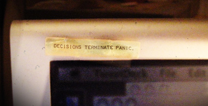
[1] ‘as simple as possible, but not simpler’ –einstein
[2] a bit about creativity
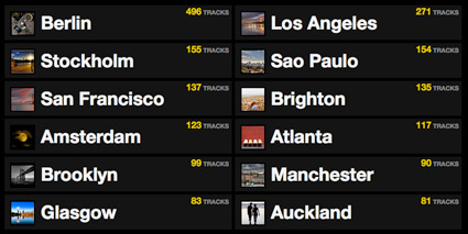
[3] citysounds.fm: what does your city sound like?
[4] lights and type of reno
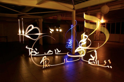
[5] julien breton: light calligraphy
[6] liquid glee!
[7] tschichold: distinguisted typographer
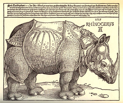
[8] dürer’s rhino
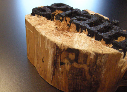
[9] wood type
[10] parkinson’s sutro fonts
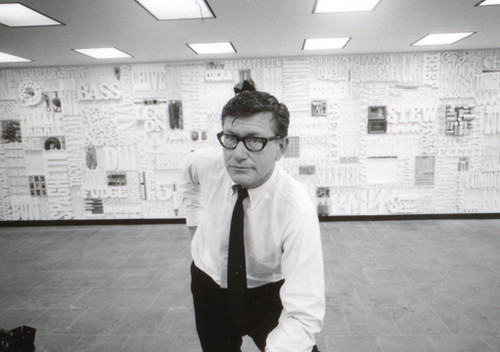
[11] the cbs gastrotypographicalassemblage
[12] eating out
[13] a joe’s primer
[14] eggs and sausage with a side of type . . .
[15] late night chocolate
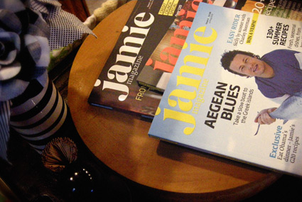
[16] jamie oliver: great chef, beautiful magazine
[17] children of the corn
[18] scribbling the corn field!
[19] the road map to success!
[20] san francisco: the drive

[21] just thinking
[22] information design: life, death, taxes and spam
[23] the us has been nuked
[24] disgust this
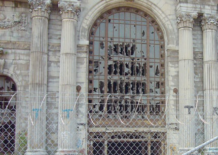
[25] ‘ruin porn’ – the cliché of abandoned detroit
[26] war commentary
[27] what it really takes to build a global community
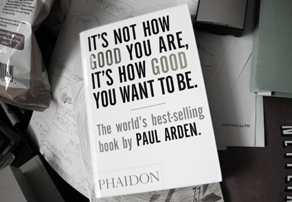
[28] good is obvious
[29] paperbag parachute
[30] star trek-n-me
[31] the abc movie
[32] a drive in break
[33] big 40 poster
[34] in defense of myspace: good music, art and real shit
[35] ‘vulgarize !!! buy !!! + porn + ! or die !’ -chymer
[36] dan herrera: estan de una herencia extraña
[37] good grade: d++
[38] jack marchment: electroacoustic audioprose

[39] *meiko
[40] really simple
[41] blackbird
[42] the notebooks of audrey kawasaki
[43] annie is deranged

[44] sew cool
[45] hurr
If 45 isn’t enough, please select from the archive at right. At current count, there’s over 500 blurgs to pour thru, with more on the way.
Tags: design, fonts, thoughts, typography by steve
133 comments . . .