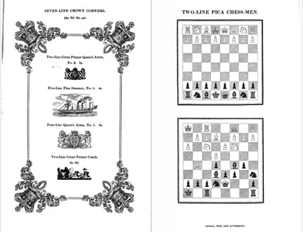
The 1841 Caslon Type Specimen Book
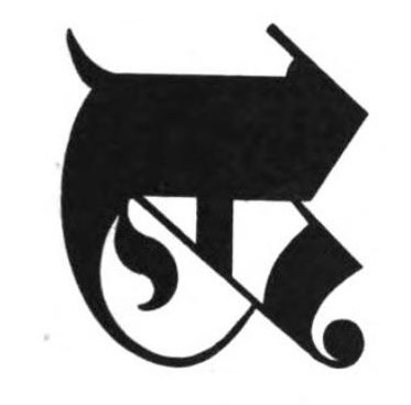
The Caslon family took type to much bolder heights in the 19th century. And a copy of their 1841 specimen book can be perused thanks to Google Books.
Go here.
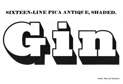
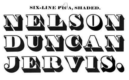
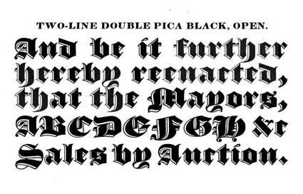
Found via I love typography
The Caslon family took type to much bolder heights in the 19th century. And a copy of their 1841 specimen book can be perused thanks to Google Books.
Go here.
Found via I love typography
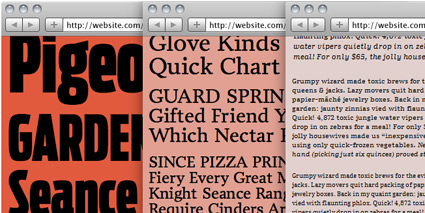
It had to do with pizza.
Font Bureau’s Nick Sherman dropped by my hotel room at TypeCon in Los Angeles. He read on Twitter that I had pizza left over – and he’s a major pizza freak.
I thought I was a pizza freak, but I don’t even come close (video below).
Nick said he was up late working on something big.
Turns out this big thing is the launch of Webtype, a collaboration between Font Bureau, Ascender Corporation, Roger Black, Petr van Blokland and DevBridge. [Read more →]
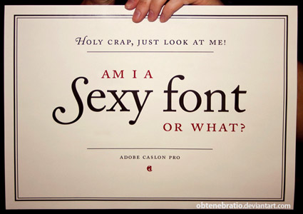
‘I’m a Sexy Font’ poster, created by Obtenebratio
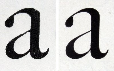
Back in the early 1990s, the Carol Twombly-drawn Adobe Caslon was one of the first font packages I ever purchased.
I’ve been in love with it ever since. I use it on just about everything – including this blog’s title, my own logotype. I’m a font designer myself, but still don’t consider my own letterforms to even come close to what was accomplished with this particular interpretation of Caslon. [Read more →]
‘How much should a revival of a typeface look like the original? Well, just as with performing an old song – an analogy Matthew Carter has made – there is something you have to like in the original in order want to revive it. And you can’t depart from the original too much, or you lose the charm of the old song that appealed to you in the first place.’
Over at I love typography, a look at William Berkson’s Caslon revival – and the work involved in such an endeavor. Read more here.
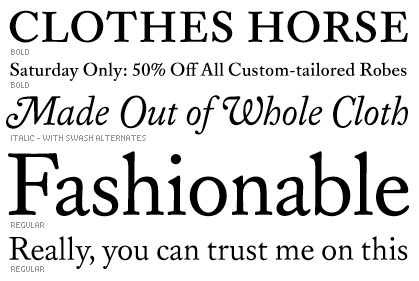
Available thru The Font Bureau.
‘A revival of classic eighteenth-century type by William Caslon, featuring shorter descenders, and higher contrast giving the face a more useful, modern quality.’
I was lucky enough to see the Replay type family in production. And a got to play with some of the beta versions; used one for a fashion logo.
Stefan Hattenbach has been working on this beautiful Caslon update for a few years now. And like all his fonts, there is brilliance in the details.
Replay is available exclusively through Veer.
“Caslon’ is an example of what became known in the commercial world of the 20th century as a ‘brand’: a family name that was not only widely recognised by customers but which stood as a guarantee of long-standing integrity.’
William Caslon’s types keep making a comeback.
One of the first revivals was made in the late 1800s by Chiswick Press, London.
Full story here.
‘The things your teachers tell you in class are not gospel. You will get conflicting information. It means that both are wrong. Or both are true. This never stops. Most decisions are gray, and everything lives on a spectrum of correctness and suitability.’
‘Realize that you are learning a trade, so craft matters more than most say.’
‘Libraries are a good place. The books are free there, and it smells great.’
‘Don’t become dependent on having other people pull it out of you while you’re in school. If you do, you’re hosed once you graduate.’
‘Everything is interesting to someone. That thing that you think is bad is probably just not for you.’
‘Think of every project as an opportunity to learn, but also an opportunity to teach.’
A few pieces of good advice for design students from the Office of Frank Chimero.
Read all of his advice here.
Found via Saawan Ebe
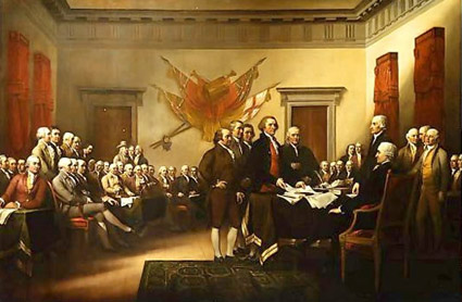
‘It was Benjamin Franklin’s favorite typeface, and the first printings of the Declaration of Independence and the U.S. Constitution were set in Caslon.’
I am a history junkie.
And I loved the scene in HBO’s John Adams miniseries when Adams disputed the accuracy of the above painting (video, below). And how Ben Franklin’s approach to French diplomacy was more . . . ardent, than formal.
(I also loved how the miniseries used titled camera angles – like the United States was founded by villains from the old Batman tee vee series)
William Caslon’s fonts were the typefaces of the American Revolution.
Here’s some great reads on early American documents – as handy PDFs.
And here’s a link to John Adams on DVD.

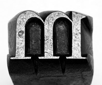
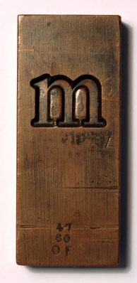
Student and Caslon g from my Spring typography course [artnm 303] at American River College, Sacramento.
Class starts up again this Friday August 28, 2010. Waiting list is full. Can’t teach everyone.
It’s gonna be an unavoidable ‘that teacher’s an asshole’ session.
Self portrait by Samantha Costanilla
This one is always a favorite.


the work at the mehallo blog. beta. is licensed under a creative commons attribution - noncommercial - no derivative works 3.0 united states license. if reposting, credit must be given to steve mehallo - and if possible, please provide a link back to the mehallo blog. beta.
i include images for the purpose of critique, review, promotion and inspiration - and always make my best effort give credit/link back to the original source. if i’ve screwed up, please fire me a note.
page layout based on the wordpress 'darkwater theme' by antbag, adapted and redesigned by mehallo. valuable php assistance from bill mead.


