entries Tagged as [typography]


Mrs Eaves goes to Berlin
Video (above) of Gemma O’Brien – aka Mrs Eaves – in Berlin for the 14th European Design Conference, TYPO Berlin 2009.
Her original viral video, Write here, right now, is below:
‘Part of a campaign to promote writing on designated graffiti spaces rather than someone elses property. Would you write all over your property?’ -Mrs Eaves
N-N-N-Neutra Face
I’m going gaga over the Poker Neutra Face video (above).
Neutraface in use in the Quantum of Solace (2008) logo (below).

The Neutraface fonts are a product of House Industries.
Click on the above images to jump to places/articles.
Scholarly HistoricType

Collection: Urban Landscape; Location: Columbus, Ohio
More than just another image collection, HistoricType plans to be an online research library for students, professionals and scholars – concentrating on non-print typography, lettering used for old signs and buildings throughout the US.
Visit the HistoricType website here. Blog here.
HistoricType is edited by Laura Franz and Anna Dempsey; programmed by Randy Apuzzo/Jetscram Design and funded thru a grant from the University of Massachusetts Dartmouth.

Collection: Downtown, USA; Location: Grafton, West Virginia
Found via Justin Nelson
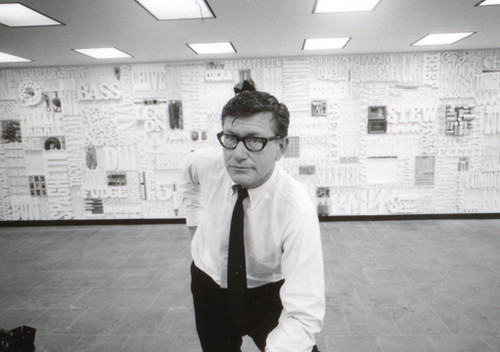
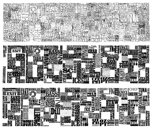
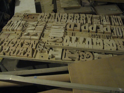
The CBS Gastrotypographicalassemblage
Back in the 1960s, CBS art director Lou Dorfsman created one of the most influential typographic treatments of all time.
Today, designers have rediscovered the Gastrotypographicalassemblage’s 3D complexity – and today it’s been influencing everything from the design of Zune advertisements to kinetic typography videos (note that the new adaptations also tend to be in black/white with minimal color).
The video (above) gives history. And here’s more history. Plus, photos and restoration images here.
More Moderno wallpaper, from Austria
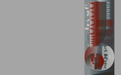
Arno Kathollnig/Typoatelier has been making typographic wallpapers. He had featured my Jeanne Moderno fonts as part of an earlier series. He’s back with a sequel (above). Go here.

Sweet Treats: typographical cookbook
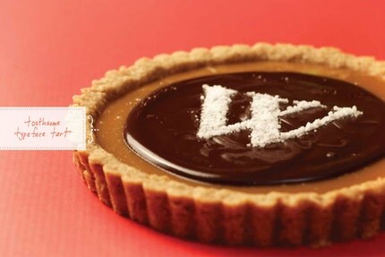
Limited edition cookbook, eight recipes using type. By Edmonton-based Woodward Design. Ships November 30. Order your copy here.
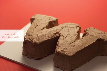
Found via Twitter.com/exspiro
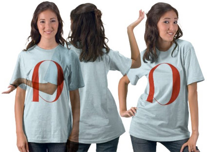
Jeanne Moderno in Ponytail

When I drew Jeanne Moderno, my hopes were the fonts would end up somewhere in a cool fashion magazine.
UK-based Ponytail has em and has used them beautifully in their third issue. Website here.


Too many type issues, so little time
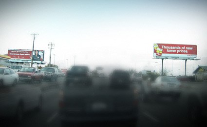
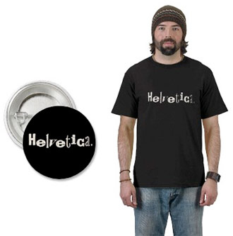
Competing Helvetica billboards, a visual from my morning commute
I’m not much of a purist. Well, that’s a lie. When it comes to type I am. Well, not always. I argue with myself a lot about it. It either works or it doesn’t. My litmus test: ‘Does it communicate?’ And if the goal for the local business is not to be read, then often, it works.
An article in this Sunday’s New York Times is all about this. Once one starts to see type, it’s all over. Read here.
Thanks to Susan and Jonathan for forwarding

handpicked posts

a piano falls in old manhattan
tetro and typography
it’s typography: film, song and dance
ghosts of gustov klimt
the great times new roman controversy
picking fonts
kapitaal
defining terms: design is not decoration
garcia's 'pure design'
'enhance that image!'
magic highway remixed
the cynic
rad anthem
Brought to you by man dom-


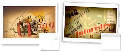
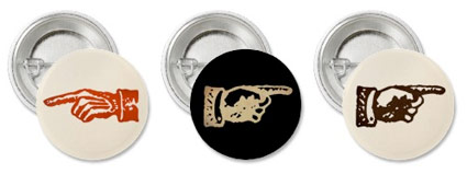
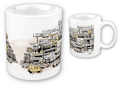
buy my fonts
go shopping
mehalloreads

Divinely Elegant: The World of Ernst Dryden
Jozsef Pecsi: Photo and Advertising
Color: A Natural History of the Palette
Collage: Assembling Contemporary Art
Modern Dog: 20 Years of Poster Art
Gaberbocchus Press: An Experiment in Publishing, 1948-1979
Advertising Art in the Art Deco Style
Googie Redux: Ultramodern Roadside Architecture
Hot Sour Salty Sweet: A Culinary Journey Through Southeast Asia
now playing


the work at the mehallo blog. beta. is licensed under a creative commons attribution - noncommercial - no derivative works 3.0 united states license. if reposting, credit must be given to steve mehallo - and if possible, please provide a link back to the mehallo blog. beta.
i include images for the purpose of critique, review, promotion and inspiration - and always make my best effort give credit/link back to the original source. if i’ve screwed up, please fire me a note.
page layout based on the wordpress 'darkwater theme' by antbag, adapted and redesigned by mehallo. valuable php assistance from bill mead.


