‘The Road Less Traveled takes its inspiration from American folk tunes from the likes of Pete Seeger and Bob Dylan . . . I have been really into the typographic work of Ed Ruscha and inspired by the typography that appears on old fruit crate labels. Both have a very ‘American’ feel to me just like the song’ -Matt Owens
Matt Owens’ The Road Less Traveled. More details here.
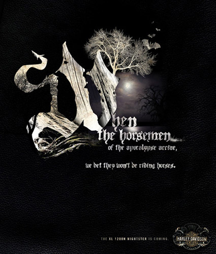
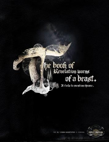
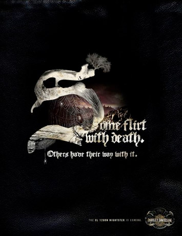
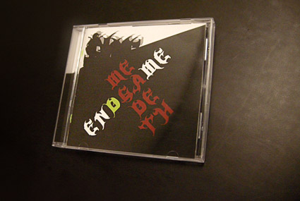
In my intermediate typography course at the California Art Institute Sacramento, students tackle CD packaging design – with a slight twist. Inspired by Project Runway, I like to put limitations on the work to force the student to engage the project where inventiveness will lead to unusual results.
If I could get them to do everything in 24 hours, with Tim Gunn checking in, I’d try that too.
project limits
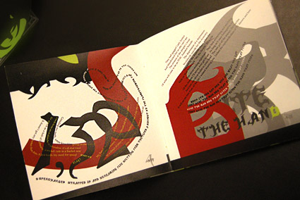
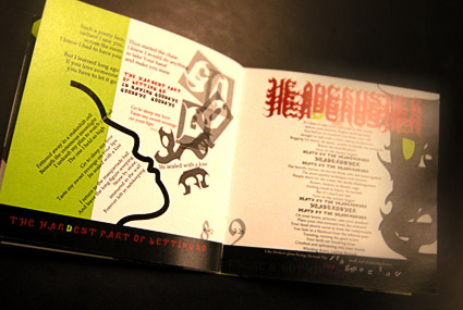
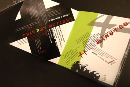
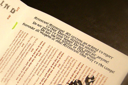
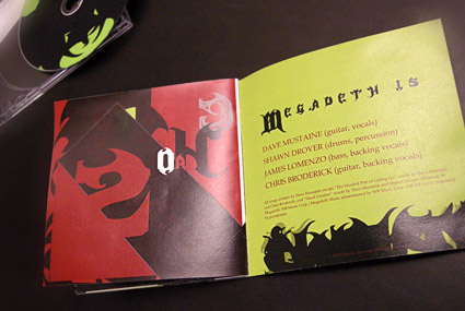
In this case, students have to work with a band (or recording artist) that they do not know anything about or (preferably) simply do not like. The more they delve into a genre foreign to them, the more interesting the results have been.
Pictured is student Isla Waite’s interpretation of the Megadeth album Endgame. Her decision to reimagine the lyrics into typographic layouts (inspired by the lyrics’ subject matter) led to a unique interpretation of the traditional stylings of Heavy Metal.
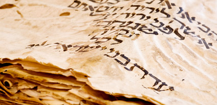
Opening April 8, 2010 at the Bayside Church in Granite Bay, CA is ‘From the Dead Sea Scrolls to the Bible in America,’ an exhibition featuring five pieces of the Dead Sea Scrolls.
Also on hand will be some rare Bibles including (reportedly) an original by Gutenberg.
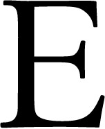
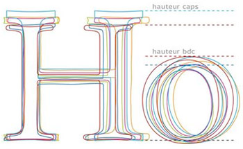
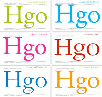
The concept of ‘negative space’ (or ‘white space’) as an important part of type design is very difficult to teach. The student either sees it right away, it clicks over time or sometimes the concept is just weird enough to cause them to back away very slowly.
It’s a up is down, left is right sort of thing. Pen strokes are important, but so are the parts that aren’t made by the pen.
Just the right amount of negative space defines the character and readability. Claude Garamond (c. 1480-1561) was a master at this; it’s one of the reasons his types are still incredibly popular today.
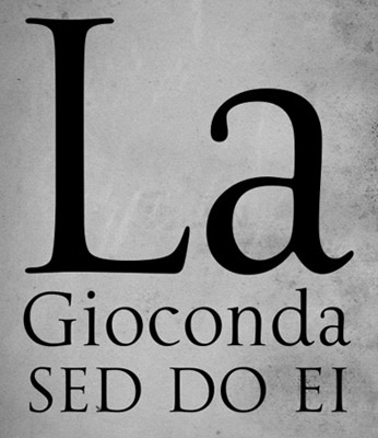
Traditionally, Trajan is based on a carefully drawn and carved inscription at the base of Trajan’s Column in Rome – crafted sometime around 113 A.D.
And basically, lowercase didn’t exist yet. What we call lowercase – minuscules, our second alphabet – evolved over the next 1000 years (or so).
So what would Trajan look like if it actually did have a lowercase? This is open to interpretation.
Dave Farey and Richard Dawson’s La Gioconda is one take on this, adapting the 16th Century lettering of Giovanni Francesco Cresci as the companion letterforms.
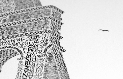
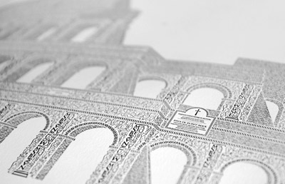
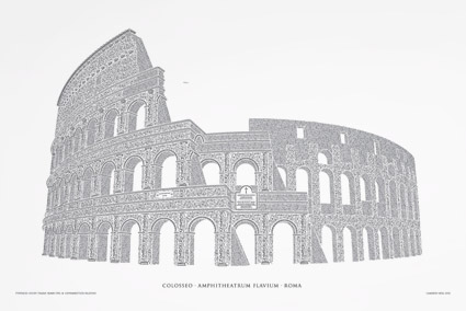
‘Over the course of the next 12 months, the artwork was handcrafted character by character, totaling roughly 250 hours of work from start to finish. Characters from the Goudy Trajan and Bembo Pro typefaces form the Coliseum (or Colosseum)’
Cameron Moll’s limited edition Colosseo letterpress posters. Video above, more project details here.