TETRO and typography
Posted on July 28th, 2009 by steve
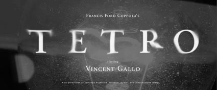
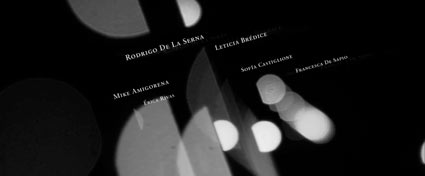
Watch this beautiful title sequence for Francis Ford Coppola’s TETRO. Designed by SFAUSTINA. Both avant garde and not at the same time.


And . . . I’ve always wondered why so many motion picture title sequences end with a shot of a bus.
Found via Twitter.com/Typegirl


