entries Tagged as [typography]
‘Nature of Language’
‘In July 2013, artist José Parlá painted Nature of Language, a mural commissioned by SNØHETTA and North Carolina State University for the James B. Hunt Library in Raleigh. The library is best known for its architecture and technological integration, including a large robotic book storage and retrieval system which houses most of the university’s engineering, textiles and hard sciences collections.’
Jose Parla’s lettering art in a library. Syncs with concepts I’m throwing around in my Friday night type class.
Found via Graffuturism
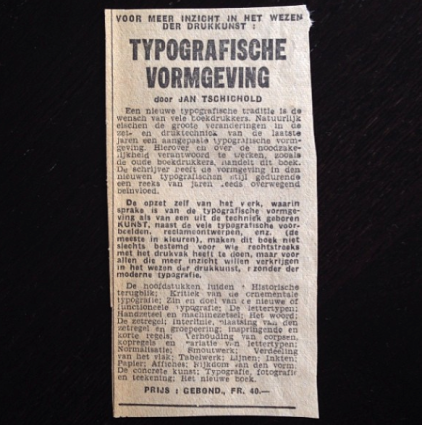
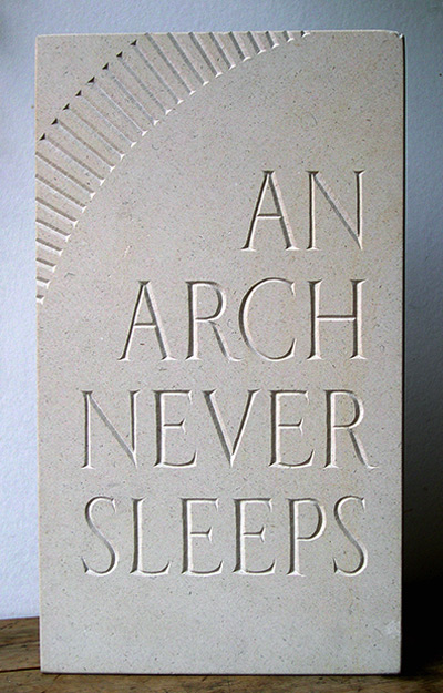
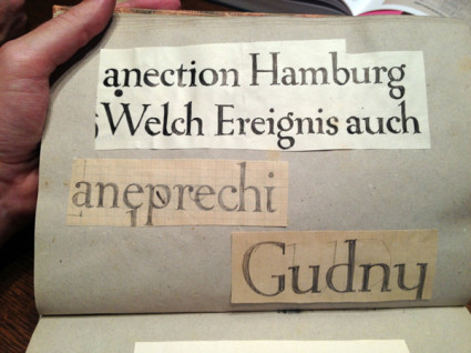
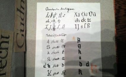
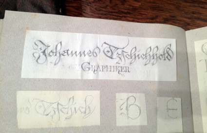
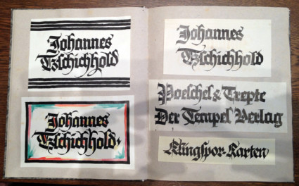
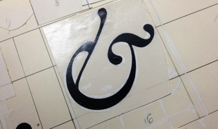
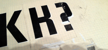
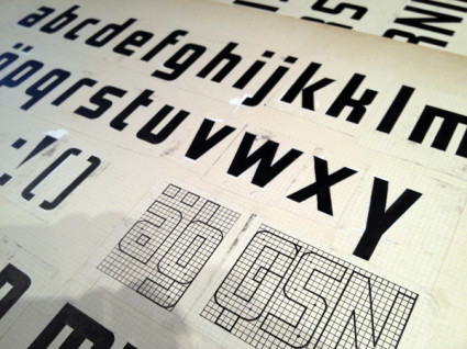
Jan Tschichold sketches
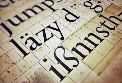
‘Sketches by Jan Tschichold found in the National Library in Leipzig, Germany’
If one is going to do a Tschichold revival, one should pour through an archive, no?
Photos posted on Behance with a link to Sebastian Nagel’s Tschichold revival, Iwan Reschniev.
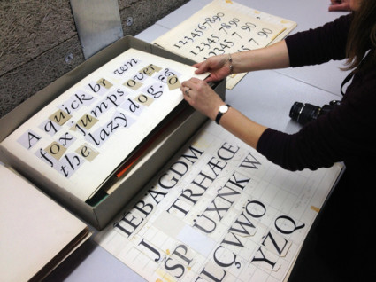
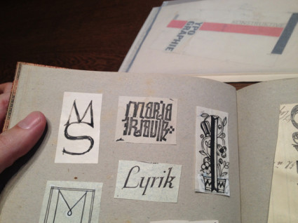
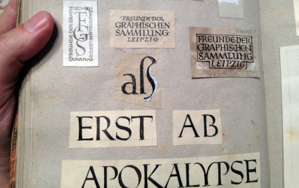
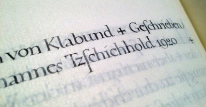
Found via Thinking Form
Stephen Fry on language
It’s interesting how celebrity works.
I’ll often bring up Stephen Fry in the classroom (and mention his incredible Gutenberg documentary for the BBC) but very few students have heard of him. Then I mention Hugh Laurie and House, then draw the connection to Fry and Laurie and – just let things happen.
(I also think Laurie should have played Archer on the Star Trek prequel series, but what do I know)
Designer Matthew Rogers took Fry’s comments on language – which has this wonderful way of evolving – and made it visual (above).
I am currently working on a project where I’m screwing with language for fun. Google Translate is a great video game, no scores or explosions (unless you look them up); but always fascinating results.
Found via Upworthy
OFFF poster 2013
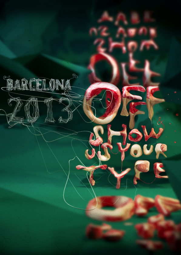
Years ago Step By Step was a graphic design magazine that showed complex design solutions in a ‘step by step’ process. So was HOW, which broke out HOW things were designed.
Today we assume computers just design everything. Not true. Not everything.
Pictured is the work of Dmitry Karpov. And at Behance, here is the Step by Step breakdown of HOW they were done.
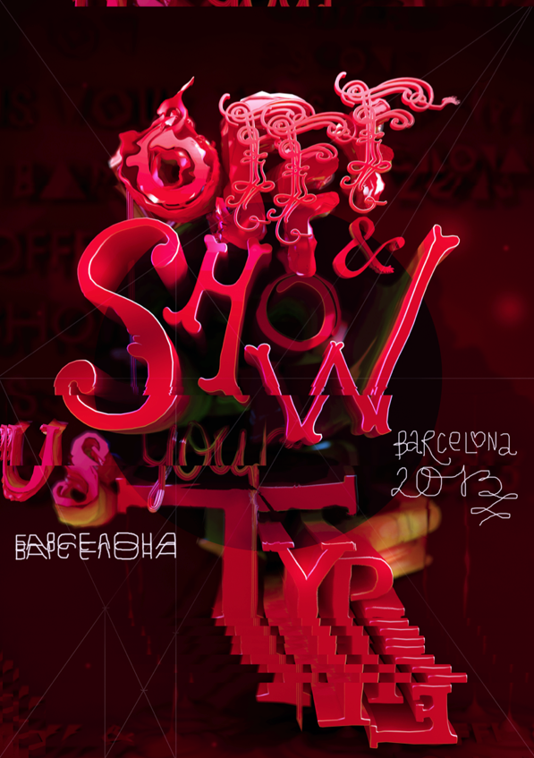
Found via Designcollector Network
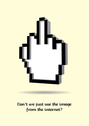
The Fuck
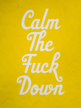
‘a nice typo series by talented recent SVA grad Zipeng Zhu’
Timely messages for a bunch of people in my life – including the redneck in the large white truck.
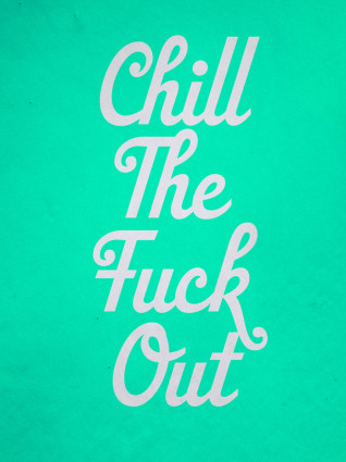
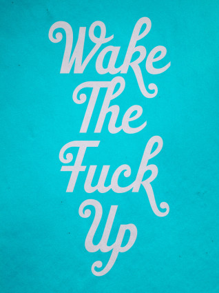
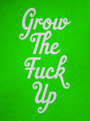
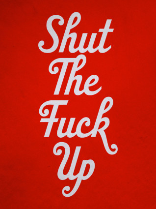
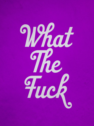
Found via Jessica Walsh
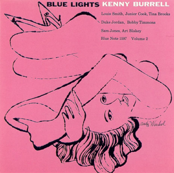
Blue Lights
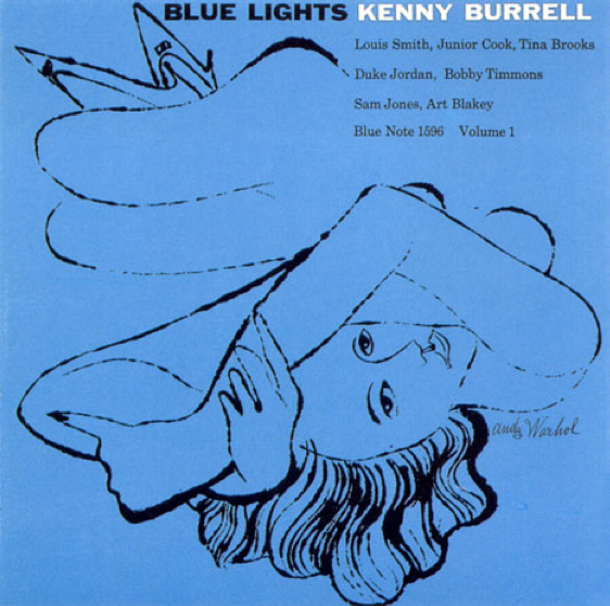
Covers for Kenny Burrell’s Blue Lights. Reid Miles, design; Andy Warhol, illustration. Blue Note Records, 1958.
Just because.
Clients know shit
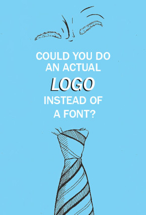
As a side project, Irish graphic designers Mark Shanley and Paddy Treacy turned a bunch of client feedback (the bad kind) into a series of posters. They then put them up for sale and ended raising a bunch of money for charity.
Pictured, a few. More here.
Of course, the goal is always to work with clients that know shit. And are willing to go thru a creative process that leads to the best work imaginable. This usually involves understanding that good logos typically involve letterforms (I’ve heard poster #1 before).
Don’t we have enough fonts already?
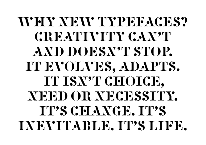
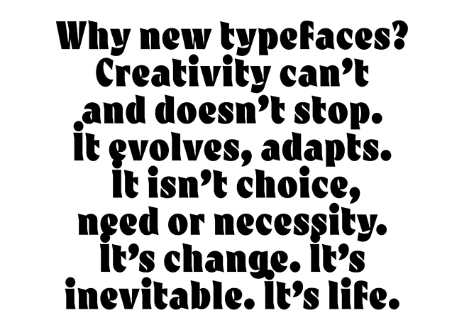
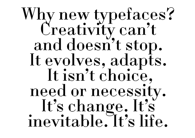
‘So just as we change as we grow up and our bodies, opinions and tastes change. This is Time. This is Life. They are defined by Change. So Change is inevitable, its outside of need or necessity. It just Is.’
The images (and words) are from this wonderful post over at the Alias blog: Why new typefaces? Alias is run by David James and Gareth Hague.
In my opinion/experience, we’ll stop having a need for new typefaces right about the time we stop wanting new music, new food ideas (I’m hooked on detox water right now) and new ways of looking at how we dress ourselves.
Types have personality, just like humans. Take it all away and we become . . . Helvetica. On a Star Trek planet where we all look, think and dress alike.
Type is everywhere. And humans like to mess with shit.
via Alias

handpicked posts

a piano falls in old manhattan
tetro and typography
it’s typography: film, song and dance
ghosts of gustov klimt
the great times new roman controversy
picking fonts
kapitaal
defining terms: design is not decoration
garcia's 'pure design'
'enhance that image!'
magic highway remixed
the cynic
rad anthem
Brought to you by man dom-


buy my fonts
go shopping
mehalloreads

Divinely Elegant: The World of Ernst Dryden
Jozsef Pecsi: Photo and Advertising
Color: A Natural History of the Palette
Collage: Assembling Contemporary Art
Modern Dog: 20 Years of Poster Art
Gaberbocchus Press: An Experiment in Publishing, 1948-1979
Advertising Art in the Art Deco Style
Googie Redux: Ultramodern Roadside Architecture
Hot Sour Salty Sweet: A Culinary Journey Through Southeast Asia
now playing


the work at the mehallo blog. beta. is licensed under a creative commons attribution - noncommercial - no derivative works 3.0 united states license. if reposting, credit must be given to steve mehallo - and if possible, please provide a link back to the mehallo blog. beta.
i include images for the purpose of critique, review, promotion and inspiration - and always make my best effort give credit/link back to the original source. if i’ve screwed up, please fire me a note.
page layout based on the wordpress 'darkwater theme' by antbag, adapted and redesigned by mehallo. valuable php assistance from bill mead.


