Parkinson’s Sutro fonts
ADAC 38th season promotional material
It’s not often one gets to meet one of their heroes.
When I was in high school, a bunch of kids thought it would be funny to sign me up for every magazine subscription they could find – by sending in a large pile of subscription cards. My parents were not amused; but it was Rolling Stone that I kept. I fell in love with the hand-inked masthead – and decided that that was what I wanted to do.
Hand-ink mastheads.
Not a big field. And who knew people actually did this? I wanted to do it, and early attempts (for my high school paper) netted not so wonderful results. Who knew that someday I’d actually be drawing fonts as a consequence.
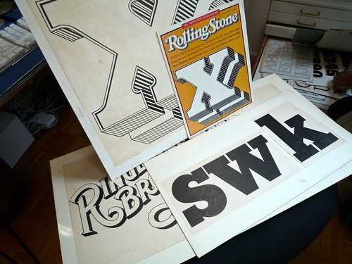
![]()
Rolling Stone masthead by Jim Parkinson
Around five years ago, I finally met the guy behind the logotype – lettering artist Jim Parkinson. And the conversations have been great – as long as I don’t actually call him hero, he’s cool. And (who knew?) we both like fresh anchovies. Which I’ve found can gross out anyone who is eating near us.
using jim’s fonts
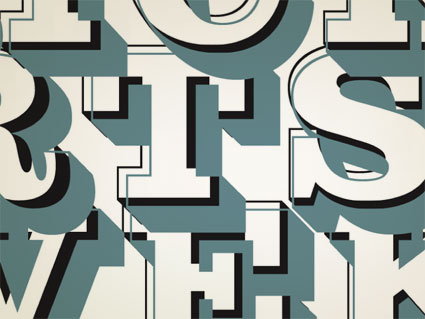
I used Jim Parkinson’s Sutro fonts on promotional materials for the 38th season of the Sacramento Art Directors and Artists Club. I was the newly appointed president, so I was determined to use fonts from the best of the best and (of course) Jim was on my list.
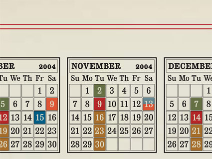
Some of the collateral included an events calendar (above) where I digitally ‘channeled’ Morris Fuller Benton’s original ATF Cheltenham calendar cuts using the Sutro family as well as an experimental t-shirt design (below) listing all speakers and events planned for the season:

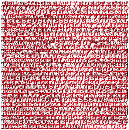
The pattern was created by setting Sutro Shaded Initials with negative leading in two almost identical overlapping text boxes. Each box was in a different color – one aligned justified, the other centered.
type at the fair
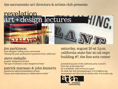
The following summer, I had the honor of giving a talk on California-themed typography – with Jim – at an unusual venue, The State Fair. I gave an historic overview of 19th century typography and Jim showcased how he adapts from these types for contemporary projects.
It was an odd thing to do (flyer below), but really fun. Spent the week before pouring thru specimen books to make a slide showing ATF Jenson, the forerunner of both the Rolling Stone logotype and Jim’s Parkinson fonts.
a california guy
Most of Jim’s fonts are named for California locations and he keeps busy designing magazine logotypes and painting. Drop by his website here.

Jim Parkinson
And for a great overview of his body of work, here’s a MyFonts interview with Jim. Or if you want to see some interesting posts about a Chilean soap opera going hog wild with the Rolling Stone logo, go here (I just had to include that one).
And if you read magazines – even just staring at them while in line at the store – you’ve seen his work. It is everywhere, which is the coolest part. Can’t pass a magazine rack without thinking of Jim.
Jim’s archive, via Stewf on Flickr


I had a chance to work briefly with Jim on a logo for a magazine that, sadly, never saw the light of day. Nice guy and obviously a master with letterforms.