Star Trek production design of the 1960s

The U.S.S. Kelvin, 2009
J.J. Abrams made a few changes to Star Trek.
Plotwise it had something to do with a black hole or alternate reality time travel singularity cinnamon gumball something or other. Below is what Abrams’ U.S.S. Kelvin would have looked like if it fit the style created by Star Trek’s original designer, Matt Jefferies.
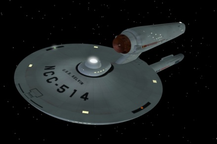
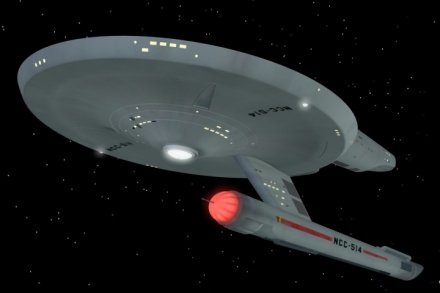
Renderings by Kenneth Thomson Jr.
Star Trek’s 1960s production design is a reflection of its era. Cold War, The Man in the Gray Flannel Suit – or Mad Men – in outer space.
Jefferies’ original Enterprise model sported antennas on the engines, a radar dish up front with deliberate nods to the military. I think that triangle thing under the forward hull may be for an anchor. Maybe.
The ships from the original series also sported traditional ‘painted’ surfaces – battleship gray hull – plus, identification tags, banners and typography. Port and starboard navigation lights. Just like the Navy.

Original Enterprise model with antennas
The Enterprise’s NCC-1701 serial number has a few tall tales behind it. In reality, it was a take on a future where opposing nations would work together – a mix of national markings for ‘United States Commercial’ (NC) and the Soviet Union (CCCC) with numbers that looked good on screen. A major part of Star Trek’s original production design (especially colors, below) had to do with limitations of 1960s television screens.
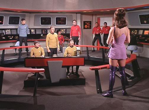

On the fashion side, costume designer William Ware Theiss worked with a primary color palette so characters would actually show up on small color tee vee sets.
NBC’s parent company, Sheinhardt Wigs RCA, was doing all they could to sell early color tee vees. Star Trek, shown in living color on NBC, was caught up in all this.

IBM System/360 Model 44, 1965
With technology, Star Trek did its best to keep up with the Joneses – namely, technology design of the day. IBM mainframes dominated (above). Personal Computers didn’t exist yet. Monitors took a backseat to a massive data paper trail – and flashing lights were everywhere. On the bridge, Spock needed a hooded monitor with bright blue light just to read his scanner. Quaint.
But this was the future that Star Trek said was coming. Bridge mainframe that whirrrrrrs, battleship gray, beeps, pings and all.

‘Sorry Mr. Spock, but I have an iPhone that does more than that thing.’
links
[1] Interview with original production designer Matt Jefferies here.
[2] More fan-produced Kelvin images here.
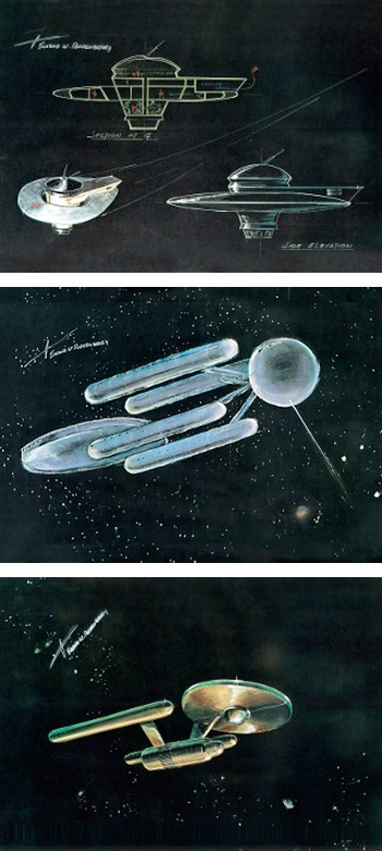
[3] Prints of Jefferies’ Enterprise conceptual drawings (below) are available thru the Roddenberry family here.
[4] CBC Cold War films here.
[5] The Man the Grey Flannel Suit Wiki.
[6] Mad Men official site.
[7] IBM Archives: Mainframe photo album here.
[8] And, a look at Star Trek fashion here.



Interesting. My grandson is nuts about Startrek especially the lego version. I used to program the IBM 360 in the olden days! A blast from the past!!!
Isn’t it pretty widely accepted that NCC stands for Naval Construction Contract?
The writers came up with that – cause Jefferies’ version didn’t quite sync with the show’s storyline. :)