The Great Times New Roman Controversy
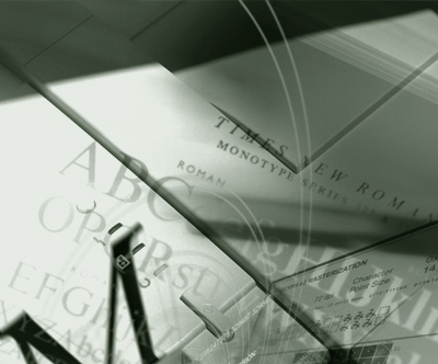
Photo composition by mehallo for Agfa Monotype, 2000
seeds
Mike Parker’s been in the news lately, mostly about the origins of Times New Roman.
I met him several years ago at one of the TypeCons. And as someone who just started teaching a History of Graphic Design course, I had to spend some time picking his brain. How often does one meet the former co-director of typographic development at Mergenthaler Linotype – one of the guys who greenlit Helvetica – and more important, someone who could help me learn to pronounce some of the names in the various design history books I’d been collecting.
There haven’t been many controversies in the type world. Except for the Garamond thing.
the garamond scandal
Turned out that early 20th Century Garamond revivals were not actual Garamonds, but based on a mislabeled specimen taken from the French Imprimerie Nationale. And in 1926, it was a woman going under the pen name Paul Beaujon who blew the lid off of this rather large mishap. (And the enigmatic force behind Beaujon, Beatrice Warde (1900-1969), can be found today on Twitter. Of course.)
the major players
Typography was Big Business in the early 20th century. The major players were Mergenthaler Linotype, Monotype and American Type Founders [ATF]. Work from The Big Three fed where Bitstream and Adobe went in the 1980s. The types we use today are just the grandchildren of work tackled 80 – 100 years ago. Digital revivals of revivals are Big Business today.
Which brings me back to Mike Parker and Times New Roman.
When we spoke, he broke out for me a class struggle story – about a factory worker at British Monotype and the elite Stanley Morison, typographical advisor to the Monotype Corporation, Cambridge University Press – and the driving force behind Times New Roman.
Times New Roman was developed under Morison’s direction (illustrated by Victor Lardent) for The Times of London – released in 1932 – and is arguably the most-used font family in the world today. Like it or not (I do like it; especially the lowercase e), it’s everywhere it can possibly be.
I scribbled my notes, but didn’t have more than that. He referenced a print journal article that I know I’d never find. But I’m not above reporting on hearsay.
history: not very accurate
The short conversation has been part of the Early 20th century type design portion of my history class for a few years now. Hell, history is all about hearsay. Whatever was written down, biases, ego and the lot. Is any of it even true? I just report on what I can find. If one can prove otherwise, great. Love it.

Donald Sutherland IS Johannes Gutenberg!
Even ‘The Father of Printing’ Johannes Gutenberg’s story is unsubstantiated. And if there ever is a movie made from the piles of oft-romanticized conjecture, I think Donald Sutherland should play Gutenberg. He seems to fit with the historical composite. With Philip Seymour Hoffman as Johann Fust. Or Johannes Fust, depending on what source you’re looking at.
(We don’t even know if Gutenberg even existed. That’s the latest hoo ha I’ve heard somewhere. He may actually have been a composite. Like Betty Crocker.)

Philip Seymour Hofmann as the conniving Johann Fust!

Jeremy Piven as the squeaky clean Peter Schöffer!

Tom Wilkinson!

Jimmy Smits!

James Cromwell!

And Miley Cyrus as Beth.
So
where was I?
Oh yeah

Mike Parker
parker’s take on number 54
Earlier this year, Mike released his version of Times New Roman; named for the man who may have been the one with the plan. William ‘Starling’ Burgess had a brief flirtation with typography before turning to aviation. Two guys, the Wright Brothers, dazzled him with some floating invention thing they were working on; and in working for them, his career went.
But it was Burgess’ seminal lettering from 1904 – catalogued ‘Number 54’ in the archives – that may have evolved into the Times types. One story goes that development of Times New Roman may have been more difficult than expected; as the project grew out of a boast, and Morison was charged with not only developing a new typeface for The Times, high legibility and conservation of space were part of the order.
And unfortunately, in all this, there’s just not enough evidence to go on.
links!
But here’s writer Joel Alas’ details of the The Great Times New Roman Controversy, posted last week in the Financial Times. And found via Twitter.com/MyFonts.
And Mike Parker’s Starling fonts can be purchased thru Font Bureau here.
Is it all true? Depends on what you believe. That’s the fun part of history, just never know what is real or what role Miley Cyrus will end up playing in all this.
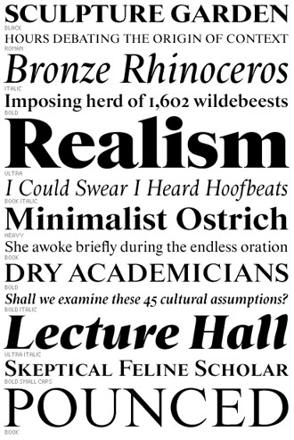
Starling, Mike Parker’s version of the (alleged) seminal types for Times New Roman, 2009


Mike Parker’s belief that the typeface that became Times New Roman was actually designed in 1904 by Starling Burgess was presented 15 tears ago in the American Printing History Association’s journal Printing History (issue no 31/32, 1994). A “Rebuttal” appeared in the journal three or four years later (issue no 37, not conventionally dated but © 1998): in it Nicolas Barker convincingly shows Parker’s evidence for the offer of the typeface to Time magazine to be spurious, and all but one of the thirteen (not five) characters Parker presented of “Burgess Italic?” in his article were identified by their designer himself as much more recent designs that Gerald Giampa had commissioned!
In addition to the capital B illustrated in Joel Alas’s article, several more of the pattern letters in question were shown by Parker in 1994, but those were all presumably lost in the 2000 flood (though you’d have thought that metal pattern letters should be fairly safe from that kind of disaster). Alas described this surviving pattern letter as brass, although it looked more like copper. Nowhere in the 1994 article did Parker claim that pattern letters of that kind were not made after 1915. He distinguished between “characteristic two-piece copper patterns” and “one-piece brass patterns,” but the Rebuttal left it doubtful whether brass ones were ever original.
According to Parker’s theory, Starling Burgess designed a typeface for which the American Lanston Monotype Company assigned the series number 54 in 1904 (and numbers 55 and 57 for eventual companion italic and bold alphabets); this number had been stamped on all the patterns illustrated in his article, together with the much higher number 362, the series number of Times Roman when Lanston Monotype started punching matrices for the typeface in 1961. But it seemed clear, as was pointed out in the Rebuttal, that the “54” on at least most of those patterns was more recently stamped than the “362.” The assignment of the series number “57” by Lanston Monotype to Times Bold when they introduced it into the United States remains puzzling.
Parker referred in 1994 to a biography of Burgess as “nearing completion” and expected it to mention his putative venture into type design. But it did not seem to have appeared by the time of the Rebuttal, and I have not been able to trace such a book. Perhaps a surviving wife thwarted the project?
The common wisdom on the origin of Times New Roman – that Stanley Morison commissioned a typeface based on Monotype Plantin – is referred to in Alas’s article and elaborated in both Parker’s article in Printing History and the Rebuttal. In an article in the Journal of Typographic Research in 1970 (Vol. IV, No 3), however, Allen Hutt, an authority on and practitioner of British newspaper design, claims to have been the first to notice the close relationship between Times New Roman and Monotype Plantin. John Dreyfus at the (U.K.) Monotype Corporation was happy to lecture on Stanley Morison and Victor Lardent as progenitors of Times New Roman after that date, but did he never do so earlier? The alphabet lengths and character-widths of Plantin and Times New Roman are identical in the 24-point size shown in Allen Hutt’s article, though not, in fact, in the composition sizes: the coincidence would nonetheless be remarkable if one face were not derived from the other – unless both faces had to conform to the procrustean “C” matrix-case layout that (as Parker pointed out in 1994) all Monotype faces had to conform to before 1909; but Monotype Plantin did not come out till 1913. Americans would perhaps have had less opportunity to be aware of the similarity, since no version of Monotype Plantin was available in the United States in 1970, and Times Roman itself was less familiar there.
I can’t believe that Parker described Times italic as a “dog”; and it’s nothing like a “standard Monotype italic” – it’s much more like a sloped roman in its serifed s and in most of its meanline terminals (most remarkably the one on the k, which must have been unique for a text face at that time), though preserving the conventional italic treatment of all the lowercase foot terminals. Times italic is in fact an inspired typeface design. Parker is much more likely to have referred to Times Bold in such terms, as he did so in a brief conversation with me in 1997, in which we agreed that Times Bold (roman) had effectively nothing in common with the normal-weight face.
If a good matching bold typeface is needed to go with Times New Roman, however, Times Semi-Bold has long been available.
The difference in the sharpness of the serifs in “Regulations” in Alas’s display is quite irrelevant in text sizes, in which all points as sharp as those, proportionately reduced, would disappear.
Your detail is incredible. And telling. Thank you!
Nice blog, very informative. However i don’t think that Jeremy Piven can pass as a squeaky clean anything.
Awsome blog. Thank you.