Stefan Hattenbach: Fine Swedish type

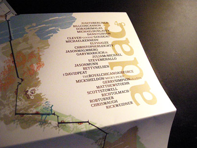
ADAC 40th Anniversary Season mailer (2006-7)
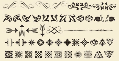
Stefan Hattenbach is a font designer from Sweden who I first met thru Rod Cavazos at Psy/Ops. His types always take me to another place. The forms are rooted in history, but his interpretations are all his own. And his typographic ornaments are exquisite.
I used his Anziano fonts for ADAC’s 40th Anniversary Season – teamed with a beta version of Stefan’s Beef fonts.
Beef will (finally) be released next year thru Veer. And I should note, Stefan is a vegetarian. Beef is pure irony.
Also a couple years back, my students picked Stefan’s fonts for use in the 2008 edition of the American River Review literary magazine. I was one of the advisors at the time; the students’ picks were uncoached – they found and selected the fonts on their own. I was surprised, then they were surprised when I said, ‘Hm. Interesting find. I know the designer.’
And
Here’s an interview with Stefan at Dyna Kau’s Girl of All Work {At Play} blog.
For more about Stefan and the magic he applies to letterforms, visit his foundry site
here. Below: his fonts in use.


Steve,
Such a nice surprise when I checked twitter today. Thank you so much for putting this together. All the best.
Cheers
/Stefan H
Anytime Stefan!
And you know, I forgot to mention your rule to me if I used your beta fonts on anything:
‘No porn.’
And
I’ve never, ever used any of your fonts for porn! :)
s.
[…] type designer Stefan Hattenbach makes incredible letterforms. And his body of typographic work has run the range from experimental […]
[…] incredible type package by Stefan Hattenbach. Snag it […]