entries Tagged as []

Ben Franklin ‘can do’


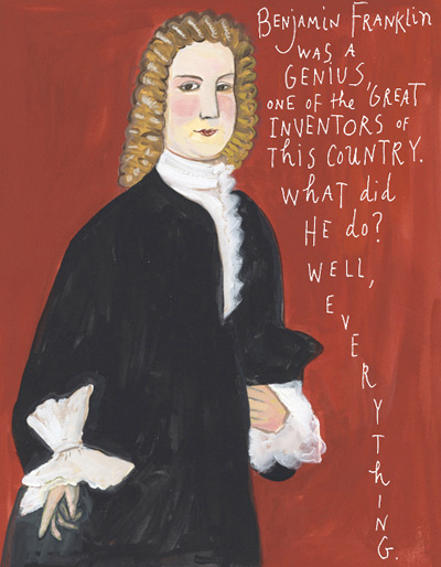
Click the image to read Maira Kalman’s ode to Franklin  . . . .

Benjamin Franklin was fun. So much fun, the International Printing Museum has on staff the incredible Phil Soinski.

Soinski portrays Franklin as part of their educational services; and does such a fantastic job, I learned more about Hot Type in one hour with ‘Ben’ than reading thru whatever pile of type books are currently stacked on my desk. Drop by the museum, set up a tour, take a class – their programs, their dedication to the craft of printing can be contagious.

And illustrator Maira Kalman gives us a bunch of really cool things to know about ultramegasuperinventor Ben Franklin in yesterday’s New York Times  . . . .

Organon: New font superset by Nick Cooke


Organon Sans Family


Organon Serif Family

Robust and playful, Organon is Nick Cook’s new superset type family – now available thru Fontworks UK. Click on the links above to order. Detailed release notes can be also be found in this post at Typophile.

As for the moniker, Nick says, ‘I got the name from the first line of ‘Cloudbusting’ by Kate Bush.’

Found via Twitter.com/typegirl

A look at Starbuck’s new stealth brand

PSFK takes a look at the new interiors for Starbuck’s great brand experiment, 15th Avenue E Coffee and Tea. Feels a smidgen like Peet’s, the other high end coffee house chain that used to own Starbucks.

The secret design history of 12 famous brands

Detailed slideshow by Armin Vit and Bryony Gomez-Palacio at Fast Company.

How type families work

Here’s a great article at Typotheque on fonts who hang out in families. Where they come from, why they get along better than real families.

Hm. SacBee uses SacUnion’s fonts  . . . .

The Sacramento Bee redesign, as posted on Font Bureau’s Facebook page. Fonts used include Benton Sans, Miller, Miller Daily and Miller Headline

A few years back, I was the art director for a reincarnation of The Sacramento Bee’s long time rival, The Sacramento Union.

In this version, The Union was reimagined as a magazine. We did just a handful of issues, the design concept was: ‘newspaper in magazine’ format  . . . [Read more →]

Coming soon: Typophile Film Fest 5

Typophile Film Fest 5 Trailer from Typophile on Vimeo

Preview for Punchcut’s 5th Typophile Film Fest. Typographic films, shorts and more. Here’s a list of who’s showing.

The Fest is confirmed for Typ09, the 2009 ATypI conference in Mexico City, October 29th. And coming to other places too.

The collage work of Cristiana Couceiro

When one thinks of collage, it’s usually something  . . .  scrapbooky. Not always the case.

Here’s some clever modernist-influenced work by Lisbon-based artist Cristiana Couceiro. Love the hint of Univers and the careful subtle essences of Lester Beall, Bradbury Thompson, Tschichold  . . .

Found via the blog of Robert L. Peters

TETRO and typography

Watch this beautiful title sequence for Francis Ford Coppola’s TETRO. Designed by SFAUSTINA. Both avant garde and not at the same time.

And  . . .  I’ve always wondered why so many motion picture title sequences end with a shot of a bus.

Found via Twitter.com/Typegirl

Eric Gill: The wine

Wine label inspired by the work (and life) of font designer Eric Gill (1882-1940). Student-designed project.

The art of setting type

‘Graphic designers were never meant to set type  . . .  That’s what typesetters are for.’

I’m not even sure who said this, it was early on; probably college. Possibly a printer, maybe Roger. Roger would say stuff like that. He’d swear to the ‘ITC god’ and he had the old dusty Varitype machine sitting in the corner to prove it. [Read more →]

Armin Hofmann’s Graphic Design Bible

Like Helvetica? Like the Swiss International Style?

Armin Hofmann’s Graphic Design Manual (1965) is what I learned out of – and if it weren’t out of print, I’d be using it in my basics classes. (right now, I have a few slides made from my dog eared edition as part of a form lecture)

Graphic Design Manual breaks composition into basics: dot, line, confrontation, plus letters and signs. And it shows by example how these basics can be applied to good, clean graphic design: form, composition, typography.

I’ve seen it going for upwards of 90 bucks in some listings. As I write this, there are 22 used available at Amazon starting at $4.10.


Bedtime in Florence


Found via Flores en el atico

The photographic work of Abelardo Morell.

Make your own Polaroids!


Photo by Live2Ski

The Polaroid instant camera is no more, the film factory shut its doors June 2008; taking with it the smelly magic that came from a photograph that would develop right in front of your eyes.

While an Impossible Project may bring the technology back (Polaroid’s chemical components are no longer available), one can still get the basic effect thru a nice little digital-manipulation thing called Poladroid.

Found via Ashley Simko’s blog.

Make your own movie miniatures!


Gallery image from TiltShiftMaker

This is just too goofy not to mention. Turn your world – or snapshots – into a bad movie miniature. Go here.

Cardboard TRON


Tron by Freres-Hueon

Everybody’s talking about Tron 2 this week. Remember the original? I haven’t seen it since 1982, big screen at the UA Cinema in Redwood City. At the time, I hadn’t realized how cheap the FX really were.