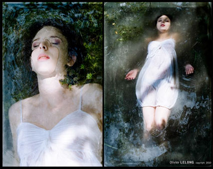
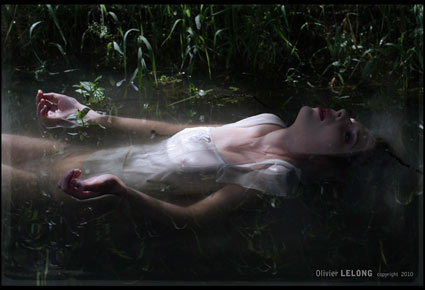
Ophelia

A few years back, I put the fetish work of Olivier Lelong in an exhibition of New Media.
Recently, he posted his latest work on my MySpace page, images from his Ophelia’s Dead series. I still love the crowd on MySpace.
A few years back, I put the fetish work of Olivier Lelong in an exhibition of New Media.
Recently, he posted his latest work on my MySpace page, images from his Ophelia’s Dead series. I still love the crowd on MySpace.
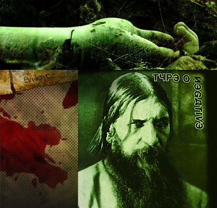
‘With a sense of humor blacker than the clothing that the individual band members wear and a profound distaste and disgust for both humanity and political correctness’ –Roadrunner Records
Type O Negative is a ‘Gothic/Doom’ metal band from Brooklyn. Below, their Halloween in Heaven track, off their Dead Again album. Lead singer Peter Steele died in 2008, the current status of the band is up in the air.
Type O Negative: Halloween in Heaven
Found via Jessica Jackson

Apnea with pumpkin innards.
And if you have a pumpkin lying around, here’s the ‘official’ recipe for my absolute favorite pumpkin pie.
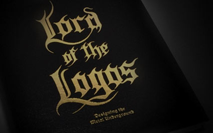
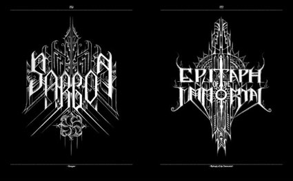
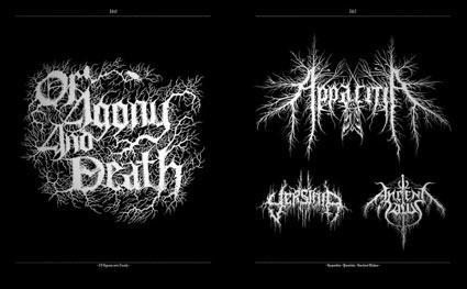
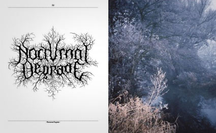
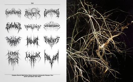
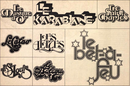
‘The hallmark of Szpajdel’s work is his surprisingly fluid combination of letters with visual elements from art movements such as art deco and art nouveau.’
The dark metal logo work of (Belgian forestry engineer) Christophe Szpajdel – compiled in convenient book form. Published by Die Gestalten Verlag.
Interview here. Another interview here.
Wolves in the Throne Room: A Looming Resonance
Found via Robynne Raye
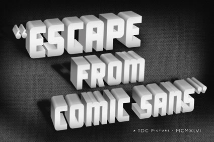
B-movie typography eCards, designed by Will Staehle for TDC. Go here.
And check out Will Staehle’s website here.
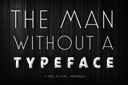
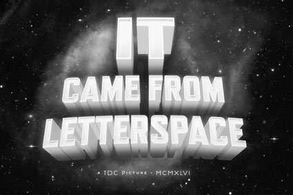
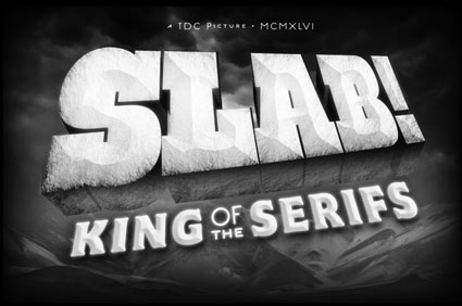
Found via Ilene Strizver
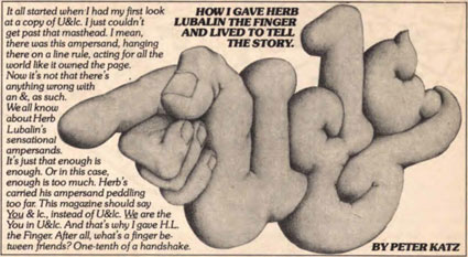
‘Over the 26 years that it was published, U&lc gathered a following of thousands of avid readers that eagerly anticipated each issue. It became the most important typographic publication of its time.’
The 1970s looked like the 1970s because of Herb Lubalin.
And the way he did this was thru Upper & lowercase magazine. Tabloid in size, printed on newsprint, U&lc was read by most of the graphic design industry. Within, the fonts and philosophy of Lubalin’s International Typeface Corporation [ITC] stressed letters that were set ‘close, but not touching’ and . . . aw, hell, let them touch, overlap and be funky.
By the time I was in design school, the look had fallen out of favor – most ITC fonts were actually banned from use in my homework. ITC’s philosophy was to reinterpret the classics, often into something strangely unique, full of its own style – or a lack of style. Like Helvetica.
The 1970s were all about that. Taking things like Art Deco and doing something totally new with it. [Read more →]
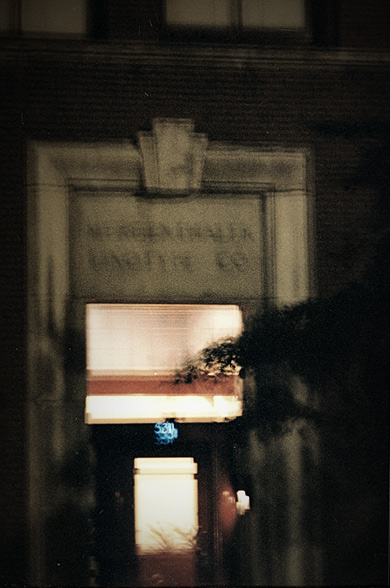
Entrance to the Mergenthaler Building, old printer’s row, Chicago.
Kate Nash: Nicest Thing, from the album Made of Bricks
Photo by mehallo
‘Linotype: The Film is a documentary about Ottmar Mergenthaler’s amazing Linotype typesetting machine and the people who own and love these machines today.’
Trailer above, film now in production. More info here.
Music by Iron & Wine
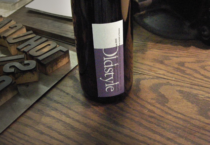
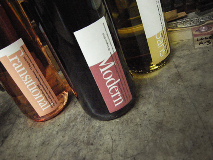
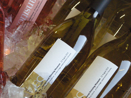
Been busy since I’ve gotten back from TypeCon 2010, so I’m only now slowly going thru photos.
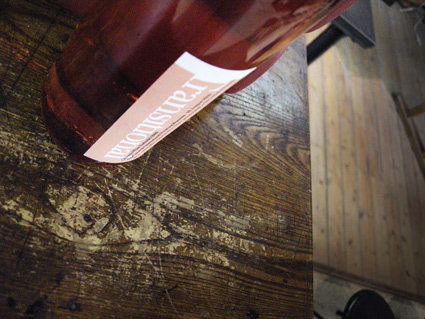
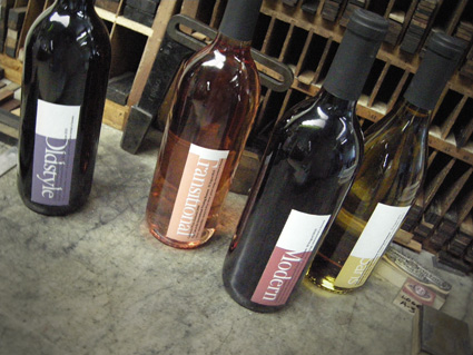
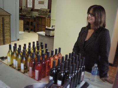
For the TypeCon afterparty at The International Printing Museum, one of my little design touches was bottles of California Typographic Wine; which came in four varieties: Oldstyle, Transitional, Modern and Sans.
Labels were printed on a fabric stock by Hal Hammond – and helping me with the whole vin production were Lucy Schallberger, Jon Coltz, Delve Withrington and (pictured below) Angela Glenn.


the work at the mehallo blog. beta. is licensed under a creative commons attribution - noncommercial - no derivative works 3.0 united states license. if reposting, credit must be given to steve mehallo - and if possible, please provide a link back to the mehallo blog. beta.
i include images for the purpose of critique, review, promotion and inspiration - and always make my best effort give credit/link back to the original source. if i’ve screwed up, please fire me a note.
page layout based on the wordpress 'darkwater theme' by antbag, adapted and redesigned by mehallo. valuable php assistance from bill mead.


