Star Trek-n-me
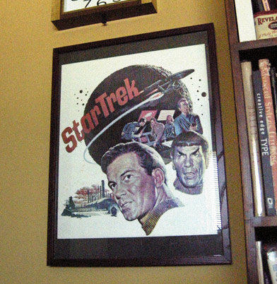
Star Trek poster 1966, art by James Bama
Okay, I’ll admit it. I was a trekkie from way back. Sort of lost interest along the way, but I did enjoy the new movie. Which releases in all sorts of formats this Tuesday.
The message of Star Trek is a good one, when it works. A future utopia where humans have gotten past all their petty hangups. President Obama thinks this way. It’s good thinking.
velour: fabric of the future!
Of course, the early design of the show fascinated me. The look changed after its second pilot episode – which featured cast and crew in these really nifty velour shirts (that Kirk could rip at will). I have the original publicity poster framed in my office (above). The art is by the incredible James Bama, great write up at the Drex Files.
The poster really captures the original look, which was a mix of mid-century modern, googie and space age Disney.
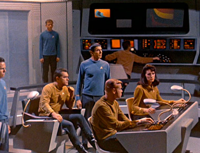
In the future, everyone gets a gooseneck video monitor!
It would have been fun if the new movie had the original velour shirts (above) on the bridge of the Kelvin. The U.S.S. Kelvin, at least, had Star Trek’s signature ‘ping’ noise and the lighting was a little bit like the scene from above. Those were a nice touches.
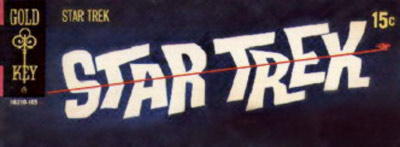
Logo used for Gold Key’s line of comics
sooo groovy, mann
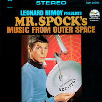
Gold Key had the first officially-licensed comic books. And they were . . . Funky. Online guide here. The logo with the tiny Enterprise speeding by was fun (above) and sort of pulled it all together. The original Star Trek was high 1960s design. With a Shatner swagger. Martinis and miniskirts on the bridge, baby. Put on your copy of Mr. Spock’s Music from Outer Space and dance, dance, dance.
Can’t dance? Sing, baby, sing!
I have several boxes buried somewhere with old early Star Trek stuff in it. Books, fanzines, posters, you name it. There wasn’t too much official stuff – Star Trek was in limbo for many years after being canceled in 1969. Were they going to do another series, would there be a movie? Children’s records, maybe a cookbook.

Collecting the crap was the fun part. Series creator Gene Roddenberry had a deal with Paramount where he could sell stuff – and he did. Thru Lincoln Enterprises, one could snag anything from patches to scripts, Starfleet certificates (signed by Captain James T. Kirk!), production letterhead, writers guides, pens, pencils, whatever wasn’t nailed down. Cheap. A treasure trove.
cartooniness
Star Trek in the 1970s was interesting. There was a post-60s look that sort of kicked in and lots of fan-produced stuff. Even the Slash stuff. Paramount tended to leave the fans alone. I even dabbled in a comic book and ‘zine, which I sent out to subscribers while I was mulling thru the 7th grade. Star Trek was another catalyst for my career in graphic design. Making stars on a black background using a toothbrush and liquid paper was messy fun!
Animated Enterprise (1973)
The animated Star Trek, which aired Saturday mornings on NBC, had a very 1970s look to it. It was as if the Swiss International Style swooped in and cleaned things up a bit. The ship was rendered with industrial design marker pens (above). Even the bridge had a second door (something they could have used years earlier). A second Star Trek series (simply titled Star Trek II) was in production when George Lucas’ Star Wars hit theatres. Then everything changed.
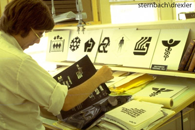
Designer Rick Sternbach and graphics for the first movie
honkin’ big movie
I really loved the design of The Motion Picture (1979). Everything was well thought out, even down to the graphics. Story: not so well thought out. But hell, great visuals!
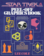
Lee Cole was the designer of all the fiddly details – and the Star Trek Peel Off Graphics Book was one of the first books I owned. Had them stickers everywhere.
And it was cool to see some of Cole’s old images peppered throughout the new film (along with Mark Simonson’s Changeling font).
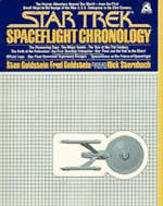
Another favorite book featured art by Motion Picture production designer Rick Sternbach. Star Trek Spaceflight Chronology, a timeline of what future spaceflight was going to entail, from the Soviet’s launch of Sputnik to the Enterprise featured in the movies (By the way, if memory serves, NASA’s Space Shuttle was to be phased out by 1990, replaced by Sleeper Ships).
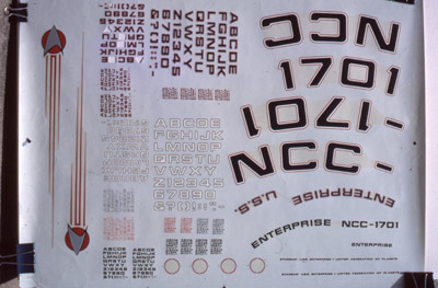
Decals
drex stuff
Along the way, I fell in love with the work of artist Doug Drexler. I saw his art printed in a fanzine – and really enjoyed the graphic design of the Star Trek Giant Poster Book, which was a fold out magazine he used to edit (love that 3D logo. Hm. Similar to Jim’s stuff).
And today, Drexler has a really cool blog – which in addition to Star Trek art, he’s also been posting his collection of old comic strips, Dick Tracy, Steve Canyon . . . (and yes, much of the stuff I’m showing I found thru his blog).

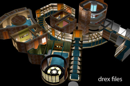
Enterprise cutaway by Doug Drexler
too, too much
Eventually Paramount Pictures realized they owned this stuff – and started enforcing their copyright. Many fan-spun clubs shut down, their wares sort of vanished. Then they made another series, then another, then another. They killed off Kirk as a publicity stunt. What were they thinking?
Reality eventually set in. One day in 1990 I got to tour the Next Generation sets at Paramount. They were small, crammed and made of plywood. Built to photograph well.
The Next Generation at Stage 9, rendered by Doug Drexler
It was really just a tv show.
But one that sparked my creativity. It was fun watching the new movie and knowing little trivia things about the show’s history. And great to see that today it’s in good hands.
Star Trek is best when someone who gets it is at the helm. It’ll be fun to see what comes next.