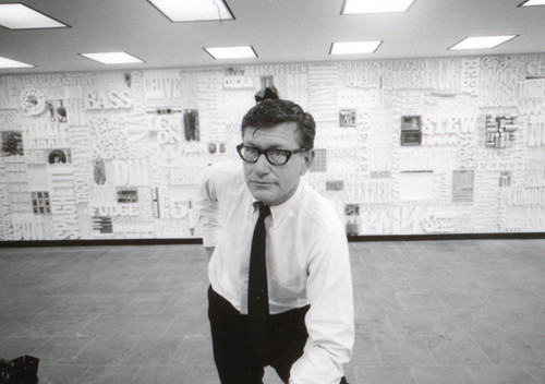
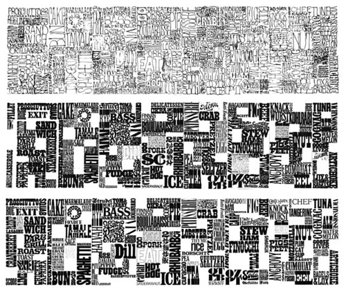
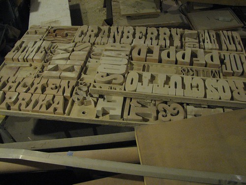
The CBS Gastrotypographicalassemblage
Back in the 1960s, CBS art director Lou Dorfsman created one of the most influential typographic treatments of all time.
Today, designers have rediscovered the Gastrotypographicalassemblage’s 3D complexity – and today it’s been influencing everything from the design of Zune advertisements to kinetic typography videos (note that the new adaptations also tend to be in black/white with minimal color).
The video (above) gives history. And here’s more history. Plus, photos and restoration images here.


nice post…
Pretty nice post. I just stumbled upon your weblog and wanted to say that I’ve truly enjoyed browsing your blog posts. In any case I’ll be subscribing to your rss feed and I hope you write again soon!…
Recommeneded websites…
[…]Here are some of the sites we recommend for our visitors[…]……
Travel Offers…
[…]these online websites might not necessarily be entirely relevant to our website however we absolutely think you all really should see them[…]…