‘In July 2013, artist José Parlá painted Nature of Language, a mural commissioned by SNØHETTA and North Carolina State University for the James B. Hunt Library in Raleigh. The library is best known for its architecture and technological integration, including a large robotic book storage and retrieval system which houses most of the university’s engineering, textiles and hard sciences collections.’
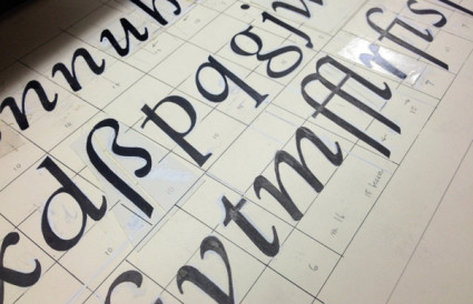
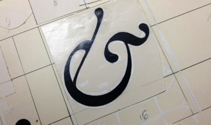
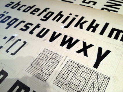
Jose Parla’s lettering art in a library. Syncs with concepts I’m throwing around in my Friday night type class.
Found via Graffuturism
Tags: design, education, illustration, typography by steve
Comments Off on ‘Nature of Language’