entries Tagged as []
NBC Mystery Movie
The NBC Mystery Movie was a 1970s anthology series showcasing different crime dramas. Like Law & Order, but different. They had the coolest intro with theme music by Henry Mancini.
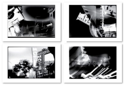
‘DublinBerkeleySanLorenzoCupertinoSanJose’
Memorable, local commercial spots from long ago.
Dubious video/sound quality. But that’s how I remember them. Denevi’s locations (above), as jingle, just stuck in one’s head like . . . paste.
The story of Maurice “Ed” Barbara (above) actually ended up on NBC’s Unsolved Mysteries, fall 1989.
No matter what one would buy at Steven Matthew David’s ‘Top-of-the-Hill-Daily-City’ electronics store, one would get a free bike. Not sure why, but hell, it was a FREE BIKE.
Paul was The Master of the Shit-Eating Grin.
Pete Ellis knew van conversions had something to do with sex. He also knew one would remember his address if children sang it. This video is the So Cal version of the commercial, the Nor Cal jingle simply had a different sing-along address (which we all knew): ‘1095 West El Camino Real, Sunny-Vale.’
A drive in break
Drive Ins always had double features and Sacramento’s six screen is still open (Facebook group here). Also projecting is the local Movies on a Big Screen.
For intermission: Commercials, community service ads and countdown animations used to remind everyone to be back in their car in time for the second film. Here’s a bunch.
And
Check out my Burlingame Drive In prints, cards and postcards.
For the record, I did propose to my wife at the (now gone) chilly Burlingame between Nine Months and Clueless.
Theatre time!
Local bumpers for theatre chains.
General Cinema’s original Feature Presentation animation (above) was iconic. Skip thru to 3:40 to see it in its 1960s blue glory!
Syufy’s old music (below) got the audience to clap along. Their googie-styled cinemas were shaped like dome spaceships.
United Artists (above) was pure 1980s flair!
I once saw a guy walk out of a showing of Amadeus (1984) humming the UA theme music.
And
Check out my Theatre prints, cards and postcards. Featuring the now defunct Millbrae and Belmont Theatres. Part of my 20th Century Obsolete series (below).
The ABC Movie
Movies on television were HUGE events. Here’s some of ABC’s dramatic intros/bumpers.
Plus
Here’s a short history of the ABC Movie of the Week: part one and part two. With movie and fall preview videos and a quick interview with Harry Marks, who designed the 1969 Movie of the Week intro with the help of a SFX guy named Doug Trumbull.
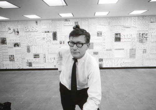
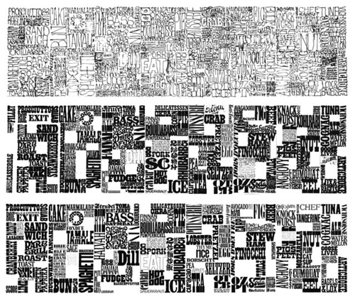
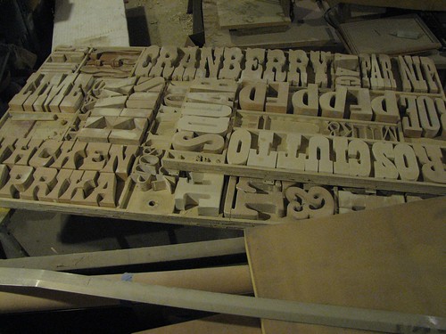
The CBS Gastrotypographicalassemblage
Back in the 1960s, CBS art director Lou Dorfsman created one of the most influential typographic treatments of all time.
Today, designers have rediscovered the Gastrotypographicalassemblage’s 3D complexity – and today it’s been influencing everything from the design of Zune advertisements to kinetic typography videos (note that the new adaptations also tend to be in black/white with minimal color).
The video (above) gives history. And here’s more history. Plus, photos and restoration images here.
This is CBS
William Golden (1911-59) developed the CBS eye back in the 1950s. The report by Charles Osgood (above) tells the story. Today, the CBS eye is considered one of the most identifiable marks in the world, right next to Target’s bulls-eye.
Golden also developed a proprietary Bodoni Didot font (a mix of Bodoni and Didot) as part of the Columbia Broadcasting System’s brand. This typeface has been used in multiple forms by CBS over the years.
Golden died of a heart attack at the age of 48. His replacement, Lou Dorfsman (1918-08), spent the next 40 years maintaining and refining the quality of the CBS brand; the Tiffany of networks.
More about Golden here. Below, a collection of CBS onscreen graphics/bumpers from over the years:
Scary logos
‘What about the children?’
Many worry about the content of children’s programming. Did anybody ever consider that the content may not have ever been as dangerous as the logos?
Video (above) of creepy tee vee logos that frightened us as children. End of shows, beginning of shows. Both versions of the Children’s Television Workshop (CTW) was nightmare-inducing. On merit alone, Viacom should get an award or something.
Here’s a few more . . . RKO Television 9 has to be the most chilling:
The Wogs
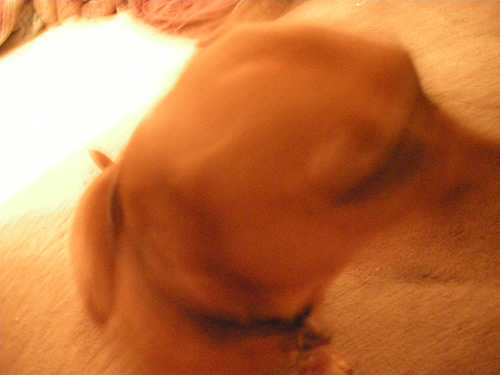
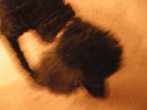
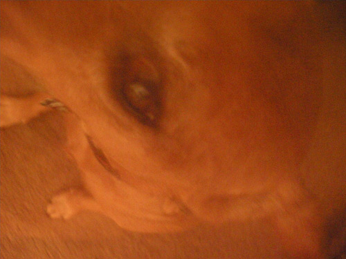
We have two dogs. We rescued them from situations that weren’t so good. Kira is the light brown one, Biene is the poodle.
This week they’re not getting along. Biene has been pooping in Kira’s bed. And the emotional response from Kira – she’s really upset about it – is overwhelming.
They’re both quite crazy.

handpicked posts

a piano falls in old manhattan
tetro and typography
it’s typography: film, song and dance
ghosts of gustov klimt
the great times new roman controversy
picking fonts
kapitaal
defining terms: design is not decoration
garcia's 'pure design'
'enhance that image!'
magic highway remixed
the cynic
rad anthem
Brought to you by man dom-


buy my fonts
go shopping
mehalloreads

Divinely Elegant: The World of Ernst Dryden
Jozsef Pecsi: Photo and Advertising
Color: A Natural History of the Palette
Collage: Assembling Contemporary Art
Modern Dog: 20 Years of Poster Art
Gaberbocchus Press: An Experiment in Publishing, 1948-1979
Advertising Art in the Art Deco Style
Googie Redux: Ultramodern Roadside Architecture
Hot Sour Salty Sweet: A Culinary Journey Through Southeast Asia
now playing


the work at the mehallo blog. beta. is licensed under a creative commons attribution - noncommercial - no derivative works 3.0 united states license. if reposting, credit must be given to steve mehallo - and if possible, please provide a link back to the mehallo blog. beta.
i include images for the purpose of critique, review, promotion and inspiration - and always make my best effort give credit/link back to the original source. if i’ve screwed up, please fire me a note.
page layout based on the wordpress 'darkwater theme' by antbag, adapted and redesigned by mehallo. valuable php assistance from bill mead.


