entries Tagged as [design history]
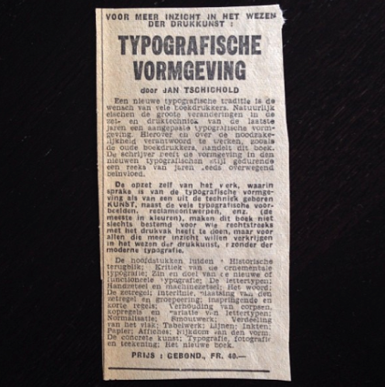
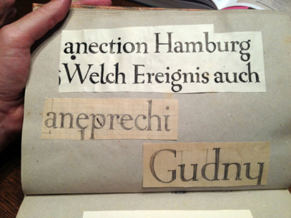
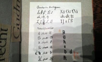
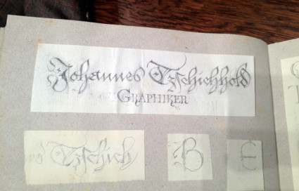
Jan Tschichold sketches
‘Sketches by Jan Tschichold found in the National Library in Leipzig, Germany’
If one is going to do a Tschichold revival, one should pour through an archive, no?
Photos posted on Behance with a link to Sebastian Nagel’s Tschichold revival, Iwan Reschniev.
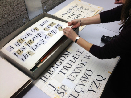
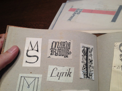
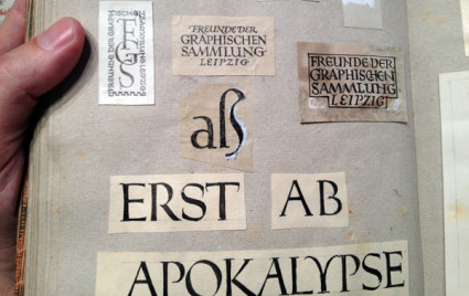
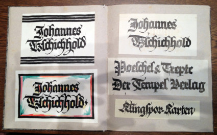
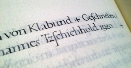
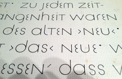
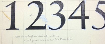
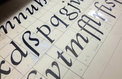
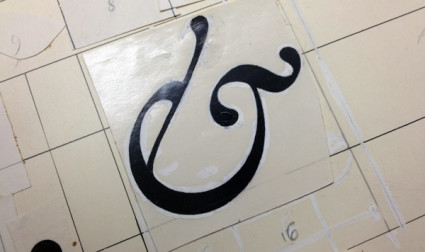
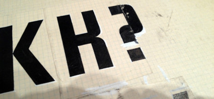
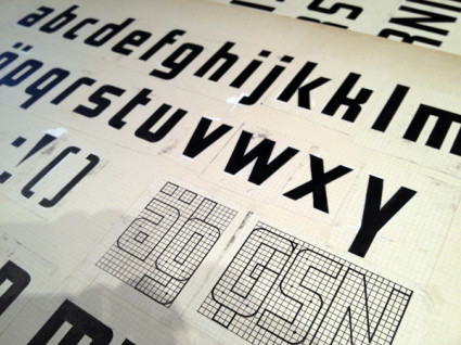
Found via Thinking Form
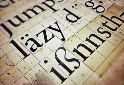
Meticulous ink
A look at contemporary letterpress printing, the technology that goes back to Gutenberg. Short film by Raspberry and Jam for Cereal magazine.
Bass at 93
‘His most famous title sequences include the animated paper cut-out of a heroin addict’s arm for Preminger’s The Man with the Golden Arm, the credits racing up and down what eventually becomes a high-angle shot of a skyscraper in Hitchcock’s North by Northwest, and the disjointed text that races together and apart in Psycho’
Last night, Google doodled this (above).
Last week in my history class, I presented footage of the original titles that Saul Bass designed that Google doodled this (above) was based on.
Dave Brubeck came along for the ride.
More info here.
Found via Alice Woodruff
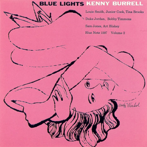
Blue Lights
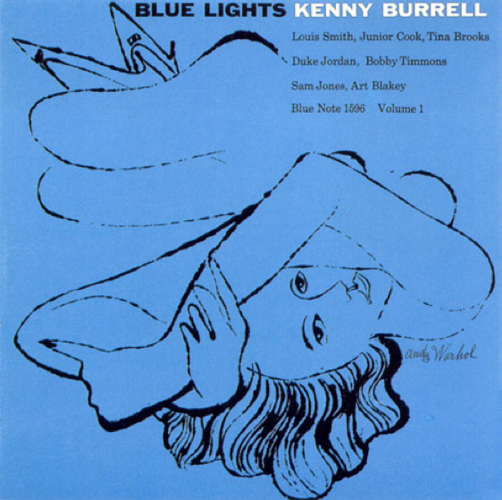
Covers for Kenny Burrell’s Blue Lights. Reid Miles, design; Andy Warhol, illustration. Blue Note Records, 1958.
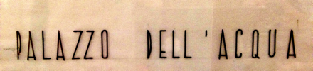
Just because.
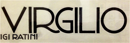
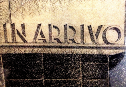
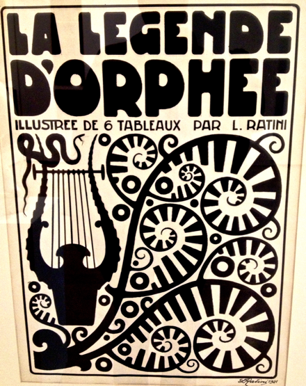
Typographic soft porn, via Italy
Last week I attended TYPO in San Francisco and noticed that my notebook was full. No room for notes.
My solution was the #typo13 hashtag, Twitter, plus big fingers and cranky iPhone. Everything I attended I tweeted, autocorrect had other ideas, TYPO ended up meaning typo.
Typically if I go on a tweeeeting binge like this, I lose ‘followers’ and get bitched out a bit. Instead I ended up meeting some cool people from around the planet.
Sol Kawage lives in South Tyrol, a ‘german speaking region in northern Italy.’ Her tagline on her Twitter account states: ‘Annoying people since 1980.’
Pics are from her blog, cool holdings of a small Museum of Modern Art in the City of Rovereto. More here and here.
‘Who are modern Russian designers?’
Modern graphic design has roots in Russian Suprematism and Constructivism. Here’s a trailer for a film by Sergey Shanovich that looks at what’s been happening since.
Facebook page here.
Found via Motioncollector
Bauhaus. World Changing. Education. Media.

I will be giving a talk on April 19 at American River College. Covered will be the history of the Bauhaus (1919-33).
And as an add-on, I’ll be subtly previewing how the Bauhaus, Futurism and early Modern Art has inspired my new educational project, FLomm: THE BATTLE For MODeRN 1923 (which already has a tumblr presence here and twitter here).
For additional information, please visit the Art New Media at American River College Facebook page here.
Born, Raised, David A. Smith and John Mayer
‘David A. Smith is a traditional sign-writer/designer specialising in high-quality ornamental hand-crafted reverse glass signs and decorative silvered and gilded mirrors. David recently produced a wonderful turn-of-the-century, trade-card styled album cover for popular American singer/songwriter John Mayer.’
More on David A. Smith here.
Monty Python moves
‘The whole point of animation to me is to tell a story, make a joke, express an idea. The technique itself doesn’t really matter. Whatever works is the thing to use.’
Terry Gilliam on animation. From 1974.
Found via Cartoon Brew
She said
‘The very first rock and roll Music Video. A stop motion film of the Beatles singing ‘I Feel Fine’ drawn by Stephen Verona and hand colored by Verona and John Lennon’

handpicked posts

a piano falls in old manhattan
tetro and typography
it’s typography: film, song and dance
ghosts of gustov klimt
the great times new roman controversy
picking fonts
kapitaal
defining terms: design is not decoration
garcia's 'pure design'
'enhance that image!'
magic highway remixed
the cynic
rad anthem
Brought to you by man dom-


buy my fonts
go shopping
mehalloreads

Divinely Elegant: The World of Ernst Dryden
Jozsef Pecsi: Photo and Advertising
Color: A Natural History of the Palette
Collage: Assembling Contemporary Art
Modern Dog: 20 Years of Poster Art
Gaberbocchus Press: An Experiment in Publishing, 1948-1979
Advertising Art in the Art Deco Style
Googie Redux: Ultramodern Roadside Architecture
Hot Sour Salty Sweet: A Culinary Journey Through Southeast Asia
now playing


the work at the mehallo blog. beta. is licensed under a creative commons attribution - noncommercial - no derivative works 3.0 united states license. if reposting, credit must be given to steve mehallo - and if possible, please provide a link back to the mehallo blog. beta.
i include images for the purpose of critique, review, promotion and inspiration - and always make my best effort give credit/link back to the original source. if i’ve screwed up, please fire me a note.
page layout based on the wordpress 'darkwater theme' by antbag, adapted and redesigned by mehallo. valuable php assistance from bill mead.


