‘In July 2013, artist José Parlá painted Nature of Language, a mural commissioned by SNØHETTA and North Carolina State University for the James B. Hunt Library in Raleigh. The library is best known for its architecture and technological integration, including a large robotic book storage and retrieval system which houses most of the university’s engineering, textiles and hard sciences collections.’
Jose Parla’s lettering art in a library. Syncs with concepts I’m throwing around in my Friday night type class.
Years ago Step By Step was a graphic design magazine that showed complex design solutions in a ‘step by step’ process. So was HOW, which broke out HOW things were designed.
Today we assume computers just design everything. Not true. Not everything.
Pictured is the work of Dmitry Karpov. And at Behance, here is the Step by Step breakdown of HOW they were done.
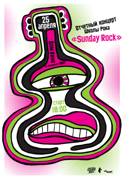
‘Specialization of our school is contemporary music teaching for kids and teenagers’
Modern Dog recently created this poster for Sunday Rock, a music school in Yekaterinburg, Russia.
And I provided Robynne and Co. some quick Cyrillic type the old fashioned way: Scanned in from early 20th Century sources, pieced together letter by letter.
Four different scripts combined to have similar weight, rough edges, heavy caps. I’ve been doing a bunch of work this way lately – sometimes one has to go back to basics.
‘David A. Smith is a traditional sign-writer/designer specialising in high-quality ornamental hand-crafted reverse glass signs and decorative silvered and gilded mirrors. David recently produced a wonderful turn-of-the-century, trade-card styled album cover for popular American singer/songwriter John Mayer.’
‘The whole point of animation to me is to tell a story, make a joke, express an idea. The technique itself doesn’t really matter. Whatever works is the thing to use.’
‘The very first rock and roll Music Video. A stop motion film of the Beatles singing ‘I Feel Fine’ drawn by Stephen Verona and hand colored by Verona and John Lennon’
If there were in the world today any large number of people who desired their own happiness more than they desired the unhappiness of others, we could have paradise in a few years. –Bertrand Russell (1872-1970)
Years ago I knew a head general counsel who worked for a legal department for a rather large corporation.
When it came to lawsuits, he explained to me that their approach was they ‘never settled’ and ‘would use all of our resources – millions of dollars at our disposal’ to fight any suit that came in. Whether they were right or wrong. “If they’re going to go up against us, that’s what they’re going to get.’
Years later I sat in on a ‘business ethics’ class where this ethic was explained in detail: ‘it is okay to destroy the competition. That’s good business ethics.’ And throw in that businesses today operate to ‘keep shareholders happy’ over everything else – we live in a very frightening world. One that squashes innovation and creativity in favor of ‘good competition.’
Good competition is fantastic – when the tables are ‘fair and balanced,’ a term – even today – that’s not used for what it actually means. There’s a lot we CAN be doing as a race – in terms of social, political and humanitarian causes – but we don’t. There’s a great scene in An Inconvenient Truth where Al Gore points to an illustration of a pot of gold. It’s our motivation. It’s what we live for. A pot of gold. A shiny pot of gold we can hide from others, shower with, rub on our bodies if it makes us feel better.
the battle
Right now there’s a David v. Goliath lawsuit going on. It seems simple open and shut: Large corporations profit from stolen artwork. So artists who created artwork get a lawyer and take on the corporations.
In this situation, the corporations are our darlings: The fantastically wonderful Disney and the ‘god I love what they do for design’ Target. And I spent an afternoon recently going thru the case files – which are posted at Friends of Modern Dog – and to me it seems it’s another bury the little guy response.
You’d think it would be Urban Outfitters doing this – it IS their modis operandi – but no. It appeares Disney and Target are poised to destroy Seattle’s very own Modern Dog.
Ashamed is not a word I use much. Though I think it applies here: BOTH Disney and Target should be ashamed. They are BOTH corporations that benefit from creative innovation. BOTH should be working WITH Modern Dog, not – as this lawsuit seems to be doing – putting them out of business . . . [Read more →]
‘Cieślewicz always compared himself to a journalist; but he referred to himself as a visual journalist. So Graphic designer, as a profession, is very close to that of journalism; except that it is about articulating clear ideas through the justaposition of imagery and layout – it’s a question of wanting to say something.’ –Professor Andrezej Klimowski, Royal College of Art
Above, a BBC overview of the work of Roman Cieślewicz (1930–96), which was part of a retrospective this summer at the Royal College of Art in London.