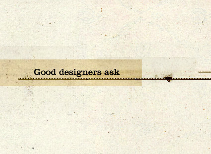
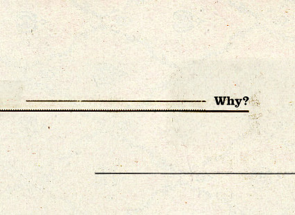
‘The good designer asked why, discovered why the client was making their request and turned it around. Sometimes the client has no real reason and the suggestion disappears into the ether. Sometimes they’re just masks for an effect or emotion they are going for but can’t articulate.’
Essay over at Retinart on why ‘why?’ is so important in designer/client relationships. Read it here.
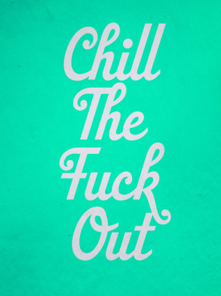
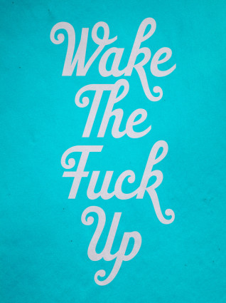
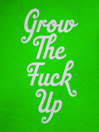
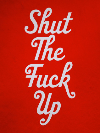
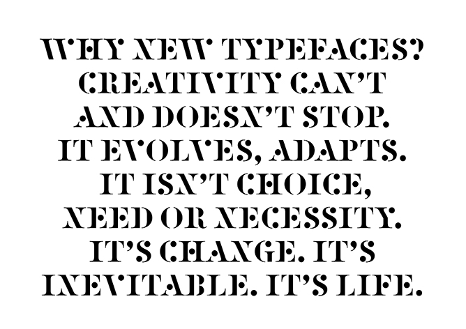
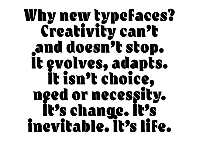
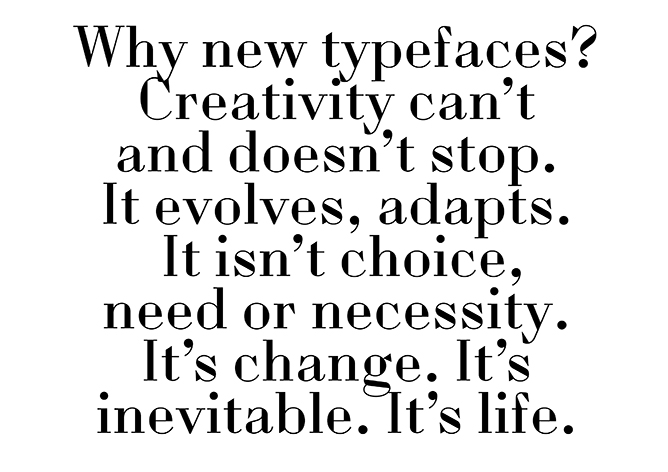
Designer Matthew Rogers took Fry’s comments on language – which has this wonderful way of evolving – and made it visual (above).
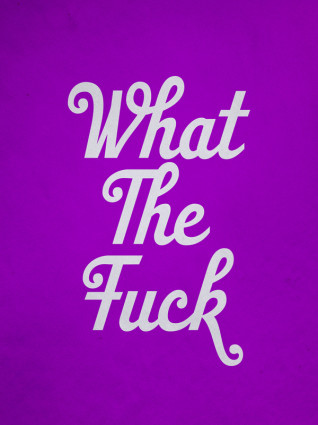
I am currently working on a project where I’m screwing with language for fun. Google Translate is a great video game, no scores or explosions (unless you look them up); but always fascinating results.
‘So just as we change as we grow up and our bodies, opinions and tastes change. This is Time. This is Life. They are defined by Change. So Change is inevitable, its outside of need or necessity. It just Is.’
The images (and words) are from this wonderful post over at the Alias blog: Why new typefaces? Alias is run by David James and Gareth Hague.
In my opinion/experience, we’ll stop having a need for new typefaces right about the time we stop wanting new music, new food ideas (I’m hooked on detox water right now) and new ways of looking at how we dress ourselves.
Types have personality, just like humans. Take it all away and we become . . . Helvetica. On a Star Trek planet where we all look, think and dress alike.
Type is everywhere. And humans like to mess with shit.
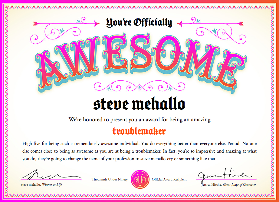
Too many graphic design award competitions award people for being young and full of ideas. What about the rest of us who are OLDER than YOUNG and maybe filled with better ideas?
I think experience and wanting to keep doing NEW is worth something, no?
So you can now be AWESOME too. At any age. Go here.
Last week I attended TYPO in San Francisco and noticed that my notebook was full. No room for notes.
My solution was the #typo13 hashtag, Twitter, plus big fingers and cranky iPhone. Everything I attended I tweeted, autocorrect had other ideas, TYPO ended up meaning typo.
Typically if I go on a tweeeeting binge like this, I lose ‘followers’ and get bitched out a bit. Instead I ended up meeting some cool people from around the planet.
Sol Kawage lives in South Tyrol, a ‘german speaking region in northern Italy.’ Her tagline on her Twitter account states: ‘Annoying people since 1980.’
In 1998 I attended this over-the-top crazy creative conference in San Francisco.
It was called FUSE: Beyond Typography and it was a Neville Brody gig, named for his font magazine. The whole shebang overstuffed itself into San Francisco’s Masonic Center on Nob Hill. And what happened inside was really ‘beyond typography,’ in that the typophiles I knew were complaining where’s the type? It made sense. It was BEYOND.
It was many days. I think a week. Maybe a month, a year? I don’t remember. Nob Hill is up in the clouds, which was fitting. But what I do know is the speakers – which ranged from budding architects Zaha Hadid and Michael Sorkin to author Karrie Jacobs and a slide show from soon-to-pass-on Tibor Kalman – left me recharged about graphic design and what a real creative can do.
Then, turned out the week of FUSE Phil Hartman died.
And
2001 changed everything.
And the economic disaster that followed also put a lot of creative plans on hold. I quit my corporate job right after FUSE and moved on to more meaningful work, eventually landing in teaching. I kept doing the fun work, but bread-n-butter work started to take over. Survival became more important as creativity was pushed aside.
In 2007 I left my position as president of the Art Directors and Artists Club of Sacramento and from a distance, saw it shut down early 2012. BUT I did remember the spark of FUSE (which was a money-loser for the organizers) and kept side projects going. I started this very blog, released a few fonts.[Read more →]
If there were in the world today any large number of people who desired their own happiness more than they desired the unhappiness of others, we could have paradise in a few years. –Bertrand Russell (1872-1970)
Years ago I knew a head general counsel who worked for a legal department for a rather large corporation.
When it came to lawsuits, he explained to me that their approach was they ‘never settled’ and ‘would use all of our resources – millions of dollars at our disposal’ to fight any suit that came in. Whether they were right or wrong. “If they’re going to go up against us, that’s what they’re going to get.’
Years later I sat in on a ‘business ethics’ class where this ethic was explained in detail: ‘it is okay to destroy the competition. That’s good business ethics.’ And throw in that businesses today operate to ‘keep shareholders happy’ over everything else – we live in a very frightening world. One that squashes innovation and creativity in favor of ‘good competition.’
Good competition is fantastic – when the tables are ‘fair and balanced,’ a term – even today – that’s not used for what it actually means. There’s a lot we CAN be doing as a race – in terms of social, political and humanitarian causes – but we don’t. There’s a great scene in An Inconvenient Truth where Al Gore points to an illustration of a pot of gold. It’s our motivation. It’s what we live for. A pot of gold. A shiny pot of gold we can hide from others, shower with, rub on our bodies if it makes us feel better.
the battle
Right now there’s a David v. Goliath lawsuit going on. It seems simple open and shut: Large corporations profit from stolen artwork. So artists who created artwork get a lawyer and take on the corporations.
In this situation, the corporations are our darlings: The fantastically wonderful Disney and the ‘god I love what they do for design’ Target. And I spent an afternoon recently going thru the case files – which are posted at Friends of Modern Dog – and to me it seems it’s another bury the little guy response.
You’d think it would be Urban Outfitters doing this – it IS their modis operandi – but no. It appeares Disney and Target are poised to destroy Seattle’s very own Modern Dog.
Ashamed is not a word I use much. Though I think it applies here: BOTH Disney and Target should be ashamed. They are BOTH corporations that benefit from creative innovation. BOTH should be working WITH Modern Dog, not – as this lawsuit seems to be doing – putting them out of business . . . [Read more →]
‘Cieślewicz always compared himself to a journalist; but he referred to himself as a visual journalist. So Graphic designer, as a profession, is very close to that of journalism; except that it is about articulating clear ideas through the justaposition of imagery and layout – it’s a question of wanting to say something.’ –Professor Andrezej Klimowski, Royal College of Art
Above, a BBC overview of the work of Roman Cieślewicz (1930–96), which was part of a retrospective this summer at the Royal College of Art in London.