In defense of MySpace: good music, art and real shit
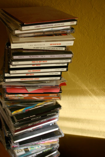
‘The function of music is to release us from the tyranny of conscious thought.’ -Sir Thomas Beecham
My current taste in music comes from too much exposure to MySpace. Music keeps me designing. Keeps me focused. Keeps me in The Zone.
My music picks bounce around a lot. They’re personal. The one constant: I won’t sync with a new band until I’ve been to their MySpace page and test driven.
Unfortunately, I keep seeing remarks/writings/commentary that MySpace is in its 15th minute. Which is such the 21st Century Thing To Do, isn’t it?
trending: it’s over?
It’s The American Way to build something up and then tear it down. Move along, there’s nothing to see here. Well, I’m still on MySpace. Not as often as Twitter, but there’s something fun about MySpace – where for me it hasn’t lost its goofy charm. And I’d say overseas, it’s still going – I’ve heard from several European friends that MySpace seems to work better outside the US. Easier load times; which is good, because on my end – it’s like days for my own page to snap into place.
Last year someone told me that Facebook was The Thing to be on – that an ‘undesirable element’ hangs out on MySpace. Which that comment alone caused me to dig in my heels a bit. I like ‘undesirable elements.’ They’re fun.
I take it as the scene from Titanic – Facebook is the stuffy upper decks, MySpace is the gang in steerage. Things are far more interesting in steerage.
I understand how easy Facebook is to maintain (the simplicity does work) – and I’m able to keep track of friends who don’t frequent MySpace. But sending people pictures of food doesn’t do it for me. I like real food. The staid blue and white and other shade of blue interface also doesn’t do it – it’s missing something. Something personal.
myspace design: yeah
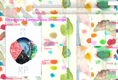
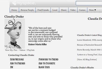
I love that MySpace is sooo screwy when it comes to design. It’s either almost easy to read or a complete mess. Some have hacked the template, some can work with it – some even push the limits of how a page loads and what it looks like.
Some great, real naïve design occurs on MySpace that really works. It’s often stuff that’s either pure genius or pure insanity. Pretty democratic in what I find and read. And that’s okay. If I can’t read it, I move along to the next.
And in the design, I’m pretty damn close to syncing with the personalities of the people involved. They build their own pages – likes, dislikes take on meaning beyond simple text. Anger, sadness, happiness, joy – sarcasm, sick fucking profanity – it still all works for me. People swear in real life, we’re prudes to think otherwise. Having a delete button as a barrier between what could become sick rather fast, not a bad idea.
I find it disturbing that we’re moving away into the pre-made templates of Facebook and Twitter. It’s like we were raised on the closed systemness of Windows and going outside of that is soo . . . horrible to ponder.
I often discuss with my students the human need to put things in frames. To organize. That’s Facebook to me. It feels like . . . a fucking Excel document.
myspace art: finds
I have many artists as MySpace friends – some tinkerers, some muses, stalkers, some professional, some just brilliant, and others, they try. Beyond gallery representation. Photographers, sculptors, typographers, graphic designers, fashion designers, industrial designers. Some of the art pushes limits in unexpected directions – last year I even managed to cull together a large new media exhibition showcasing many experimental artists who have pages on MySpace.
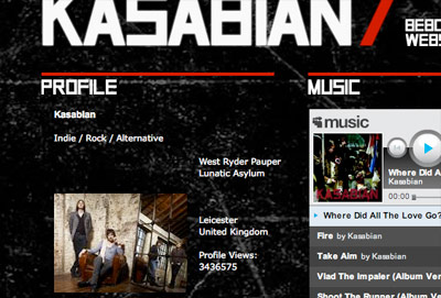
myspace bands: cool
And as mentioned, I’ve also found some incredible bands on MySpace – and some not so incredible. Some just plain honest. Some who’ll never make it but are trying real hard. Some that sync with their local culture, some who will suddenly be the Next Big Thing (right after they make the sex tape – for many, their pics pages show that they are at least working on it/thinking in the right direction).
myspace: so is it really over?
MySpace keeps making decisions that do threaten what they’re up to. It started with . . . News Corp taking over and treating it like a business. The ad driven music player: kind of a pain in the ass.
Same thing with MySpace’s inability to play well with other web networks, but this seems to be changing. They kept blocking tinyURL in any post I’d make (I use them a lot to streamline/rename links; it’s easier than creating mehallo.com redirects).
Last I checked, I’d get a ‘terms of service violation’ if I even try to mention reCAPTCHA. They were slow in syncing with Twitter for updates – and that, I’d say, hurt a lot (It was remedied first by Tweetdeck then as of last week, they added a Twitter option called Synced).
But I’m staying put for now. It’s the people that make it work. And there’s many more to meet. Or run screaming away from. As necessary.












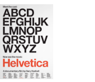






so this guy made this comparison between arial and helvetica.
i am teaching adobe products at my old highschool currently. and it’s funny this should come up because i just told them that arial is basically helvetica done up for the PC.
http://10.media.tumblr.com/tumblr_kpyttiNcn11qzrip0o1_500.png
Interesting. For me though it is a time and space issue. Facebook and Twitter seem more immediate and closer than Myspace does. Moving away from MySpace has been a natural drift for me .
Garmin 1490t GPS…
[…]while the sites we link to below are completely unrelated to ours, we think they are worth a read, so have a look[…]…
Garmin 1490t GPS System…
[…]the time to read or visit the content or sites we have linked to below the[…]…
1.) Extra Reading…
2.) […]this site is off topic but I recommend taking a quick look at it[…]…