And a few more . . .
Okay, I lied.
There were more than the last 45. I’m including 15 additional blog highlights below.
Also, I’m posting these just so you have something to read while we organize the comments from the contest and figure out the winners. The contest just ended – AND majorly huge, HUGE thank you for all the notes! I was expecting just ‘here’s my comment’ but got so much more. It really means a lot. I’ll do my best in the coming weeks to keep things flowing as – sporadically as I can.

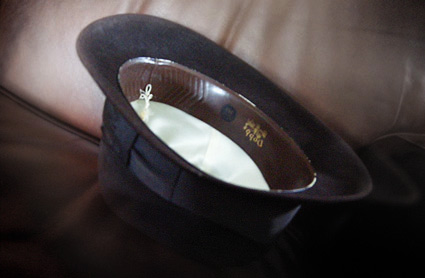
We have a hat.
It was my dad’s, a Dobbs/Roos Atkins original from the 1950s. We’re putting everyone’s name on slips of paper, throwing them in the hat and my wife (who the fonts were named after) will draw the winners.
So give us a bit to do all this, we’ll post the results in a short while.
Here’s more highlights from 2009 . . .
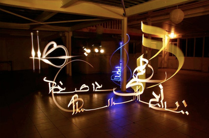
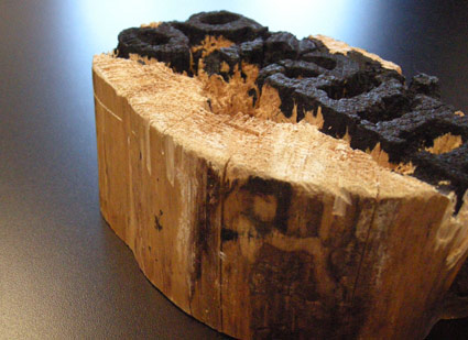
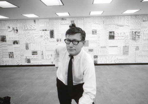
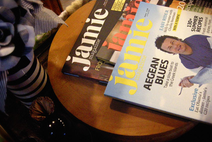
[46] djg design
[47] asbestos press
[48] pioneers of modern typography
[51] stefan hattenbach: fine swedish type
[52] yakov g. chernikov
[53] too many type issues, so little time
[54] us interstate, london underground map
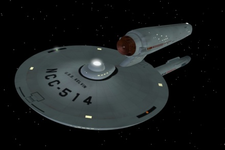
[55] star trek production design of the 1960s
[56] this is cbs
[57] the cynic
[58] taking a break, simulated veterans day
[59] wolf
[60] dreams
