Today is my 14th Wedding Anniversary
Polka, by Rodolfo Collado Hernandez, Vancouver Film School
Polka, by Rodolfo Collado Hernandez, Vancouver Film School

Exhibition poster by Herbert Bayer, 1926
‘done in that fabu Bauhaus style we keep hearing so much about’ -Modernist House description at Curbed LA, 2007
Here’s an article about bauhaus style being more than just bauhaus style. Written by Erik Spiekermann, read here.
Image found via DesignersTalk
While I’m in the mood, might as well post Daniel Kleinman’s titles for Casino Royale (2006). Video above, article here.


‘What about the children?’
Many worry about the content of children’s programming. Did anybody ever consider that the content may not have ever been as dangerous as the logos?
Video (above) of creepy tee vee logos that frightened us as children. End of shows, beginning of shows. Both versions of the Children’s Television Workshop (CTW) was nightmare-inducing. On merit alone, Viacom should get an award or something.
Here’s a few more . . . RKO Television 9 has to be the most chilling:

We have two dogs. We rescued them from situations that weren’t so good. Kira is the light brown one, Biene is the poodle.
This week they’re not getting along. Biene has been pooping in Kira’s bed. And the emotional response from Kira – she’s really upset about it – is overwhelming.
They’re both quite crazy.


Marker for the International Dateline from a front yard on Taveuni; via Flickr
My dad was a navigator during World War II. He knew a lot about celestial navigation, time zones and the International Dateline.
I once asked him if one traveled fast enough and could cross the International Dateline backwards – repeatedly – would they have to subtract a day each time . . .
And as a result, would one end up traveling back in time?
He said,
Yes.
‘Bones McCoy was not a morning person.’
How much for just the planet? was one of the silliest books I’ve ever read. Author John M. Ford (1957-2006) did a lot with this Star Trek thing. And that’s actually him as part of the cover art (above).
Not for purists though, which is why I enjoyed reading it. It was released in 1987. Details (and spoilers) here. Snag a cheap used copy here.
I read somewhere that this novel sent Gene Roddenberry into a tizzy. Don’t know if it were true, but this book has some nasty religion stuff, nymphomaniac Ensign Sara George, lots of sex and the crew in a nakkid crucifiction in the rain something or other. I remember reading this as a kid and thinking about the rather frank, adult content, This is NOT going to be made into a movie is it? Also thought: This Star Trek thing is pretty damn interesting (teenage hormones speaking, of course).
‘Ensign George was pure, unadulterated, wanton sex.’
Yeah.
This was one of the first original Trek novels, released in 1976. I loved the stark whiteness of the original glossy Helvetica-set cover (now faded); paired with wonderful artwork by Gene Szafran. Unfortunately, future printings ended up with more literal interpretations up front.
Here’s a blow by blow review. Snag a copy here (is this thing even still in print?)
When Star Trek first became a global sensation, Toru Kanamori landed a gig illustrating Japanese translations of the original series stories. Wouldn’t it be great to reprint a bunch of these in an art book with text from the Blish novels?
You know, I’d love to design something like that. Somebody call me.
For more about the work of Toru Kanamori, jump here.

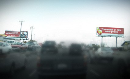
Competing Helvetica billboards, a visual from my morning commute
I’m not much of a purist. Well, that’s a lie. When it comes to type I am. Well, not always. I argue with myself a lot about it. It either works or it doesn’t. My litmus test: ‘Does it communicate?’ And if the goal for the local business is not to be read, then often, it works.
An article in this Sunday’s New York Times is all about this. Once one starts to see type, it’s all over. Read here.
Thanks to Susan and Jonathan for forwarding