entries Tagged as [typography]
Old Penney, new logo
JCPenney last ‘officially’ updated their logotype in 1971 – changing from a custom script (seen above) to Helvetica, set clean and neat (below).

1971
And last night – in a series of Academy Awards spots – jcp unveiled its new moniker (at bottom). Red box (retained from originally, their ‘it’s all inside’ campaign), lowercase helvetica, still clean and neat.
‘The winning design was provided by Luke Langhus, a third-year graphic design student at the University of Cincinnati.’
I do like when a redesign keeps the flavor of the original – here’s the official press release. Although this update does beg a few questions:
Doesn’t this look a lot like what GAP abandoned last year? And is the connection to Target’s brand a bit too obvious? And is ‘crowd sourcing’ how they went about this?
‘Participants included the Company’s associates, several design agencies and two art schools – University of Cincinnati and Rhode Island School of Design – that collectively submitted over 200 designs for consideration.’
I hope on the labor front, logo development participants were not as crowdsourced as is becoming commonplace. And it is a risky move to go this route – some could say jcp is running with what GAP chose to reject.
Though in the end, good merch behind the logo will determine what happens next. ‘What’s inside’ is still more important than not.
1964 Penneys architectural drawing found via Vintage Seattle, click image to view larger, more/jump
Wiggly
‘Nick’s Fonts is a modest little foundry dedicated to the preservation of our rich typographic heritage’
Nick Curtis’ Quigley Wiggly free font. Just because.
Found via Sean Ireton
St Marie and St Ryde
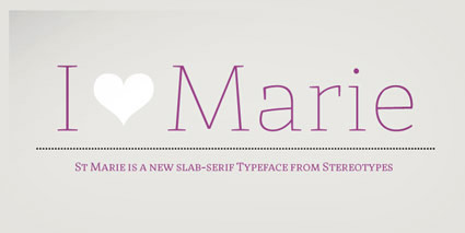
Two type families from Sascha Timplan: St Marie and St Ryde.
Each family has one weight that retails for $0. Click the images to view/jump/download.
Miso
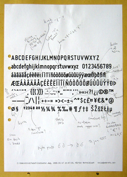
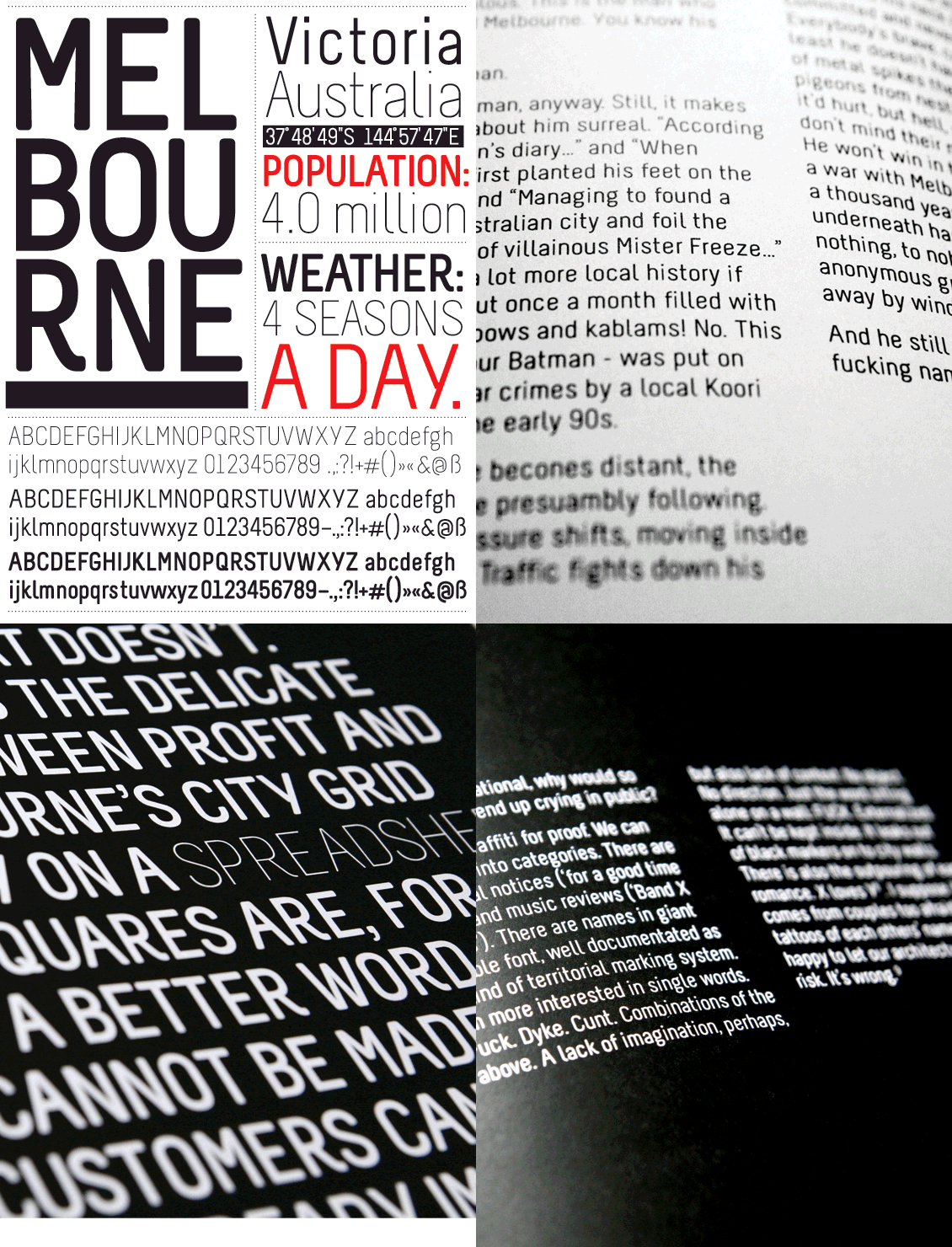
Mårten Nettelbladt’s geometric Miso fonts. Free download here.
Production notes available at Typophile.
Also from Typophile: (below) photos of Miso in use at Milan Design Week 2009.
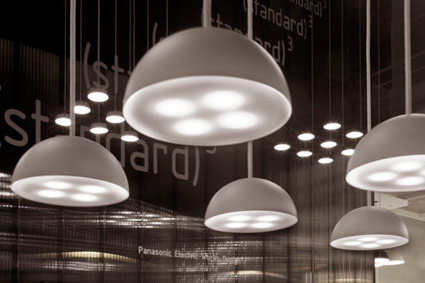
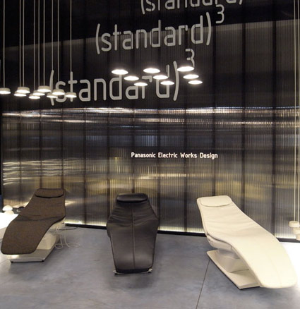
Found via Lori Yung
Lato, free open source fonts
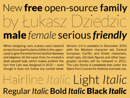
‘Lato is a sanserif typeface family designed by Warsaw-based designer Łukasz Dziedzic. Lato consists of five weights (plus corresponding italics), including a beautiful hairline style.’
Details at Typophile. Download the Lato fonts via Google.
Yanone Kaffeesatz
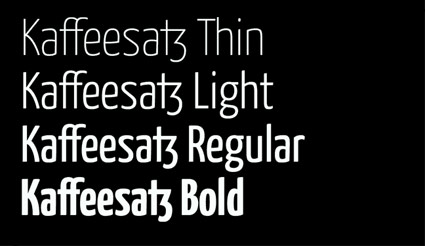
‘Its Bold is reminiscent of 1920s coffee house typography, while the rather thin fonts bridge the gap to present times’
Yanone Kaffeesatz are the first typefaces designed by Yanone. They feel like a contemporary interpretation of the work of the great Ozwald Cooper (1879–1940).
Snag the 2004 free version here.
The pro version – released in 2009 under the name ‘Kava’ – is available thru FontFont.
Birra Stout
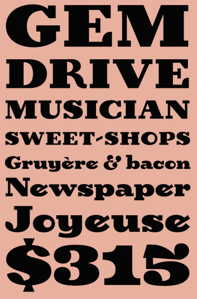
‘Birra arose from years of compulsive doodling in pen and ink, and conjures the whimsy and syncopated contrast of novelty handlettering in the early 20th century’
Birra is Joshua Darden’s reworking of Frederic W. Goudy’s least favorite novelty font, Goudy Stout. Though Birra is actually totally different and completely not the same. Not unlike being not similar like. It’s odd, fun, playful and one can download it free.
Grab it here.
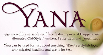
Yana, starting at $10
‘I told Yana that as soon as I figured out how to design type, that would be one of the designs I would create – and I would name it after her. She laughed, and said, ‘Well, I’ll be the first person to buy it.”
Yana: A classical, decorative type family, designed by Laura Worthington. Available thru Ascender.
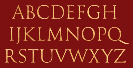
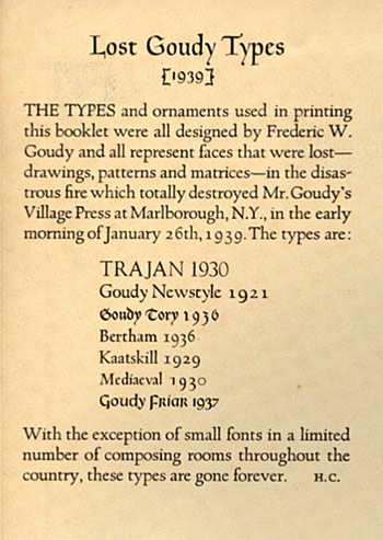
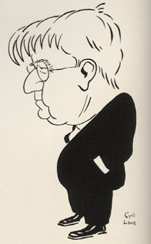
Goudy’s Trajan
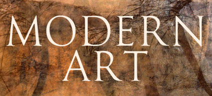
‘Not to be confused with Adobe’s Trajan typeface (which is very similar), this face is based on the drawings by Frederic W. Goudy of his rendition of the capital letters inscribed on the Trajan column in Rome.’
Expressive, classical.
Nick Castle’s digital version of Goudy’s Trajan, a reworking of one of Goudy’s lost fonts. Free trial version available, download here.
