entries Tagged as [typography]
Milk Bar
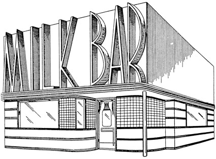
Store front design by Harry L. Wyman, 1939. US Patent Office drawing.
Found via Great Inventions, Good Intentions
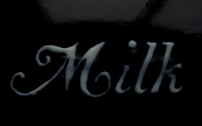
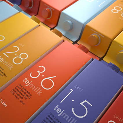
Reading milk
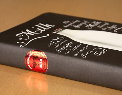
‘The Bodoni Classic Chancery set at different sizes and with as many swashes as I could create. The only color is the red foil cap in the picture. I loved that . . . so I made a foil milk cap for the spine.’
Pictured, Barbara deWilde’s design for Anne Mendelson’s Milk: The Surprising Story of Milk through the Ages.
Design details here. NPR interview with Mendelson here.
Moderne Benz
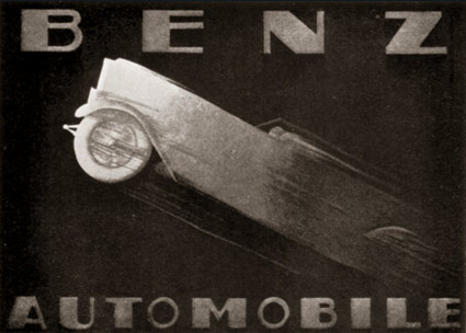
Advertisement for Benz Automobiles by Adalbert Roth, 1928.
Found via Advertising Art in the Art Deco Style
Luminance
‘Originally made by the Czech type designer Carl Pracht in 1941–43. Having a rather calligraphic style both in regular and italic, MRF preferred it to be more straightforward and modern-looking.’
Another incredible type package by Stefan Hattenbach. Snag it here.
‘avarice’
‘Sugary motion graphic piece inspired by a poem from Irish author Tony Curtis.’
Video by Fan Sissoko of the Dublin-based firm Stef&Fan. Check out the other cool stuff at their site.
Music: Birdy Nam Nam’s 2009 track, From Here to There.
Moonshine design
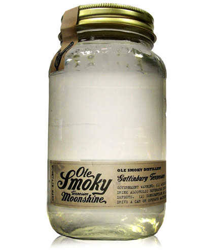
‘Moonshine now finds its first taste of legality with a recent state law in Tennessee allowing the distillation of spirits’
Of course, the ‘first legal moonshine in Tennessee’ needs some good branding.
Ole Smoky’s script logo was designed by letterpress specialist YeeHaw – with Ole Smoky Distillery owners Jessi and Joe Baker, Cory Cottingim and Tony Breeden developing the look of the mason jar bottle, label and seal.
The team at Robin Easter Design pulls it all together with a kick ass website.
More details here. Order here.
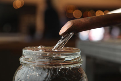
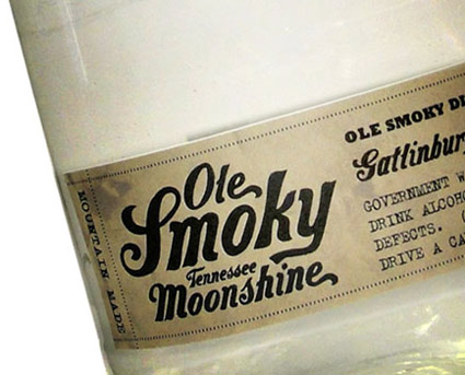
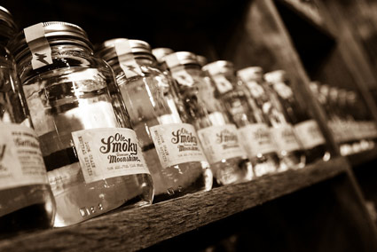
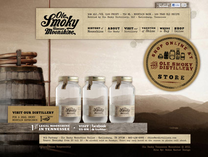
Info provided via Whitney Hayden at Robin Easter Design; images found via The Dieline, IVI Blog and Thirstysouth
Good Ol Font
Hobo, of course, was the font of choice for Them Duke Boys (1979-85). Theme sung by Waylon Jennings.

handpicked posts

a piano falls in old manhattan
tetro and typography
it’s typography: film, song and dance
ghosts of gustov klimt
the great times new roman controversy
picking fonts
kapitaal
defining terms: design is not decoration
garcia's 'pure design'
'enhance that image!'
magic highway remixed
the cynic
rad anthem
Brought to you by man dom-


buy my fonts
go shopping
mehalloreads

Divinely Elegant: The World of Ernst Dryden
Jozsef Pecsi: Photo and Advertising
Color: A Natural History of the Palette
Collage: Assembling Contemporary Art
Modern Dog: 20 Years of Poster Art
Gaberbocchus Press: An Experiment in Publishing, 1948-1979
Advertising Art in the Art Deco Style
Googie Redux: Ultramodern Roadside Architecture
Hot Sour Salty Sweet: A Culinary Journey Through Southeast Asia
now playing


the work at the mehallo blog. beta. is licensed under a creative commons attribution - noncommercial - no derivative works 3.0 united states license. if reposting, credit must be given to steve mehallo - and if possible, please provide a link back to the mehallo blog. beta.
i include images for the purpose of critique, review, promotion and inspiration - and always make my best effort give credit/link back to the original source. if i’ve screwed up, please fire me a note.
page layout based on the wordpress 'darkwater theme' by antbag, adapted and redesigned by mehallo. valuable php assistance from bill mead.


