Sweet Sans, starting at $1
‘The standard Thin and Thin Small Caps fonts are priced at just $1. Give them a try.’
An update of Engravers Gothic by Mark van Bronkhorst. Info here.
‘The standard Thin and Thin Small Caps fonts are priced at just $1. Give them a try.’
An update of Engravers Gothic by Mark van Bronkhorst. Info here.
Just my mindset this morning.
Set in Alte Hass Grotesk, a free font based on the ‘cold type’ version of Helvetica. Download here.
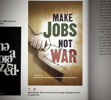
Former student takes design class. Former student notices my work in his textbook. Sends me an email. Photo, above.
Mike Dunkl spotted my 2003 ‘Make Jobs Not War’ poster in his copy of Design Basics: 8th Edition – with some academic text explaining how my visual works (below). Aside from the pencil illustration, I lifted the gothic type directly from a 1912 American Type Founders specimen book. (The green color means ‘money,’ btw) (And there are two ls in ‘mehallo’)

In 2003, jobs were drying up and we were about to go to war on some really flimsy evidence. I felt I had to say something, so I did. My poster – among others – became available for free download at Another Poster For Peace.
At the time, anti-war statements were not the popular thing. Though for me, it was the right thing to do. When the war started, I was following a young Iraqi’s ‘live from Baghdad’ blog up until he stopped posting. Never knew what happened to him – another innocent lost to history.
I still stand behind my poster. Evidence of why we ended up in Iraq in the first place has turned out to be far more flimsy than imagined . . . and today, we’re still at war. And the jobs have simply gone away.
This week I gave my design history talk on American Type Founders’ Gothics – a large collection of (mostly 19th century) sans serifs typefaces.
ATF was formed in 1892 by a merger of 23 American type companies – resulting in, literally, a huge pile of metal that had to be sorted, catalogued, duplicates removed and if necessary, redesigned. Morris Fuller Benton (1872-1948) ended up doing a lot of the dirty work – among the results were ATF’s very industrial Gothic series of typefaces.
These types exist today in many digital forms – some with their original ATF names, such as Franklin Gothic and News Gothic – or as revivals, which includes Benton Sans and Jonathan Hoefler’s comprehensive Knockout series.
Amidst recent revivals is Caroline Hadilaksono and Micah Rich’s League Gothic (above) – an interpretation of ATF’s Alternate Gothic No. 1 (below).
Snag your own free version here.
And hell, if you see any problems, fix em. The font is open source.
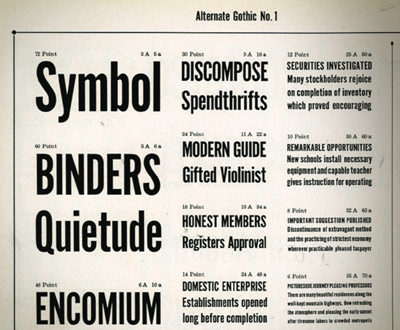
Alternate Gothic No. 1 specimen (cropped), ATF’s Book of American Types, 1934
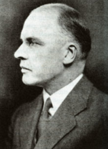
M.F. Benton, read more on Benton here
‘The name says it all: FontFont’s Basic Gothic is a neutral American grotesque for all purposes, something between Gill Sans and Verdana.’
More from Hannes von Döhren: The Basic Gothic types were a joint project with Livius Dietzel. Basic Gothic uses ideas from the 19th Century – resulting in some really nice workhorse fonts for today.
Grab the Regular weight free here. Another limited time offer.
‘An extended family of 36 fonts inspired by Swiss type design.’
Released just this year, Supria Sans is an incredible new type family designed by Hannes von Döhren.
And you can snag the Regular weight (+ Italic) free here. Offer ends Monday, February 28, 2011.
‘it is a passion and a drug’
Swedish type designer Stefan Hattenbach makes incredible letterforms. And his body of typographic work has run the range from experimental to traditional and experimental traditional. They’re always a pleasure to set on a page.
This month, Stefan’s one of MyFonts’ Creative Characters.
Read the interview here.
Check out Stefan’s website here.
‘Another inspiration was the film MAX (2002), written and directed by one of Emigre magazine’s founders, Menno Meyjes . . . I decided Jeanne would be a fictional typeface that was released in 1918, the timeframe from the movie.’
Ascender is running a little sale on some of my fonts. 25% off until March 5, 2011. Offer only available thru Ascender’s website. For details, go here.
(and watch the trailer for MAX here)
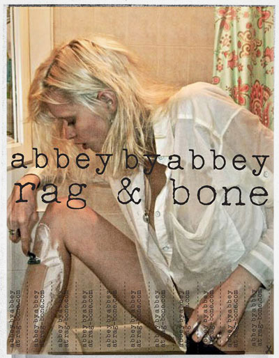
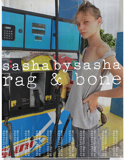
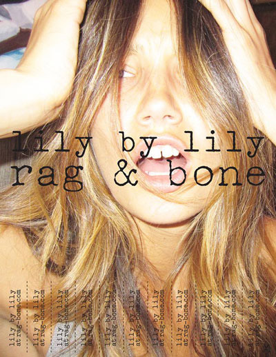
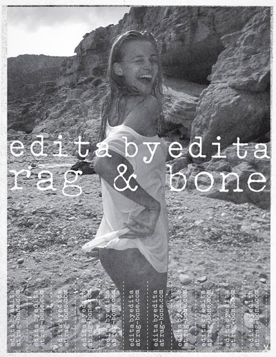
‘Rag & Bone enlists an astonishing top models cast for their SS11 campaign shoot – photographed by models themselves and their friends’
Many years ago, I worked on an ad campaign that took this candid approach. Only without the supermodels. And ultimately, without approval. Our series, targeted to IT professionals, would have been the first printed appearance of Psy/Ops’ Default Gothic – we were doing our mockups using beta versions of the fonts.
Pictured: Abbey Lee Kershaw, Sasha Pivovarova, Lily Aldridge and Edita Vilkeviciute
Found via Design Scene