Penney’s logo history
It all boils down to . . . Helvetica.
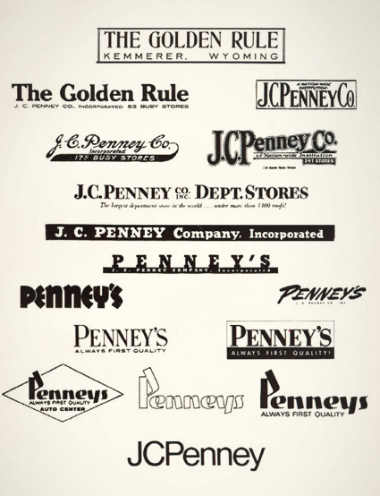
JCPenney started as The Golden Rule store – or so said the literature I read as a kid. Wiki says something else.
My mom worked for JCPenney for 22 years and they had a big anniversary in the 1970s. They had wooden rulers with ‘golden rule’ written on them as part of a anniversary suite of premiums. I remember lots of simple yellow (‘golden’) and black stuff, sort of a 70s take on Victorian style.
And I was fascinated with a logotype history chart that was part of a company history booklet. Above is an old photocopy.
Over the years, the company simply became known as Penney’s – logo treatments reflecting retail trends.
The possessive was dropped and the ‘JC’ was officially re-added in 1971 – the year its founder, James Cash Penney passed away.


[…] Penney’s logo history […]
[…] JCPenney isn’t what it used to be and how Macy’s – which once competed with Nordstrom – is dropping […]
[…] last ‘officially’ updated their logotype in 1971 – changing from a custom script (seen above) to Helvetica, set clean and neat […]
I was just directed here from a comment on The Consumerist. Although this is a nice illustration, it is lost on your (frankly) atrocious blog design. Too bad.