New Gap logo: One more for the pile
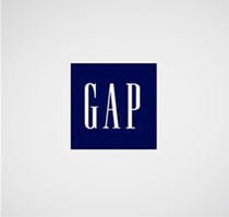
Before and after
Another company’s gone and done it.
Desperate times call for . . . logo changes. If a company’s not doing well, they have to do something. Forget the pressure of product marketing, pricing, supply and demand – all too tough to deal with. Instead: Let’s change the logo.
K-Mart has done it a few times.
Not quite getting to the root of things. But changing a logo to solve a major problem is like saying, I have cancer, so – I’m going to go get my hair done.
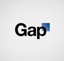
When exactly did this become the rule of the day? Is a logo change what it takes to shore up a failing brand? Gap seems to think so and if that’s how they’re managing things right now, they probably should fail.
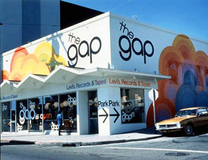
 Previous Gap website
what designers really do
There’s a difference between a graphic designer and an art director. Graphic designers design things. Like logos.
Art Directors are supposed to look at the big picture. So when a major retailer says ‘We need a new logo,’ a good art director is supposed to ask, ‘Why?’ instead of launching Adobe Illustrator and drawing blue boxes.
That said, a good art director should also know that changing an established identity – or logo – is a risky undertaking. It can be tackled for many reasons, customer dissonance, legibility problems, something fell on someone and a name change is in order. Or it’s just ego.
Ego is when designers get excited about a project and change something that works into something else.
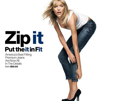
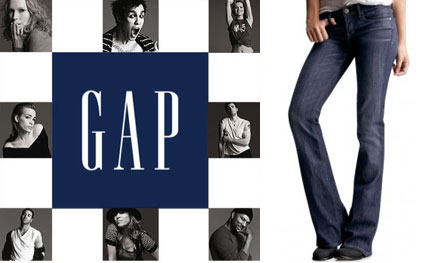
That was my first reaction to Gap’s new moniker offering (supposedly crafted by their ad agency): Let’s make our own version, it’ll match the 1969 jeans campaign we’ve been doing (below). But I think there’s more going on than that.
economic acts of desperation
In two of my classes this past week I asked a simple question: ‘Who shops at the Gap?’
No hands went up.
I then asked, ‘Who shops at Old Navy?’
Bigger response for Gap Inc.’s low end store.
Retail is on the decline and is tied to the economy. So there’s some really odd things happening out there. Example: Restoration Hardware, once a fun place, ain’t so fun anymore.
As a culture, we’re shifting from a ‘buy what we don’t need’ model into a ‘what’s really necessary’ ideology. Many are living paycheck to paycheck. Foreclosures aren’t going away. And major retail stores are in trouble. Something has to happen.
Something . . . that gets consumers back into failing stores. That’s the problem that has to be solved.
A few years back – I was going thru some 1930s retail advertising and saw similar things. The Great Depression did affect desperate decisions on behalf of retail. And was a huge jump from how things were marketed in the 1920s. I think what Gap’s doing is just more of this.
I hope it’s more than this. Some of my students have been commenting on Facebook: ‘I have a feeling the new Gap logo is a marketing ploy. So many people are up in arms about it, and all publicity is good publicity.’
Is this a carefully planned marketing campaign based on customer backlash? Really? Or just another last ditch effort to shore up a dying brand?
online reaction, not so good
Today, instant critiques have become common.
Tropicana Orange Juice was one of the biggies – their audience was so angry, Tropicana pulled the new design and went back to basics.
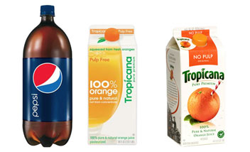
Don’t even get me started on Tropicana owners, Pepsi and their 2008 overhaul. Though I will note: They’ve been slowly updating their sodas, adding elements from their previous branding to what they’re now stuck with. Interesting to watch.
If anything, consumers don’t want major change right now. Not in their orange juice, soda or retail stores. Hell, just change Facebook a bit and revolts happen.
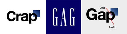
The response to Gap was quick. Read here. And here. And here. And here. And here. Oh, and make your own here and here. And ISO50 is even running a redesign of the redesign contest. In short, Gap has a new logo – with a blue box that suggests faded blue denim – but it looks like a design intern took over and ran with it. Student quality work for a major brand.
Anyone remember when an identity, a logotype meant something? There was a time when making a logo was something really special. And now, throwing together crap is the norm.
Maybe the 19 buck logo model is actually doing its job. It’s where we’re headed.
Good logos need staying power.
Look at Apple today vs. Apple 20 years ago. IBM today vs. 20 years ago. CBS, CocaCola . . . And Bank of America. That one bugs me.
BofA had a cool mark with an American eagle flying thru it – replaced with a generic flag on a red background. I’ve said it before: Red isn’t a great color when it comes to money and banking. WTF are they doing??

weird trend following, off by a few years
I also don’t get Gap’s timing. The Helvetica revival that they’re latching on to (sort of tied to the release of the film) is kind of played out in the fashion industry (note American Apparel, above).
To see Gap go in this direction is a rather late response. Desperate. Or boring.
Another way to look at it: cheap. It says cheap to me. It says H&R Block from 10 years ago.
First Gap, 1969
optimistic thoughts
I am hoping there’s more to this than meets the eye. Gap has always been a fun brand – with even funner campaigns that can suck one in. There’s gotta be an unsuspecting something up their sleeve that will have me humming ‘Fall into the Gap’ over and over again.
They have a plan. Can’t be this dumb, right?
And an update (thanks to Tim Kim): Gap to scrap new logo, return to old design
GAP website image found via Rob Young; Gap 1969 via redesign:related; and thanks to Jeanne Mehallo for help with this post


the mehallo blog. beta. » New Gap logo: One more for the pile…
I found your entry interesting do I’ve added a Trackback to it on my weblog :)…
[…] This post was mentioned on Twitter by steve mehallo, steve mehallo. steve mehallo said: newblogpost: New Gap logo: One more for the pile – http://mehallo.com/blog/archives/21493 […]
i got this in my email today, another for your list of who’s running redesigns? :]
http://99designs.com/logo-design/contests/design-better-gap-logo-community-project-54693
[…] When talking about the very top I reference the brilliant sweater scene from Devil Wears Prada (2006), below. It IS how design works. Someone creates something incredible and it works its way down to the everyday consumer. This happens in all industries – sometimes the inspiration leads to great things, other times, not so much. […]
[…] this look a lot like what GAP abandoned last year? And is the connection to Target’s brand a bit too obvious? And is ‘crowd […]
1.) Extra Reading…
2.) […]this site is off topic but I recommend taking a quick look at it[…]…
Garmin 1490t…
[…]below you’ll find the link to some sites that we think you should visit[…]…