Yanone Kaffeesatz
Posted on February 27th, 2011 by steve
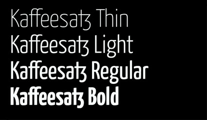
‘Its Bold is reminiscent of 1920s coffee house typography, while the rather thin fonts bridge the gap to present times’
Yanone Kaffeesatz are the first typefaces designed by Yanone. They feel like a contemporary interpretation of the work of the great Ozwald Cooper (1879–1940).
Snag the 2004 free version here.
The pro version – released in 2009 under the name ‘Kava’ – is available thru FontFont.


Garmin 1490t…
[…]below you’ll find the link to some sites that we think you should visit[…]…
1.) What do you think…
2.) […]it would be cool if you took a look at this site. It has some good information on it[……]…
1.) Good Post…
2.) […]Will all the junk out there I like to link back to the good sites and this is one![…]…
nice post…
Pretty nice post. I just stumbled upon your weblog and wished to say that I’ve truly enjoyed browsing your blog posts. In any case I will be subscribing to your rss feed and I hope you write again very soon!…
Travel Deals…
[…]all of these online websites may well not be completely relevant to our site but we absolutely believe you should certainly visit them[…]…