Frederic W. Goudy: new site launches, new releases
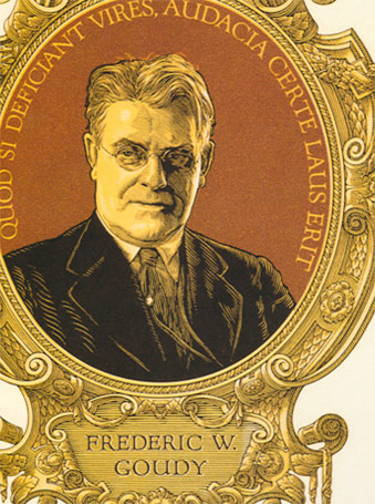
F.W.G. portrait by Clarence P. Hornung
from Leslie Cabarga’s Logo, Font & Lettering Bible
Frederic W. Goudy (1865–1947) was considered one of the most prolific type designers of the early 20th Century. Not to be confused with Antonio Gaudi, F.W.G. is mostly known for Copperplate and Goudy Oldstyle that show up on most font menus. But that’s just the beginning.
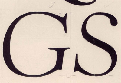
Goudy’s ‘quick sketch’ drawings for Kennerley Italic
from D.J.R. Bruckner’s Frederic Goudy
Goudy was self taught. And his font career really didn’t take off until he was in his 40s. Legend goes, Goudy could draw a font in about a week. Since it was in metal, it’d take a lot longer in production. But his quick sketch method brought a ton of personality to his work. His types ooze personality.
My rule of thumb: when using fonts by Goudy, let them do their job. Don’t crowd them, allow their personality to come thru and you’ll end up with a beautiful composition.
Unfortunately, exceptional digital versions are hard to find. It’s a difficult task to adapt Goudy’s handwork to the digital environment and actually make it work.
Steve Matteson’s digital revival of Truesdell (1930) was one of the first font packages I’d purchased. And I recently used it in a poetic fashion on my Master of Typography mug.
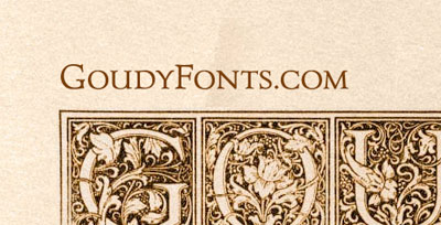
Steve is over at Ascender these days and they’ve recently launched the GoudyFonts site; and make no mistake, this is a Fan Site. All involved have been and are Goudy fanatics. They also just happen to know how to turn all that dorky energy into beautiful fonts. With this bunch, the roots of studying F.W.G. go back to their college days. The site will be about All Things Goudy.
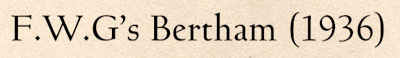
And most recently, Steve’s released Bertham Pro, a beautiful digital rendering of F.W.G’s 100th font.
So another rule of thumb: If Ascender is releasing a Goudy revival, it’s going to be beautiful. They know their shit in F.W.G.land.
It’s great to see Goudy’s been making a comeback (in more places than one). I have a few items that were printed by F.W.G. and when set well, his types have a beauty beyond mere pixels. And I’ll have more on Goudy in my fall graphic design history course at American River College.
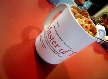
Mehallo’s Master of Typography Mug, set in F.W.G.’s Truesdell


Steve,
Little did I know, when I used to roll my eyes during your dorky, fact-laden ramblings in our Intro to Type class how much I would come to appreciate your typographic hypersensitivity. Your love of the craft is infectious. Thanks for the post and keep em coming!
xoxoxokc
[…] with Adobe’s Trajan typeface (which is very similar), this face is based on the drawings by Frederic W. Goudy of his rendition of the capital letters inscribed on the Trajan column in […]
[…] is Joshua Darden’s reworking of Frederic W. Goudy’s least favorite novelty font, Goudy Stout. Though Birra is actually totally different and completely […]
Garmin 1490t GPS…
[…]while the sites we link to below are completely unrelated to ours, we think they are worth a read, so have a look[…]…
1.) What do you think…
2.) […]it would be cool if you took a look at this site. It has some good information on it[……]…