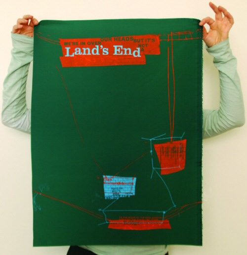
‘Wars not make one great’
Posted on March 26th, 2010 by steve
‘Mac McGrew’s 1993 2nd, revised edition is an important book for any printer, collector, student or aficionado of letterpress type. Equally valuable as a typeface reference and an insightful history of the typemaking industry in America.’ –Letterpress Type
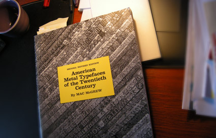
THE book on metal typefaces cast in America (hint: not all of them have been digitized) is Mac McGrew’s American Metal Typefaces of the Twentieth Century.
Long out of print, this 398 page resource is available once again. Snag your copy here.
Pictured: my dog eared, Post-It note filled edition.
Found via Steve Matteson
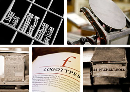
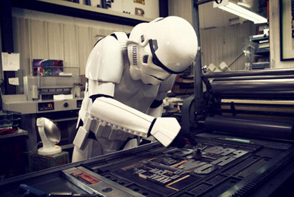
One of the coolest printing history finds in the Los Angeles area is The International Printing Museum in Carson.
Tucked away in an industrial section and run by the incredible Mark Barbour, the museum hosts an amazing collection of rare equipment, The Book Arts Institute (Hi Rachelle!), The Wayzgoose Gazette, a gallery, library and more.
And now they have a new RSS-friendly blog-based website – sporting a new logotype (above) created by Gina Pirtle Simpson.
Click on any image to visit the museum’s website/jump.
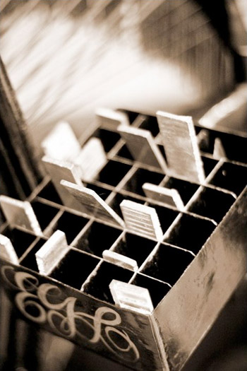
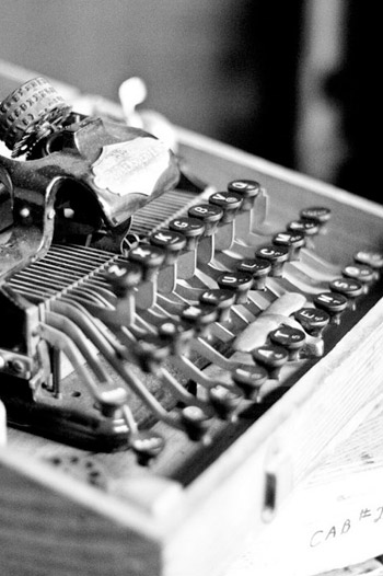
Museum photographs by April Rocha
‘The St Bride Library is the largest library for printing, publishing and the graphic arts in the English-speaking world.’
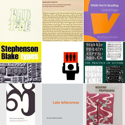
The St Bride Library now has a shop. Limited edition type/printing books, snag em here.
Jason Munn
Just had a discussion – and major test question – involving 19th Century wonder Clarendon in my history class. As a type, Clarendon has been popping up all over the place for a bunch of years now.
I use it (paired with Jenson) for handouts in my introductory type course at ARC, up until recently, it was the corporate font for Starbucks . . . it just boldly says, read me.
New article (and cool samples) posted by SOTA’s Tamye Riggs here.
Jessica Fleischmann
Madeleine Eiche
Simon Dovar and Nils Davey
‘Is there a way to know what fonts will work together? Building a palette is an intuitive process, but expanding a typographic duet to three, four, or even five voices can be daunting.’ –H&FJ
‘how do I pick the right font?’
. . . is the most common question I’m asked in my type courses. And my answers aren’t usually simple. I liken it to picking the right suit, tie and shoes.
What handbag will work best, nail polish, lipstick, gloss or none, which eye liner will simply look great . . .
One learns by doing. [Read more →]
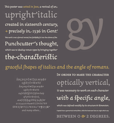
‘Joos is a revival of an upright italic created in 1536 in Gent. This work is not a formal revival but it faithfully fits into the scheme of Joos Lambrecht (punchcutter), which was to idealize roman types by bringing together the characteristic graceful shapes of italics and the angularity of romans.’
Not all Italics are slanted – they have their origins in calligraphy.
More about Laurent Bourcellier’s beautiful Joos fonts here.
Found via Colin M. Ford
The work of Mabona Origami for ASICS. Creative director: Lars Rühmann, Nordpol+ Hamburg.
Found via Gábor Kóthay
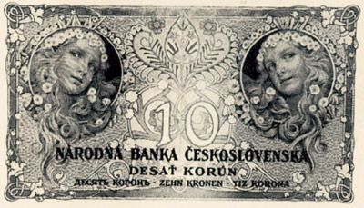
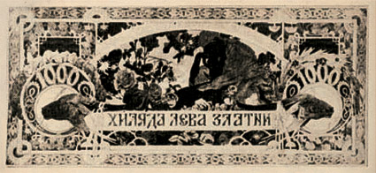
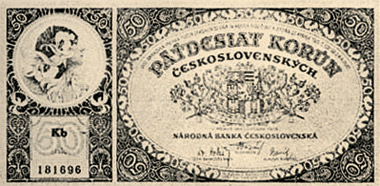
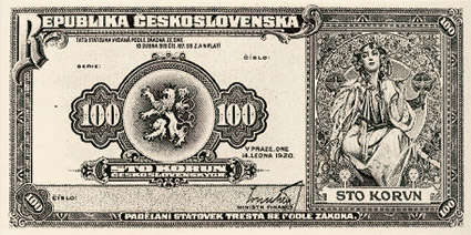
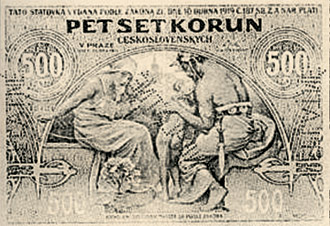
Money designed by Art Nouveau painter/illustrator Alphonse Mucha for the Republic of Czechoslovakia, circa 1919-29.
‘The video was fourteen months in production. Seven months in notes, research, photography, pre-production, art work and direction. It was then all sent to Philip James Cheaney with full trust and faith and he knocked it out of the park with seven more months of motion work and additional art and direction elements. It wouldn’t work without him. We’re working together under the title of Mur Mur Man Productions’ -DJG
Introducing: The first music video directed (and designed) by my friend, Danny J. Gibson. And animated by Philip James Cheaney.
Video for David Seume’s Will Ya Be My Friend, download the debut single here. From the album It Is What It Is.
Danny’s been working with David Seume since November 2008. Images of DJG’s production art can be found on Flickr. And pre-motion art can be found here.


the work at the mehallo blog. beta. is licensed under a creative commons attribution - noncommercial - no derivative works 3.0 united states license. if reposting, credit must be given to steve mehallo - and if possible, please provide a link back to the mehallo blog. beta.
i include images for the purpose of critique, review, promotion and inspiration - and always make my best effort give credit/link back to the original source. if i’ve screwed up, please fire me a note.
page layout based on the wordpress 'darkwater theme' by antbag, adapted and redesigned by mehallo. valuable php assistance from bill mead.