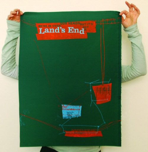
The Clarendon trend


Jason Munn

Just had a discussion – and major test question – involving 19th Century wonder Clarendon in my history class. As a type, Clarendon has been popping up all over the place for a bunch of years now.

I use it (paired with Jenson) for handouts in my introductory type course at ARC, up until recently, it was the corporate font for Starbucks  . . .  it just boldly says, read me.

New article (and cool samples) posted by SOTA’s Tamye Riggs here.
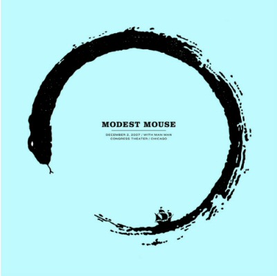

Jessica Fleischmann


Madeleine Eiche


Simon Dovar and Nils Davey

One Response to “The Clarendon trend”

  1. […] This post was mentioned on Twitter by steve mehallo. steve mehallo said: new blog post: The Clarendon trend – http://mehallo.com/blog/archives/14716 […]


Creative Commons License

the work at the mehallo blog. beta. is licensed under a creative commons attribution - noncommercial - no derivative works 3.0 united states license.  if reposting, credit must be given to steve mehallo - and if possible, please provide a link back to the mehallo blog. beta.

i include images for the purpose of critique, review, promotion and inspiration - and always make my best effort give credit/link back to the original source.  if i’ve screwed up, please fire me a note.

page layout based on the wordpress 'darkwater theme' by antbag, adapted and redesigned by mehallo.  valuable php assistance from bill mead.