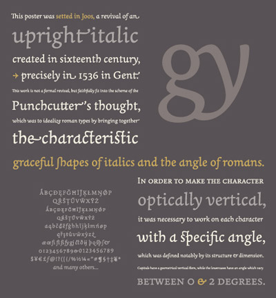
Joos Italic

‘Joos is a revival of an upright italic created in 1536 in Gent. This work is not a formal revival but it faithfully fits into the scheme of Joos Lambrecht (punchcutter), which was to idealize roman types by bringing together the characteristic graceful shapes of italics and the angularity of romans.’

Not all Italics are slanted – they have their origins in calligraphy.

More about Laurent Bourcellier’s beautiful Joos fonts here.

Found via Colin M. Ford
Comments are closed.


Creative Commons License

the work at the mehallo blog. beta. is licensed under a creative commons attribution - noncommercial - no derivative works 3.0 united states license.  if reposting, credit must be given to steve mehallo - and if possible, please provide a link back to the mehallo blog. beta.

i include images for the purpose of critique, review, promotion and inspiration - and always make my best effort give credit/link back to the original source.  if i’ve screwed up, please fire me a note.

page layout based on the wordpress 'darkwater theme' by antbag, adapted and redesigned by mehallo.  valuable php assistance from bill mead.