Dead Sea Scrolls and Gutenberg, locally

Opening April 8, 2010 at the Bayside Church in Granite Bay, CA is ‘From the Dead Sea Scrolls to the Bible in America,’ an exhibition featuring five pieces of the Dead Sea Scrolls.

Also on hand will be some rare Bibles including (reportedly) an original by Gutenberg.

More information here. SacBee article here.

Found via Susan Poirier

Blackletter in Mainz

I Love Typography takes a look at the holdings of the library of the Gutenberg Museum in Mainz. More than just Bibles.

Article here.

Few things about type design


Alice Savoie’s Capucine

Here’s a great article by Gerry Leonidas over at I Love Typography.

White space and E


The concept of ‘negative space’ (or ‘white space’) as an important part of type design is very difficult to teach. The student either sees it right away, it clicks over time or sometimes the concept is just weird enough to cause them to back away very slowly.

It’s a up is down, left is right sort of thing. Pen strokes are important, but so are the parts that aren’t made by the pen.

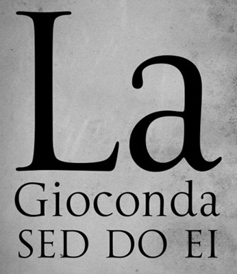
Just the right amount of negative space defines the character and readability. Claude Garamond (c. 1480-1561) was a master at this; it’s one of the reasons his types are still incredibly popular today.

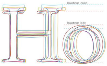
Here’s some cap E comparisons to chew on.

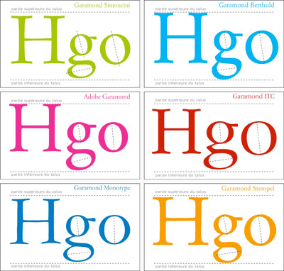
Plus, here’s a great breakdown of today’s Garamond interpretations (images below).

And, an interview with the master himself.

Cap Es found via Nina Stoessinger; Garamond comparisons by Barney Carroll

Jenson’s Italic


‘Arrighi was here’ button by George Abrams

Any current drawing of the type work of Nicholas Jenson (1420-80) that includes an Italic is doing a little fudging. Since (like Trajan and lowercase), Italic wasn’t quite around yet when Jenson was making type.

Typically the work of Ludovico Arrighi (1475–1527) is adapted as the companion font to Jenson – as the Italic.

Monotype did this with its Jenson-influenced Centaur – and Adobe Jenson sports an Arrighi-influenced italic. [Read more →]

Trajan with lowercase

Why doesn’t the Trajan font have lowercase?

Traditionally, Trajan is based on a carefully drawn and carved inscription at the base of Trajan’s Column in Rome – crafted sometime around 113 A.D.

And basically, lowercase didn’t exist yet. What we call lowercaseminuscules, our second alphabet – evolved over the next 1000 years (or so).

So what would Trajan look like if it actually did have a lowercase? This is open to interpretation.

Dave Farey and Richard Dawson’s La Gioconda is one take on this, adapting the 16th Century lettering of Giovanni Francesco Cresci as the companion letterforms.

Check it out here.

Reimagining the Roman Colosseum with type

‘Over the course of the next 12 months, the artwork was handcrafted character by character, totaling roughly 250 hours of work from start to finish. Characters from the Goudy Trajan and Bembo Pro typefaces form the Coliseum (or Colosseum)’

Cameron Moll’s limited edition Colosseo letterpress posters. Video above, more project details here.

‘Vulgar, 60-year-old emoticons’

‘Nick Martens digs into the pages of the great dictionary that chronicles the history and development of the English language, and unearths some typographic gems.’

Great article about obscure typographic references in the Oxford English Dictionary. Read it here.

Photo found via emdot

MoMA and the history of @

‘MoMA’s announced what might be its boldest acquisition ever. And it didn’t even cost anything: The ‘@’ symbol is now a part of the museum’s permanent design collection.’

Article here.

Pictured above, the @ symbol from Goudy’s Bertham font.

Retro modern stationery

‘SORT stands for Society of Revisionist Typographers and, as their name suggests, they use typography and printing techniques of the past but marry them up with a contemporary design aesthetic’

SORT’s Modern Living stationery set is available thru the Southbank Centre. Other sorts from SORT are available thru their Etsy store.

The official SORT website is here.

Found via Retro To Go

Making Metal Typefaces in the 21th Century

‘This project has a dual goal of documenting the almost-lost skill of creating metal fonts and of capturing the personality and work process specifically of practitioner the late Canadian graphic artist Jim Rimmer (1931–2010)’

Richard Kegler’s long-delayed documentary, Making Faces: Metal Type in the 21st Century, has just secured just enough funding for completion.

For more about the film, go here and here.


Rimmer and Kegler


Creative Commons License

the work at the mehallo blog. beta. is licensed under a creative commons attribution - noncommercial - no derivative works 3.0 united states license.  if reposting, credit must be given to steve mehallo - and if possible, please provide a link back to the mehallo blog. beta.

i include images for the purpose of critique, review, promotion and inspiration - and always make my best effort give credit/link back to the original source.  if i’ve screwed up, please fire me a note.

page layout based on the wordpress 'darkwater theme' by antbag, adapted and redesigned by mehallo.  valuable php assistance from bill mead.