Fire
Video for Seabear’s I’ll Build You a Fire. Directed by Máni Sigfússon. From the new album, We Built a Fire.
Seabear’s official site here.
Video for Seabear’s I’ll Build You a Fire. Directed by Máni Sigfússon. From the new album, We Built a Fire.
Seabear’s official site here.

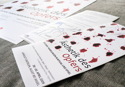
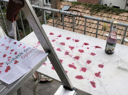
‘Some of my favorite assignments are posters and program flyers for conferences dealing with complex subjects. This one was about patterns, forms, functions and aesthetics of sacrificial rituals. Raster design with blood (OK, beet juice)!’
The work of Nina Stössinger.
More project details in her blog post here.
Or you can read it in the original German here, or in bad Google translated English here.

‘Guilloché machines (also known as geometric lathes) have been used since the 17th century by watchmakers and goldsmiths, such as Fabergè, for ornamentation.’
Subblue’s Guilloché Pattern Generator.
Found via Nina Stössinger
‘Anyone who was following my Twitter personal account at the time may have noticed a fair bit of bitching about Illustrator’s pathfinder tools’
Aegir Hallmundur’s beautiful money illustration for Wired magazine. Details (and design considerations) here.
Again, can’t we just let someone like Aegir design our currency? Pleeease??
Found via expiro
‘My currency work originated in California, while I was studying at UC Davis. I was very interested in camouflage at the time. This interest led me to create my first paintings on dollar bills, between 1992-94, in which I camouflaged/painted images onto and into bills. A death in the family led me to the east coast, and faced with the costs of living in New York City on an artist’s budget, I continued to paint on money.’ -HvG
Hanna von Goeler’s My Money, My Currency series. Details (and more work) here.
These days, I get really depressed when I look the design of US money.
At least the one dollar bill is going to stay the same (not worth counterfeiting), but gads; new money we have: so ugggly. Tiny gold 20s floating everywhere. Horrid layouts, random mismatched Helvetica number on the back. Bleeeh.
The Art of Money author David Standish picks the ‘top 10 most beautiful bills’ from around the world – check out the slideshow here.
And
Here’s a look at the color – and current, um, design – of US money at COLOURlovers.

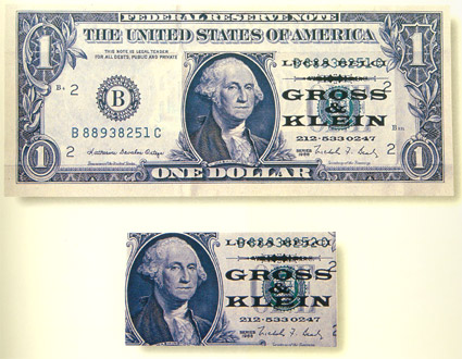
Client said that each business card should cost no more than a dollar.
Design by Stefan Sagmeister. Featured in his first book, Sagmeister: Made You Look.