entries Tagged as [typography]

Jeanne Moderno type samples

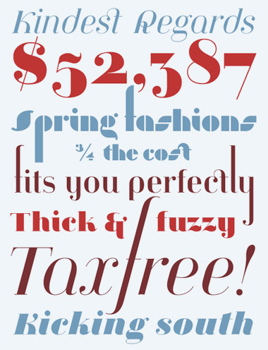
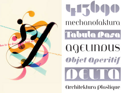
. . .  And when MyFonts did a write up of my Jeanne Moderno fonts for their Rising Stars newsletter – they spent some time digging thru so they could show some of my telescoping ascenders, alternates and ligatures (above). I like to hide things in my fonts, fill the blank slots as it were.

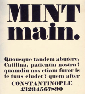
(Below) Psy/Ops new type sample for Jeanne Moderno. Psy/Ops also carries the Jeanne fonts, they did the final OpenType mastering before release (and without their support, Jeanne could possibly still be sitting in the 10 year limbo that was part of my process).

Making a type sample


The Making of a Type Sample from FontShop on Vimeo

Once a font is completed, showing the letters and glyphs in their best light is a tricky exercise. FontShop does it right and in this video shows some of the decisions made when creating a good type sample – in this case, the sample for Matthew Carter’s beautiful Miller typefaces, which I used for The Sacramento Union Magazine.

In the 1800s, type foundries used to set their samples in Latin – following the belief that our alphabet looks best in its original language. Marcus Tullius Cicero’s first speech against Lucius Sergius Catilina (below) was popular for samples.

Today, graphic designers use Lorem Ipsum for placeholder text.


Robert Thorne’s Fat-Face type sample, 1821

Beer and typography


Artois Le Passage from ilovetypography.com on Vimeo

Really seksi spam buttons – for charity

As I write this, there are 2,728 items in my spam folder; most of them involve some form of penis renovation, ‘The Big Pink,’ ‘urgent and confidential business’ inquiries from deposed royal family members that need my help – and on my blog, 2,201 spam posts sitting in what I call my ‘hey asshole, don’t spam my blog’ folder.

Designer Floyd Hayes has decided to turn annoying spam into money – for a good cause. Since a lot of spam is about freaky misspelled sex stuff, every four weeks Hayes will be issuing the best subject lines as buttons and donate all the profits to a sexual health charity. Details here.

Oh and wait – ‘The Big Pink’ is actually a cool new band, it’s an email I’m actually subscribing to. Here’s their debut album, A Brief History Of Love. Drops September 22nd.

I really wish spam filters worked better.

Buttons found via PSFK

Typographic art by Daïd

Based out of France, artist Daïd Daragones was in the new media show I co-curated last year. Some of his typographic works are now available thru MYFACE. Go here.

Fountain presents: Heroine fonts

Eleisha Pechey’s Windsor typeface (1905) is one of my funky favorites. There’s a hint of it in Jeanne Moderno (believe it or not; even moreso in my upcoming text versions), Woody Allen loves it for titles and Sacramento’s Golden 1 Credit Union uses it for a distinct yellow logo.

Today, Fountain Type releases Göran Söderström’s Heroine, a ‘modern interpretation of this rusty pearl is something that always have been missing in the major type libraries.’

More details here.

Baskerville: The Animated Movie

John Baskerville (1706-1775) was an incredible type designer. His work holds up very well today. He reinvented printing and his ink was beyond compare. And, unfortunately, he was hated by his contemporaries. His type was seen to ‘hurt the eye’ and would be ‘responsible for blinding the nation.’

‘Baskerville the Animated Movie celebrates John Baskerville, the man, the typeface and his future legacy.’

For more about this short film, drop by The Baskerville Project website.

For more detail about John Baskerville and other famous type luminaries, snag a copy of Type: The Secret History of Letters and start reading.

It’s not all about fonts


Shirley-Ann Dick’s There’s more to life than Helvetica tee

Designed in under 10 minutes.

Found via Whitezine

Asterisks*


* Large wood-backed asterisks around Portland, Oregon

The Results Under Action Project. Details here.


& cufflinks

Ampersand Faux Cufflinks at Veer.

Found via swissmiss

Type mistakes you may be making


Fonts can’t handle being stretched, they end up looking awkward/slows down reading

Fonts require a lot of massaging in order for them to work for you. Here’s a list of some fairly common mistakes – posted over at The Design Cubicle.


Creative Commons License

the work at the mehallo blog. beta. is licensed under a creative commons attribution - noncommercial - no derivative works 3.0 united states license.  if reposting, credit must be given to steve mehallo - and if possible, please provide a link back to the mehallo blog. beta.

i include images for the purpose of critique, review, promotion and inspiration - and always make my best effort give credit/link back to the original source.  if i’ve screwed up, please fire me a note.

page layout based on the wordpress 'darkwater theme' by antbag, adapted and redesigned by mehallo.  valuable php assistance from bill mead.