The art of setting type
‘Graphic designers were never meant to set type . . . That’s what typesetters are for.’
I’m not even sure who said this, it was early on; probably college. Possibly a printer, maybe Roger. Roger would say stuff like that. He’d swear to the ‘ITC god’ and he had the old dusty Varitype machine sitting in the corner to prove it.
Years ago, we had typesetters. Their job was to set type. And when the computer really took over (early 1990s) the typesetters went away. And designers became responsible for doing their own typesetting. With many varied results, the key observation is that quality has really gone out the window. To say the least.
Graphic designers today have a lot to worry about, so why worry about type. They’re supposed to be concentrating on designing stuff – and that’s what they do. They design and when they have to do the type, they just . . . Let it happen.
A lot of really good pieces are ruined this way.
Great designers, lousy typesetting skills. At least in the old days, the typesetter was trained in the Real Way to do things (well, sort of; whole dissertation on ITC and why ‘close but not touching’ didn’t quite work should fit in here).
Software makes it so easy, the defaults just kick in and they almost work. Almost. And Adobe has done a great job with OpenType features and (my favorite) Optical kerning (it’s on the type palette, switch ‘Auto’ to ‘Optical’ and let it go. Fixes a lot of spacing issues. It SHOULD be the default). But type still has to be massaged. Adjusted, tweaked, cleaned up and . . . to show respect for the work . . . made to read well. Made to where it reads so well, it’s not given a second thought. The ideas flow. It doesn’t look wonky, it doesn’t hurt eyes. Communication happens.
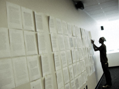
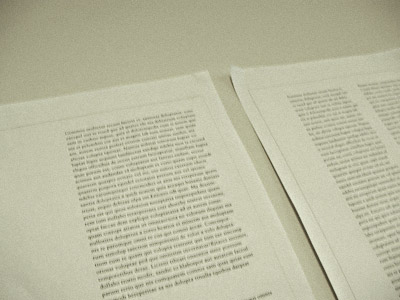
I spend about 10 hours teaching how to set a simple paragraph. Text only. No silly bits, no drop shadows, no goofy overlaps. Just good text.
It’s an art based on tradition. Worth studying. Worth preserving.
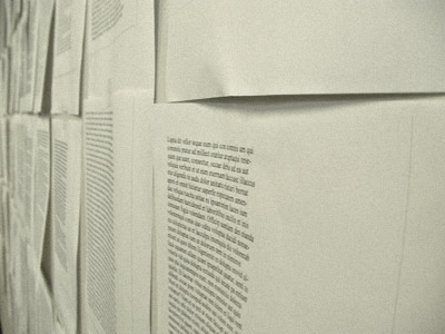
Pictured: Student pages from my typesetting critique, July 22nd, 2009.
Thanks to Tiffany Valdez for sending over the snaps.


