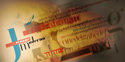
Introducing: Jeanne Moderno, 9 new modernist fonts
![]()
get modern[o]
This is what I’ve been up to for the past year. Instead of plopping down in front of the tee vee, I decided to do something a bit more productive.
Last January I started working on a font idea I’ve had brewing for about 10 years. Sketched a lot, poured thru my collection of type books, fired up Fontlab, put on some music (bands of choice: theSTART and iVellora) (and actually, I could only draw these letters when listening to Aimee, Chelsea + co) and I basically took myself through one letter after another . . . and
with some final tweaks this week by Rod Cavazos and his team at Psy/Ops in San Francisco, I am happy to announce today the release of my newest fonts!
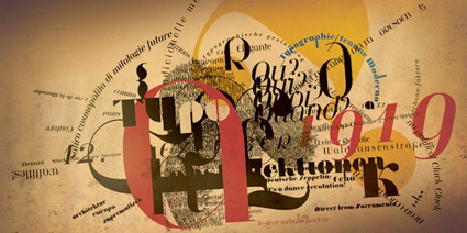
Jeanne Moderno is a synthesis of Bodoni Italic, 19th Century Fat Faces and elements from early 20th century (pre-bauhaus) modernism.
Jeanne Moderno is a ‘revisionary’ typeface, in that it incorporates elements that sort of existed, and also didn’t exist. Kind of modern, a bit steampunk, with a twist of fashion . . . all together raw and elegant.
With a geometric version just for anyone who wants a change from Futura Black or font menu standby, Braggadocio.
![]()
purchasing options
You can download your very own copy of Jeanne Moderno thru the steve mehallo foundry at MyFonts. MyFonts also has a set of my historical ‘specimen’ images in the gallery section.
Psy/Ops was the first foundry to release Jeanne Moderno, and you can order your copy here. Jeanne Moderno is also available thru my friends at Ascender.
We’ve set up a few different purchasing options for Jeanne Moderno. We have the fonts available as a superset (9 fonts for 99 bucks US) or individually (32 bucks US) – basically, whatever you choose, Jeanne Moderno is about the same price you’d pay for a really good book.
Huge thanks to everyone who has supported me in this endeavor. Especially my wife, who is the namesake of this particular type family.


Garmin 1490t…
[…]below you’ll find the link to some sites that we think you should visit[…]…
Garmin 1490t GPS System…
[…]the time to read or visit the content or sites we have linked to below the[…]…
1.) Layout…
2.) […]Here is a good example of a clean layout…