entries Tagged as [typography]

Typeface: A Documentary

‘Charting the intersection of Rural America and Contemporary Graphic Design’

The film about the Hamilton Woodtype Museum is making the rounds.

Official site here. Pictured: promo prints for the documentary.

Found via “JE NE SUIS QU’UNE PAUVRE PLUME…”

Slab serif ‘Egyptian’ types: A history

Here’s a detailed history over at Hoefler & Frere-Jones on slab serif typefaces; showcasing their new Clarendon-based Sentinel fonts.

The Clarendon types: A history

The Know your type series at idsgn continues with an overview of Oxford-bred, 19th Century wonder Clarendon.

Parkinson’s Sutro fonts


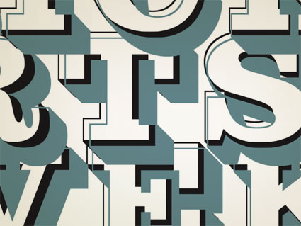
ADAC 38th season promotional material

It’s not often one gets to meet one of their heroes.

When I was in high school, a bunch of kids thought it would be funny to sign me up for every magazine subscription they could find – by sending in a large pile of subscription cards. My parents were not amused; but it was Rolling Stone that I kept. I fell in love with the hand-inked masthead – and decided that that was what I wanted to do.

Hand-ink mastheads.

Not a big field. And who knew people actually did this? I wanted to do it, and early attempts (for my high school paper) netted not so wonderful results. Who knew that someday I’d actually be drawing fonts as a consequence.


Rolling Stone masthead by Jim Parkinson

Around five years ago, I finally met the guy behind the logotype – lettering artist Jim Parkinson. And the conversations have been great – as long as I don’t actually call him hero, he’s cool. And (who knew?) we both like fresh anchovies. Which I’ve found can gross out anyone who is eating near us.

using jim’s fonts
I used Jim Parkinson’s Sutro fonts on promotional materials for the 38th season of the Sacramento Art Directors and Artists Club. I was the newly appointed president, so I was determined to use fonts from the best of the best and (of course) Jim was on my list. [Read more →]

Seeing stars!

Award-winning magazine designer Jason Malmberg made me a logo.

He said, ‘It’s not quite what I envisioned. I’m still trying to find a way to give a lens flare TO a lens flare.’

If you don’t see the humor, you’re reading the wrong blog.

To see Jason’s real work, check out Sactown magazine, one of the best city/metropolitan magazines in the country. (So good, even local competitor Sacramento Magazine has reformatted to be a bit more like Sactown. I always see that as a nice compliment.)

But if you want the real deal, the October/November 2009 Sactown (above) just dropped. It should be showing up on select newsstands just about now (Sactown is distributed nationally). Or subscribe here.

Good grade: d++

Marko Davidovic is an artist and graphic designer out of Belgrade. I love the expressive freedom in his art – it just totally syncs with me – in each medium he works, his energy explodes.

He’s always posting something interesting on my MySpace page – ‘just fooling around,’ is his MySpace approach. His work, however – calligraphic, canvas, photographic, illustrative, digital – is something else.

He goes under the tag of d++. Find him on MySpace here.
 

Musicians and the letter R

Above: Remi Nicole tweets ‘Rrrrrrr’
Remi Nicole on MySpace.

Below: Lisa of The Veronicas tweets, ‘My favorite letter of the alphabet… ;)’
The Veronicas on MySpace.

NYT: Turkish edition


Advertisement for the launch of the Turkish Edition of the New York Times, created by Istanbul-based studio Imago New Media

More typographic details via The Font Feed here.

Typembrya


Typembrya by Oded Ezer on Vimeo

Typembrya is a personal homage to Herb Lubalin’s famous Mother & Child logo (seen below). This is the third experimental project in the ‘Biotypography’ series by Israel-based designer Oded Ezer. For more info, please visit his site here.

Chill


Vintage Original Joe’s ashtray, photo by mehallo

Kick back, have a Martini at Joe’s.

get the playlist or watch video or create your own at mixpod.com
please support the musicians on my player by legally purchasing their music

Jeanne Moderno detergent

I was told when I released my Jeanne Moderno fonts, they’d probably end up being used on a cereal box.

Instead, I’ll settle for this cool laundry detergent box designed by Bootleg.


Creative Commons License

the work at the mehallo blog. beta. is licensed under a creative commons attribution - noncommercial - no derivative works 3.0 united states license.  if reposting, credit must be given to steve mehallo - and if possible, please provide a link back to the mehallo blog. beta.

i include images for the purpose of critique, review, promotion and inspiration - and always make my best effort give credit/link back to the original source.  if i’ve screwed up, please fire me a note.

page layout based on the wordpress 'darkwater theme' by antbag, adapted and redesigned by mehallo.  valuable php assistance from bill mead.