entries Tagged as [typography]

LAIKA: Interactive typography from Switzerland


LAIKA from Michael Flückiger on Vimeo

Traditional fonts are static. For their bachelor thesis, Michael Flückiger and Nicholas Kunz created a dynamic typeface called LAIKA.

LAIKA isn’t static. Style, weight, size, kerning and other properties can be adjusted on the fly using a control panel, as seen in the video. LAIKA can also respond to outside stimuli, such as people.

To test drive/interact with LAIKA, go here.


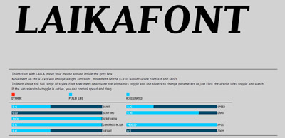
Interactive online interface for LAIKA

Found via Twitter.com/frank000

Helvetica vs. Arial: Game

This has been a favorite for awhile. Premise: You’re time-honored Helvetica and you get to beat the crap out of sneaky Arial. Unless Arial gets to you first.

Go here.

And call me crazy, but this game seems to go a bit faster these days. That bastard Arial has gotten even more aggressive!

Helvetica vs. Arial: Identification

Take the quiz.

It ain’t easy. I actually got 19/20 and I supposedly know what I’m doing.

Helvetica-themed interfaces: clean, neat

Sick of overdesigned interfaces? Go Swiss!

Emily Chang does a roundup of Helvetwitter, Helvetical and more.

Swiss interpretations

A bunch of Helvetica posters here.

Type that doesn’t wash off


‘ . . .  WW is Walt Whitman.’

Ina Saltz wrote THE book on typographic tattoos, Body Type: Intimate Messages Etched in Flesh. You can snag a copy by clicking on the image below.

But there’s even more at her website here.

Hangul at the Design Museum

Claudia Pungaru, one of my students, turned me on to the work of Dr. Hyunju Lee. Lee’s work is typographic and she uses the Korean script Hangul as a starting point for expressive interpretations – about Korean life and culture.

Ongoing right now is Typographic Exploration in Hangul: An Exhibition of work by Hyunju Lee and Phil Choo (work pictured above) at the UC Davis Design Museum. In the show, letters evoke emotions – all tied to the tradition and sounds of the Hangul writing system.

For more information about the show, go here. The Design Museum’s site is here.

The museum is open limited hours Monday thru Friday, and on Sunday afternoons. Show ends December 6, 2009.

Image found via design in society

‘It’s time to be bold’

The work of Poland-based designer/illustrator Martin Plonka.

Found via Typography Daily

In my kitchen: Scrabble Cheez-Its

Could not find an ‘F’ in the whole bloody box.

Wood type

Experimental final project from my beginning typography course. Carved by student Rikki Morehouse.


First print  . . .


Offset print made from first print

Alta California: Named after a newspaper


Alta California office, San Francisco 1851; found via Flickr

At one point in my life, I was going to be a journalist. So folly along  . . . .

I love history, so every one of my fonts falls into some historical category (or categories, if you look at Jeanne Moderno).

Alta California is my artist’s response to Susan Kare’s early Macintosh font, San Francisco. And it was a tricky build, as I was literally going thru book after book after book of old types – then messing them up, then messing them up more; and redrawing the edges until I had what I wanted.

(Please note, when it comes to ‘grunge typography’ – I don’t trust anything automatic; I’ve always gone in and tweaked the edges until I have something that looks – printed. Printed poorly, but printed.) [Read more →]


Creative Commons License

the work at the mehallo blog. beta. is licensed under a creative commons attribution - noncommercial - no derivative works 3.0 united states license.  if reposting, credit must be given to steve mehallo - and if possible, please provide a link back to the mehallo blog. beta.

i include images for the purpose of critique, review, promotion and inspiration - and always make my best effort give credit/link back to the original source.  if i’ve screwed up, please fire me a note.

page layout based on the wordpress 'darkwater theme' by antbag, adapted and redesigned by mehallo.  valuable php assistance from bill mead.