entries Tagged as [typography]

Font sex

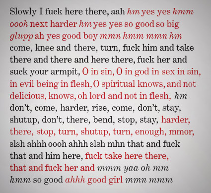
‘Unlike conventional fonts, Chan’s Sade fonts are comprised of sexual phrases and sentence fragments rather than letters, so that what is typed on the keyboard is not what appears on the screen.’

Type a letter, get a phrase. Type a sentence, get a story.

18 TrueType fonts by Paul Chan. Download them free here.

Found via Fleshbot

NY, the very good type

Typography from New York magazine.

Found via mslk

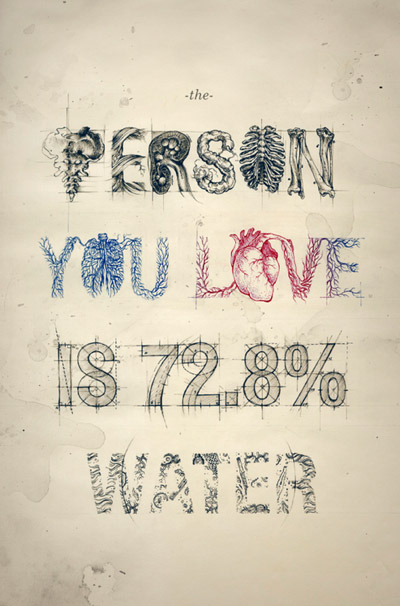
Water

The work of Teagan White.

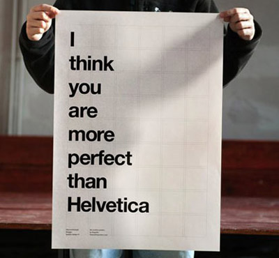
‘you are more perfect’

From Bisgràfic studio: The Positive Posters. Info here.

Found via Zachariah Moreno

Hadank

‘Hadank is a display typeface developed from hand-lettered words in a German printer’s letterhead from the 1920s’

Andrew Leman makes props for the motion picture industry. And along the way, he’s built a collection of fonts to help with making said props authentic.

Order his Hadank fonts here. Website (with interview video) here.

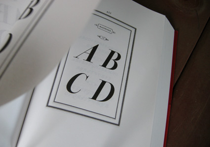
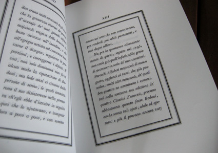
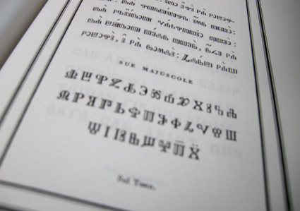
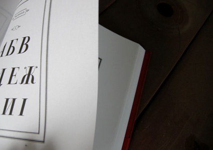
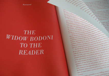
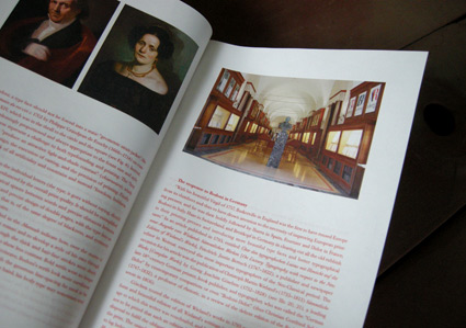
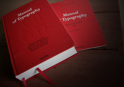
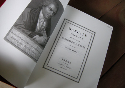
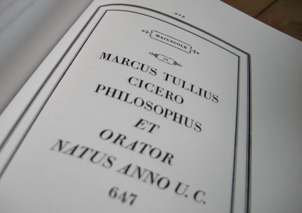
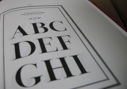
Bodoni’s Manuale Tipografico

‘Published posthumously in a limited edition of 250, features 142 sets of roman and italic typefaces, a wide selection of borders, ornaments, symbols, and flowers, as well as Greek, Hebrew, Russian, Arabic, Phoenician, Armenian, Coptic and Tibetan alphabets.’

My birthday was last week and to my surprise, my wife got her hands on Taschen’s limited edition reprint of Giambattista Bodoni’s masterwork, his Manuale Tipografico (1818).

Bodoni had almost unlimited funding and resources at his disposal – so the details in his large body of types (he just kept going) is beyond what is seen in most revivals of his work. ITC Bodoni comes damn close, but a lot of Bodoni’s original designs end up on the cutting room floor.

My Jeanne types (named for my wife) have roots in Bodoni – and I used some digital resources to research his Manuale. But it is great to now actually have a print edition in my collection – cause I’m not done with tinkering.
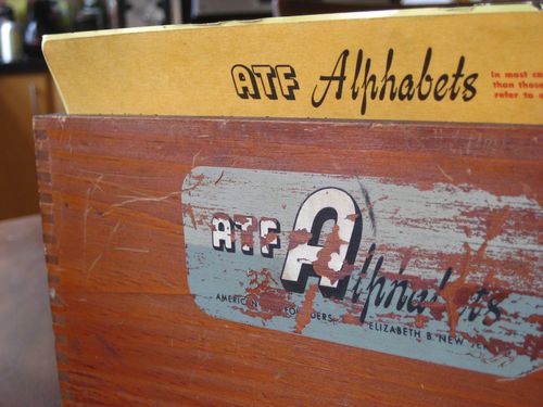
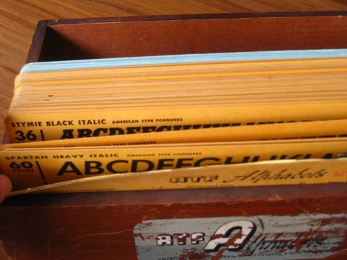
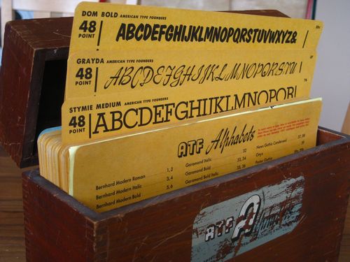
ATF kit

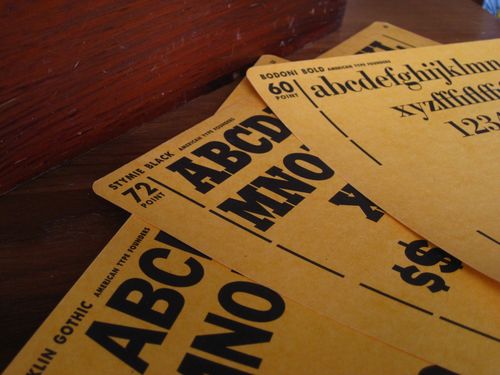
‘Features over 100 cards with specimens from the 1951 type catalog, showcasing dozens of fonts in their various weights and point sizes.’

American Type Founders
was the largest metal type company in the world. They came to an end in 1993 in an ill-planned bankruptcy auction.

Tons of type history (literally) were melted down for scrap. Many records and original drawings were destroyed.

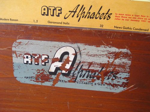
Pictured, Just My Type’s recent acquisition: ATF’s 1951 merchandising case.

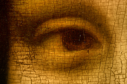
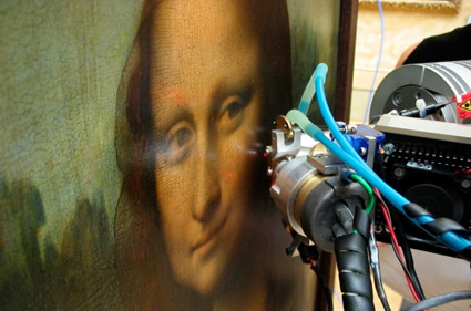
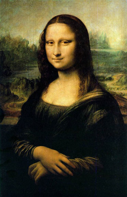
Mona Lisa eyes

‘Silvano Vinceti claims he has found the letter S in the woman’s left eye, the letter L in her right eye, and the number 72 under the arched bridge in the backdrop of Leonardo da Vinci’s famous painting’

Article here.

Found via Zachariah Moreno

Godard titling

A selection of trailers and title sequences from the films of Jean-Luc Godard.


Doret’s type

I have one little parallel with Michael Doret.

I like to do type revivals – interpretations – of vernacular lettering that we often take for granted.

My Martini at Joe’s fonts are all about this. I based them on my favorite restaurants, the Joe’s of Northern California.

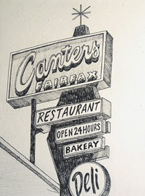
And Doret based his fantastic Deliscript on signage lettering of world famous Canter’s Deli on Fairfax in LA. This led to him developing their catering truck. All elements of an incredible body of work. [Read more →]

Canter’s in pen and ink

The work of Michael Rubin.


Creative Commons License

the work at the mehallo blog. beta. is licensed under a creative commons attribution - noncommercial - no derivative works 3.0 united states license.  if reposting, credit must be given to steve mehallo - and if possible, please provide a link back to the mehallo blog. beta.

i include images for the purpose of critique, review, promotion and inspiration - and always make my best effort give credit/link back to the original source.  if i’ve screwed up, please fire me a note.

page layout based on the wordpress 'darkwater theme' by antbag, adapted and redesigned by mehallo.  valuable php assistance from bill mead.