entries Tagged as [graphic design]

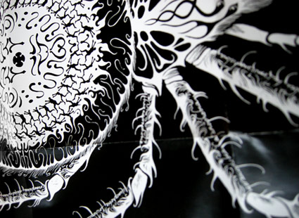
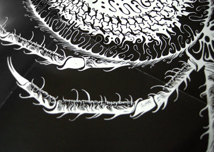
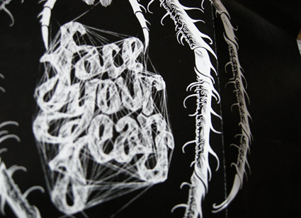
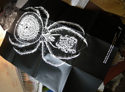
Big Bantjes spider on my desk!

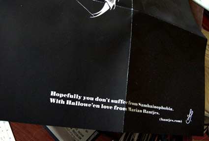
A few years back the incredible Marian Bantjes sent me this wonderful Hallowe’en poster. Earlier the same year, I had put her work in an exhibition.

Marian’s post on heraldry is one of my favs. And check out her 10th Anniversary cover for GQ Italia, ’10 designers, 10 covers  . . .  10 years of men, stories, adventures and style.’

Happy Hallowe’en!
McDonaldland

Stephen Von Worley maps McDonalds locations in the US. Looking at the Dakotas, there’s not as many as one would think. Details here.

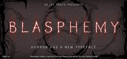
Free caps font, it’s Blasphemy!

Just in time for Halloween!

Blasphemy Initials from Delve Fonts is GREAT for titles, drop caps, frightening timid people, crucifictions, things like that. The thorny letters are carefully proportioned and based on classical form.

To snag your own, simply GO HERE and do what you’re told.

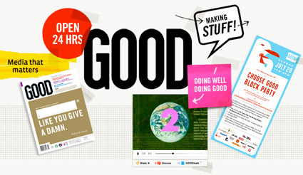
GOOD is good. So is Scott and his team.

GOOD is for people who give a damn – read more below.

but first   . . .
OPEN studio’s Scott Stowell headed up the original design team for GOOD. And I have to write about Scott because he’s been a major influence on my work. Scott = GOOD influence.

I’ve been a fan of Scott’s work for years, ever since I saw a talk he gave at one of the 1990s ATypI conferences. His views/advice on design and teaching – for me – has been invaluable. [Read more →]

The US has been nuked

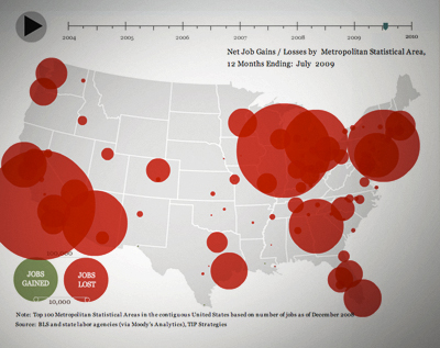
If you’re having problems coping with unemployment in the US (who isn’t?), here’s some visuals. It’s huge. Bigger than you are. Interactive map here.

Change is about rethinking how we do things. I’ve been changing my whole outlook; what I do with my business – my blog is part of it. And following the status quo, doing the same thing over and over and over isn’t working. This map shows it.

Found via FlowingData

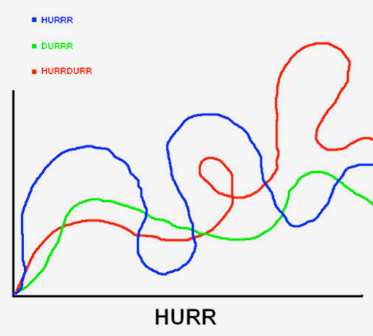
Hurr

Found via Twitter.com/bwargh

Visual politics

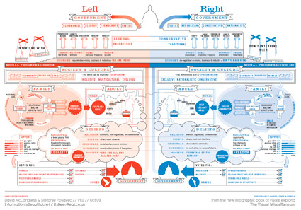
The Left and the Right in the US – as visualized by David McCandless and Stefanie Posavec. From the upcoming book, The Visual Miscellaneum.

Click on the image for larger view/jump. More stuff from David McCandless here. And check out Stefanie Posavec’s site here.

‘Make my website for free’

Here’s one more.

Same robots, but not really. Different robots because the voices are different.

I’m smart. I figured that out.

‘Graphic designer vs. client’

This one’s been bouncing around for a few weeks now. And one of the reasons this video resonates is – it’s sooo true. I’ve had similar conversations over the years (even just a couple months ago), but don’t remember this much swearing. At least not during the actual conversation.

And (below) here’s the sequel  . . .

And another  . . .

Found via Twitter.com/AngelaGlenn and Jonathan Weast

When I grow up  . . .


Spoof of Monster’s ‘When I Grow Up’ campaign

Found via Jonathan Weast

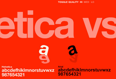
Helvetica vs. Arial: Game

This has been a favorite for awhile. Premise: You’re time-honored Helvetica and you get to beat the crap out of sneaky Arial. Unless Arial gets to you first.

Go here.

And call me crazy, but this game seems to go a bit faster these days. That bastard Arial has gotten even more aggressive!


Creative Commons License

the work at the mehallo blog. beta. is licensed under a creative commons attribution - noncommercial - no derivative works 3.0 united states license.  if reposting, credit must be given to steve mehallo - and if possible, please provide a link back to the mehallo blog. beta.

i include images for the purpose of critique, review, promotion and inspiration - and always make my best effort give credit/link back to the original source.  if i’ve screwed up, please fire me a note.

page layout based on the wordpress 'darkwater theme' by antbag, adapted and redesigned by mehallo.  valuable php assistance from bill mead.