entries Tagged as [graphic design]
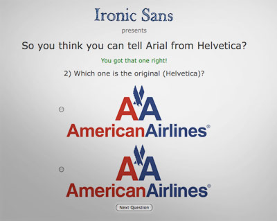
Helvetica-themed interfaces: clean, neat
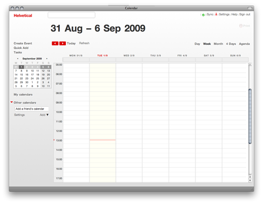
Sick of overdesigned interfaces? Go Swiss!
Emily Chang does a roundup of Helvetwitter, Helvetical and more.

Interactive dirty poster!
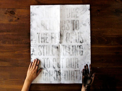
Dirt Poster by Roland Reiner Tiangco
One can’t see the message in the poster unless one’s hands are dirty. See how it works here.
Slab serif ‘Egyptian’ types: A history

Here’s a detailed history over at Hoefler & Frere-Jones on slab serif typefaces; showcasing their new Clarendon-based Sentinel fonts.

The US and its deadly sins

I used to count ‘graphic design’ as one of the Seven Deadly Sins – I had it listed among the sins on an old business card (replacing ‘gluttony,’ of course).
Kansas State University Geography students have visualized the sins as regional, at least in the US. View the maps here.
Found via One Floor Up


A bit about creativity

Line art by Steve Masseroni
gurus plant ideas
Steve Masseroni is an incredible artist I knew in high school. He was dabbling with working for Marvel Comics at the time, but set out in his own direction. In a afternoon critique in 1985, he gave me his favorite brush and a few tips on being an illustrator. [Read more →]
Akzidenz Grotesk and industry

Köln-based graphic designer Tobias Battenberg projects Akzidenz Grotesk (the forerunner of Helvetica) onto industrial surfaces.


Found via Flores en el Atico


handpicked posts

a piano falls in old manhattan
tetro and typography
it’s typography: film, song and dance
ghosts of gustov klimt
the great times new roman controversy
picking fonts
kapitaal
defining terms: design is not decoration
garcia's 'pure design'
'enhance that image!'
magic highway remixed
the cynic
rad anthem
Brought to you by man dom-


buy my fonts
go shopping
mehalloreads

Divinely Elegant: The World of Ernst Dryden
Jozsef Pecsi: Photo and Advertising
Color: A Natural History of the Palette
Collage: Assembling Contemporary Art
Modern Dog: 20 Years of Poster Art
Gaberbocchus Press: An Experiment in Publishing, 1948-1979
Advertising Art in the Art Deco Style
Googie Redux: Ultramodern Roadside Architecture
Hot Sour Salty Sweet: A Culinary Journey Through Southeast Asia
now playing


the work at the mehallo blog. beta. is licensed under a creative commons attribution - noncommercial - no derivative works 3.0 united states license. if reposting, credit must be given to steve mehallo - and if possible, please provide a link back to the mehallo blog. beta.
i include images for the purpose of critique, review, promotion and inspiration - and always make my best effort give credit/link back to the original source. if i’ve screwed up, please fire me a note.
page layout based on the wordpress 'darkwater theme' by antbag, adapted and redesigned by mehallo. valuable php assistance from bill mead.


