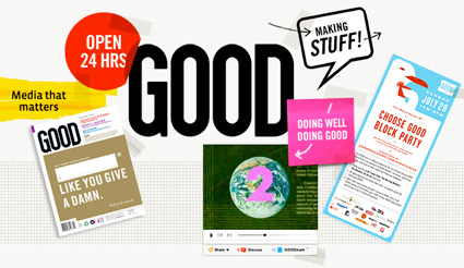
GOOD is good. So is Scott and his team.
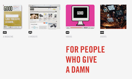
GOOD is for people who give a damn – read more below.
but first . . .
OPEN studio’s Scott Stowell headed up the original design team for GOOD. And I have to write about Scott because he’s been a major influence on my work. Scott = GOOD influence.
I’ve been a fan of Scott’s work for years, ever since I saw a talk he gave at one of the 1990s ATypI conferences. His views/advice on design and teaching – for me – has been invaluable.

Scott Stowell, photo via Sappi
Scott was art director of COLORS magazine and worked for Tibor Kalman at M&Co. (über-designer Stefan Sagmeister has similar pedigree). Kalman was dedicated to social responsibility in design – alone, his ideas are world changing.
Since, Scott opened OPEN – a studio where signs all over New York City would advertise his business for him. OPEN developed the nifty Bravo logo, they’ve been involved in numerous causes with progressive clients and they have oodles of cool, smart stuff under their belt. Just browse thru the portfolio; print, motion and more.
Scott’s approach is about simplicity. Simple, direct communication. It’s refreshing in a world gone mad.
It was mind-opening when in 2006, ADAC brought him to Sacramento for both a talk and workshop (as president, I had made sure he was on our mailing list, and each year angled to bring him here) – and I wish I had more time before shuffling him to the airport to actually get him the In-N-Out Burger he wanted. In-N-Out = (unfortunately) long lines.
(We were also camera-less, so it was impossible to take some cool shots of the old signage in Sacramento Terminal B – one of the few airport buildings still using Univers for wayfinding)
going good
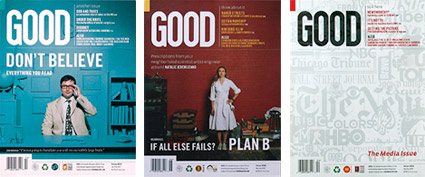
Scott had just started on GOOD magazine (above) – OPEN established the design and produced the first 15 issues. If you haven’t been exposed yet (GOOD is everywhere these days) – is a collaboration of individuals, businesses, and nonprofits pushing the world forward.
GOOD is into world changing and has some serious backers. The design approach harkens back to one of my favs, SPY magazine.
And content is king – the Transparency features are graphically nummy. Here’s an incredible archive at Flickr.
Plus . . . 100% of your subscription dollar goes to support a social action project thru GlobalGiving.com. Really. Details here.
but, it’s more than just a magazine
Today, GOOD has grown beyond the confines of print and has become rather excellent at using social media and blogs, as well as setting up local social events. GOOD even had a short-lived newsprint edition – point-of-purchase – at Starbucks.
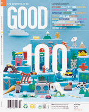
The current GOOD design team is headed up by creative director Casey Caplowe – who is taking the style set forth by OPEN in new directions; including The GOOD 100 (above) which features a 3D take on the style established by Scott and Co. It’s always fun to see design evolve.
So if you haven’t gotten GOOD yet, START here.
Because you give a damn. Or you wouldn’t have read this far.
