entries Tagged as [graphic design]

World changing: What could be next?

‘Renowned academic David Harvey asks if it is time to look beyond capitalism towards a new social order that would allow us to live within a system that really could be responsible, just, and humane?’

Dr. Harvey defines our world financial problems from a Marxist perspective – with cartoon illustrations by Andrew Park.

He asks the right question, but the problem does need an answer.

Part of the RSA Animate series of lectures.

On now! Save on mehallo stuff for Veterans Day

$2 off t-shirts, $4 off mugs. Input code: VTRNSDAYSALE.

Visit my store at Zazzle here – or just click the images.

More Zazzle Veterans Day Sale info here. (other stuff on sale too, not just my stuff)

Sale ends Thursday November 11, 2010 at 11:59 pm (PST).

Graphic Design Biennial, with breasts

‘The Biennial of Graphic Arts, which has been held without interruption since 1955, has a longer tradition than any other recurring exhibition in Slovenia and, in fact, is one of the oldest print biennials in the world.’

‘Oh, I get it, it’s a pun on ‘graphic,’ right?’ –Dabitch

This year they’ve decided to promote the Biennial with soapy breast billboards placed all over Ljubljana.

And I’d like to say it’s causing quite the outrage. But, no. It is Europe. It’s just turning a few heads.

But in the US, civilization would come to a stop as we know it. Banks would close, all media would crumble.

NBC would cancel another show.

Found via Metro

The wonky type at 10 Downing

‘If I could change anything, I’d straighten up that 0 on the number 10. It’s a bit wobbly.’

Here’s an excellent read by J.M. Mosley on the odd lettering used for the numerals at 10 Downing Street. Not quite the original, sort of an accident that is now part of history.

It’s interesting how small type details are often overlooked. The numbers on my own home are rather awful, and even though several years back I’d purchased some Bodoni as replacements, have never gotten around to actually installing them.

Found via Matthew Williams

‘I like Ike’

‘I’m totally voting for Eisenhower now.’ -posted comment

From the 1952 election.

and
Best political comment I’ve read this season comes from one of my students, Ashley:

‘NEWS FLASH: It’s 2010. You know what’s NOT a big deal? Smoking pot. Or being gay. Or women and brown people in politics. Can we all just acknowledge this already, or would you like a little more time to camp out in 1950?’

Found via Jamie DeVriend

Adams, Henry

‘Seriously gorgeous paired volumes of Adams’ celebrated intellectual autobiography – a brilliant deployment of two classic typefaces, Garamond and Caslon’

Pictured, covers from the beautifully-designed 1964 double volume, of which a copy may be snagged here. If you’re fast.

Details about Bostonian Henry Adams (1838-1918) here. Theme analysis by the NYT here.

Found via this, that, and also

Inked font: Piel Script

The incredible new tattoo-inspired font from Ale Paul. Info here.

Frank-n-pie

Illustration by Al Parker for The American Weekly, November 1958. Details.

Happy Halloween!

Lord of the Logos

‘The hallmark of Szpajdel’s work is his surprisingly fluid combination of letters with visual elements from art movements such as art deco and art nouveau.’

The dark metal logo work of (Belgian forestry engineer) Christophe Szpajdel – compiled in convenient book form. Published by Die Gestalten Verlag.

Interview here. Another interview here.


Wolves in the Throne Room: A Looming Resonance

Found via Robynne Raye

‘Escape from Comic Sans’

B-movie typography eCards, designed by Will Staehle for TDC. Go here.

And check out Will Staehle’s website here.

Found via Ilene Strizver

The U&lc archive: Free as PDFs

‘Over the 26 years that it was pub­lished, U&lc gathered a fol­low­ing of thou­sands of avid read­ers that eagerly anti­cip­ated each issue. It became the most import­ant typo­graphic pub­lic­a­tion of its time.’

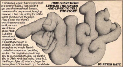
The 1970s looked like the 1970s because of Herb Lubalin.

And the way he did this was thru Upper & lowercase magazine. Tabloid in size, printed on newsprint, U&lc was read by most of the graphic design industry. Within, the fonts and philosophy of Lubalin’s International Typeface Corporation [ITC] stressed letters that were set ‘close, but not touching’ and  . . .  aw, hell, let them touch, overlap and be funky.


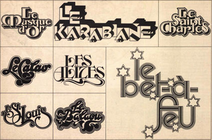
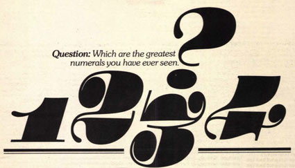
By the time I was in design school, the look had fallen out of favor – most ITC fonts were actually banned from use in my homework. ITC’s philosophy was to reinterpret the classics, often into something strangely unique, full of its own style – or a lack of style. Like Helvetica.

The 1970s were all about that. Taking things like Art Deco and doing something totally new with it. [Read more →]


Creative Commons License

the work at the mehallo blog. beta. is licensed under a creative commons attribution - noncommercial - no derivative works 3.0 united states license.  if reposting, credit must be given to steve mehallo - and if possible, please provide a link back to the mehallo blog. beta.

i include images for the purpose of critique, review, promotion and inspiration - and always make my best effort give credit/link back to the original source.  if i’ve screwed up, please fire me a note.

page layout based on the wordpress 'darkwater theme' by antbag, adapted and redesigned by mehallo.  valuable php assistance from bill mead.