The old Linotype office in Chicago

Entrance to the Mergenthaler Building, old printer’s row, Chicago.
Kate Nash: Nicest Thing, from the album Made of Bricks
Photo by mehallo

Entrance to the Mergenthaler Building, old printer’s row, Chicago.
Kate Nash: Nicest Thing, from the album Made of Bricks
Photo by mehallo
‘Linotype: The Film is a documentary about Ottmar Mergenthaler’s amazing Linotype typesetting machine and the people who own and love these machines today.’
Trailer above, film now in production. More info here.
Music by Iron & Wine
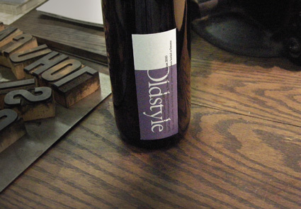
Been busy since I’ve gotten back from TypeCon 2010, so I’m only now slowly going thru photos.
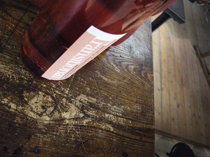
For the TypeCon afterparty at The International Printing Museum, one of my little design touches was bottles of California Typographic Wine; which came in four varieties: Oldstyle, Transitional, Modern and Sans.
Labels were printed on a fabric stock by Hal Hammond – and helping me with the whole vin production were Lucy Schallberger, Jon Coltz, Delve Withrington and (pictured below) Angela Glenn.




Before and after
I was thinking.
The recycle symbol we’ve been using all these years could use an update. Something simpler, more modern, earth-friendly and all that.
And what better way to update than looking to the most legible of the legibles, Helvetica. With all the Gap hoohaw this past week, I’d noticed that the G actually has an arrow in it. Not a perfect arrow, but redrawing Helvetica – that would take too much time. No one’s gonna notice an arrow that’s a bit off, right?
G is for garbage, of course. Turning it backwards means sending things back. For recycling. And the gradiated avocado green box, it just says green better than anything else can say green.
Because people really like avocados.
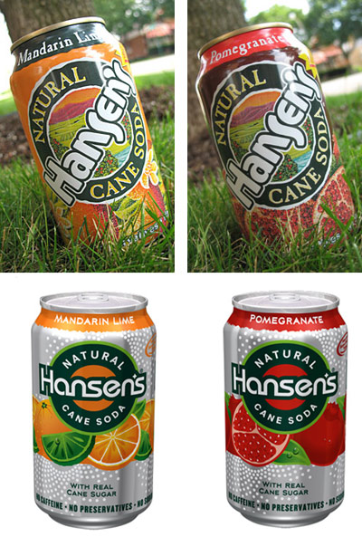
Before and after
This hit last year, redesign of soda cans for Hansen’s Natural Sodas by Deutsch Design Works.
The look just seems very . . . techno to me.
Garbage: I’m Really Into Techno, B-side from Shut Your Mouth 3
Photos found via BevReview
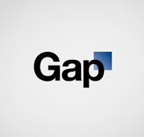
Before and after
Another company’s gone and done it.
Desperate times call for . . . logo changes. If a company’s not doing well, they have to do something. Forget the pressure of product marketing, pricing, supply and demand – all too tough to deal with. Instead: Let’s change the logo.
K-Mart has done it a few times.
Not quite getting to the root of things. But changing a logo to solve a major problem is like saying, I have cancer, so – I’m going to go get my hair done.
When exactly did this become the rule of the day? Is a logo change what it takes to shore up a failing brand? Gap seems to think so and if that’s how they’re managing things right now, they probably should fail. [Read more →]