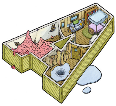
New Coke
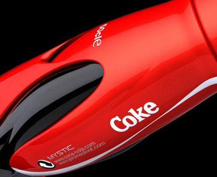
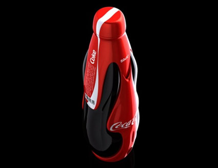
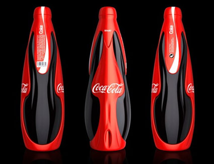
‘French designer Jerome Olivet has crafted an awesome new look for Coca Cola entitled ‘Mystic”
Found via Creative Greed
‘French designer Jerome Olivet has crafted an awesome new look for Coca Cola entitled ‘Mystic”
Found via Creative Greed
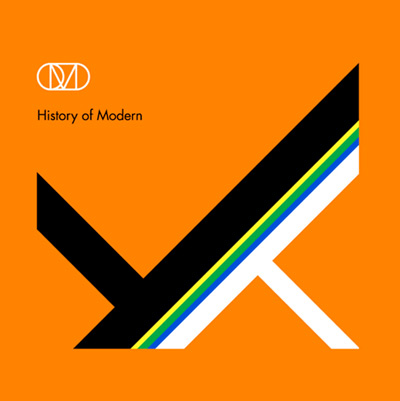
‘It’s classic OMD given a contemporary shot in the arm’
Video for OMD’s If You Want It. From the album History Of Modern, which sports a cover (below) designed by the great Peter Saville.
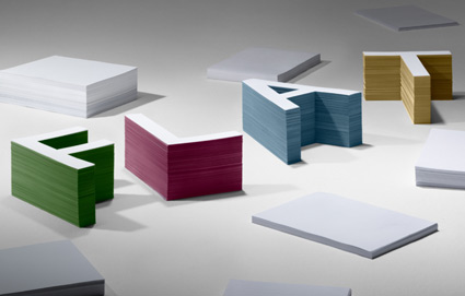
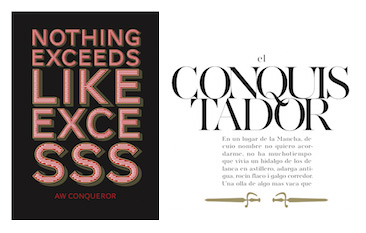
‘Jean François Porchez was approached at the end of 2009 to create a set of typefaces to relaunch the Conqueror papers collection.’
Jean François Porchez’s beautiful Conqueror fonts are based on some great historical design eras – and are available free via Arjowiggins Creative Papers thru end of March 2012.
The fonts themselves are mostly caps and missing a few punctuation marks – but they also have similar widths, cool alternate characters (such as swashes) and 3D carved versions (as extras) – making them vastly interchangeable. And who knows, since they’re free, maybe they’ll conqueror the design world.
A standard commercial font license applies. Grab em here.
More details here.
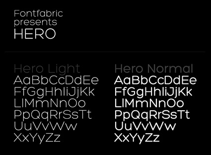
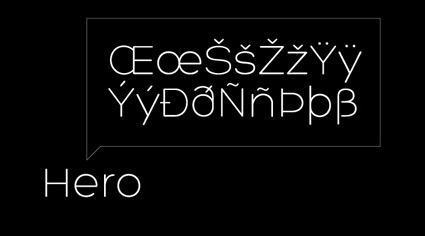
Fontfabric’s free sanserif Hero fonts. Two weights, multiple language support.
Grab em here. Fontfabric has a great section of other freebies too.
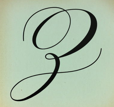
Pictured: Cap Z from Penabico, a new font based freely on ‘the copperplate script styles to be found in the Universal Penman.’
Available at MyFonts. And currently trending as one of their best sellers.
More detail here.
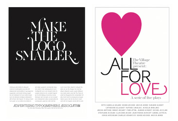
‘The last logo ran for 20 years’
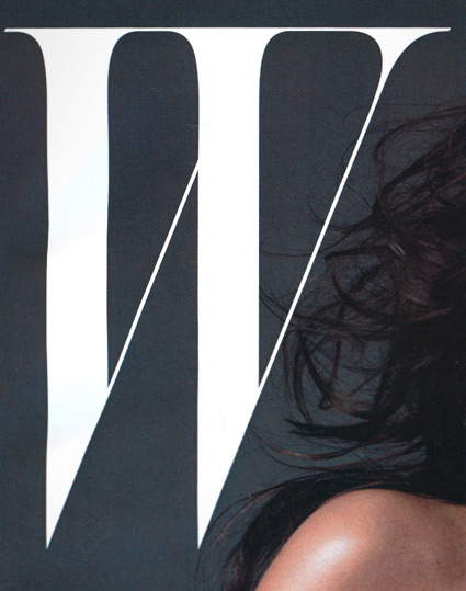
A few months back, Stefano Tonchi jumped over from singular letter T magazine to reboot singular letter W magazine. And the results are quite elegant. [Read more →]
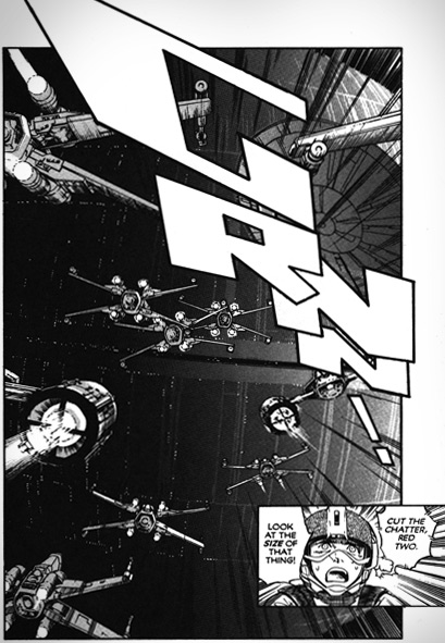
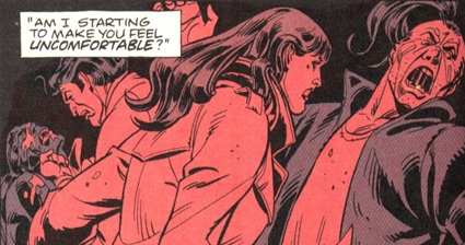
‘Orzechowski modeled his lettering on the Flash Gordon newspaper strips of the 1930s. Another influence was Robert Crumb’s Zap Comix: Orzechowski recognized that Crumb’s title work was clearly derived from the brush techniques of that same era, the 1920s and 30s.’ –Wiki
One of the first times I really became aware of hand lettering in comic books came with Marvel Comics’ 1977 Star Wars movie adaptation. From issue #2 thru #5, the lettering had this smooth, compact quality to it. With cool titles up top.
Behind the scenes was lettering artist Tom Orzechowski – working for the Mighty Marvel Bullpen. [Read more →]
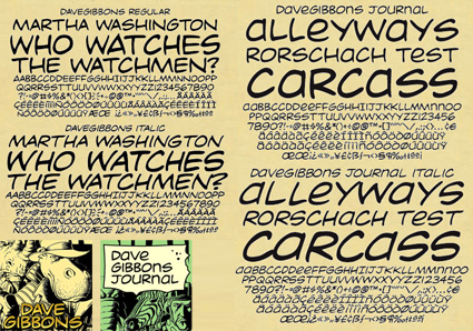
‘It’s just a shame they couldn’t have used just the original font, because [Comic Sans is] a real mess.’ -Dave Gibbons, interview in The Guardian
Sick of Comic Sans? Why not try something more authentic . . . .
Vincent Connare based the design of his Comic Sans fonts on the lettering work of comic book illustrator Dave Gibbons. With infamous results.
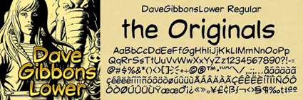
But the comic book lettering gurus at Comicraft have something a bit better: Real Dave Gibbons fonts.
They won’t come preloaded free on your PC. But if you want to put your money where your mouth is, the ‘DaveGibbons’ fonts – available in upper, lowercase, international, journal and splash page titling versions – should be up to the task at hand.
Snag em here. Multiple purchase options available, including some ‘Gibbous Packs.’
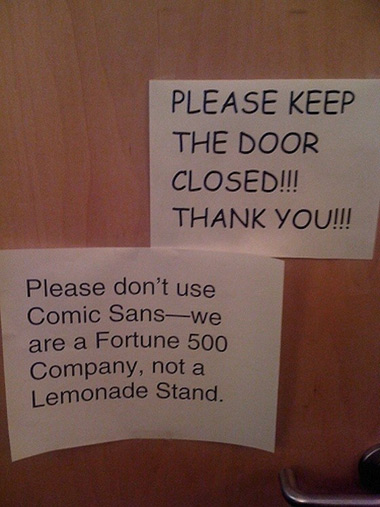
A few weeks back, I was explaining to a culinary instructor the whole hate Comic Sans thing.
She had just put together a bunch of slides for a presentation and picked Comic Sans as her font.
And was really surprised at the reaction she got. Some members of the Hate Comic Sans faction were there that day and they made their presence known. To her dismay. [Read more →]


the work at the mehallo blog. beta. is licensed under a creative commons attribution - noncommercial - no derivative works 3.0 united states license. if reposting, credit must be given to steve mehallo - and if possible, please provide a link back to the mehallo blog. beta.
i include images for the purpose of critique, review, promotion and inspiration - and always make my best effort give credit/link back to the original source. if i’ve screwed up, please fire me a note.
page layout based on the wordpress 'darkwater theme' by antbag, adapted and redesigned by mehallo. valuable php assistance from bill mead.