The wonky type at 10 Downing
Posted on November 4th, 2010 by steve
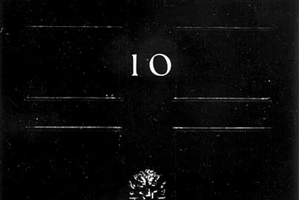
‘If I could change anything, I’d straighten up that 0 on the number 10. It’s a bit wobbly.’
Here’s an excellent read by J.M. Mosley on the odd lettering used for the numerals at 10 Downing Street. Not quite the original, sort of an accident that is now part of history.
It’s interesting how small type details are often overlooked. The numbers on my own home are rather awful, and even though several years back I’d purchased some Bodoni as replacements, have never gotten around to actually installing them.
Found via Matthew Williams


