The U&lc archive: Free as PDFs
‘Over the 26 years that it was published, U&lc gathered a following of thousands of avid readers that eagerly anticipated each issue. It became the most important typographic publication of its time.’
The 1970s looked like the 1970s because of Herb Lubalin.
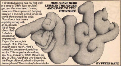
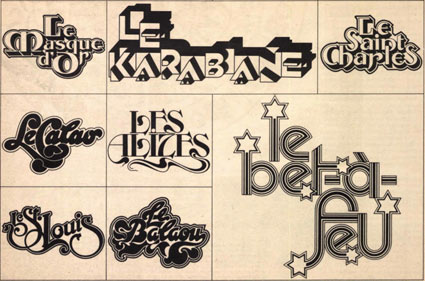
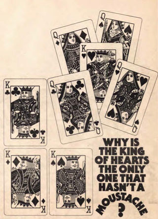
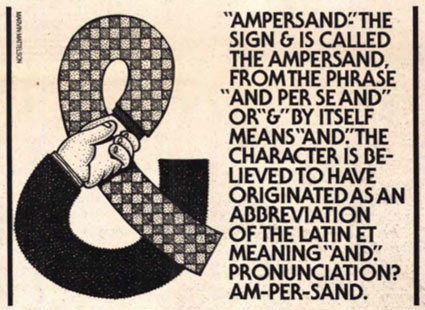
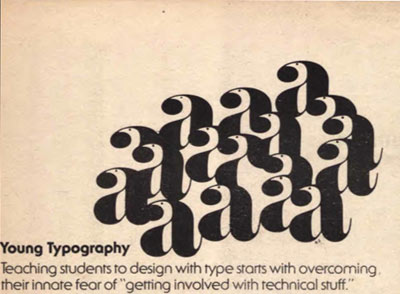
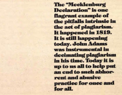
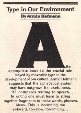
And the way he did this was thru Upper & lowercase magazine. Tabloid in size, printed on newsprint, U&lc was read by most of the graphic design industry. Within, the fonts and philosophy of Lubalin’s International Typeface Corporation [ITC] stressed letters that were set ‘close, but not touching’ and . . . aw, hell, let them touch, overlap and be funky.
By the time I was in design school, the look had fallen out of favor – most ITC fonts were actually banned from use in my homework. ITC’s philosophy was to reinterpret the classics, often into something strangely unique, full of its own style – or a lack of style. Like Helvetica.
The 1970s were all about that. Taking things like Art Deco and doing something totally new with it.
the influence
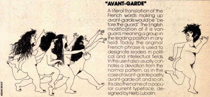
Lubalin’s style ended up making a comeback in the past decade, as young designers embraced – and regrew – some of his techniques. ITC Bauhaus and ITC Avant Garde were once banned by my professors – and by 2005, I was seeing them everywhere.
And starting this month, Monotype Imaging (current owners of ITC) are in the process of scanning the U&lc archive – offering the 26-year run of the magazine as high resolution PDFs.
Download your free vintage issues here.
Permed hair not required.
Found via Typegirl


[…] This post was mentioned on Twitter by steve mehallo, James Saturnio II. James Saturnio II said: The U&lc archive: Free as PDFs http://bit.ly/cAAAaK […]
Garmin 1490t…
[…]below you’ll find the link to some sites that we think you should visit[…]…
Garmin Nuvi 1490t…
[…]here are some links to sites that we link to because we think they are worth visiting[…]…
Featured…
…These are some featured websites that we choose to honor with a link back to their site……