entries Tagged as [fonts]

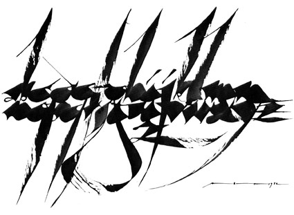
Arthur Baker and my type classes

It started with the advice: ‘You have to go back to the broad edge pen. It’s all there.’

Brilliant calligrapher Arthur Baker gave me direction when I first set up my beginning typography course. And I’m still using the same approach today. [Read more →]

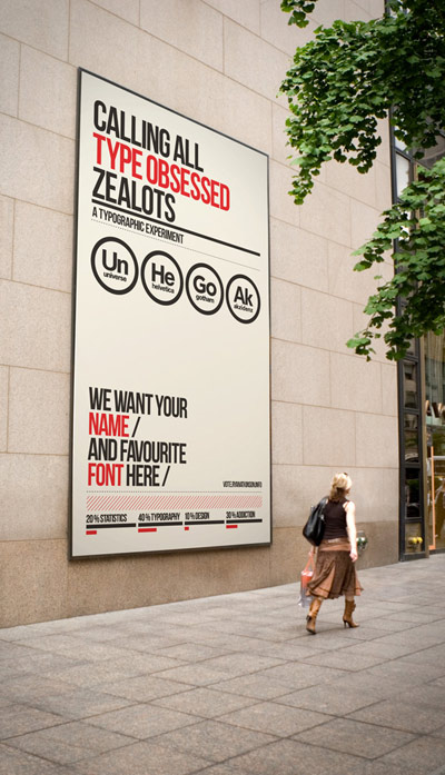
‘Our grotesk love affair’

‘A typographic experiment: Sub­mit your name and your vote for your favorite grotesk font’

Vote here.

The Helvetica Battery

The most incredible invention ever conceived by human beings.

These commercials scared the shit out of me.

Penney’s logo history

It all boils down to  . . .  Helvetica.

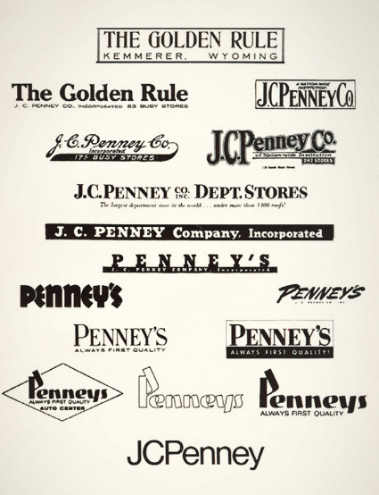
JCPenney started as The Golden Rule store – or so said the literature I read as a kid. Wiki says something else.

My mom worked for JCPenney for 22 years and they had a big anniversary in the 1970s. They had wooden rulers with ‘golden rule’ written on them as part of a anniversary suite of premiums. I remember lots of simple yellow (‘golden’) and black stuff, sort of a 70s take on Victorian style.

And I was fascinated with a logotype history chart that was part of a company history booklet. Above is an old photocopy.

Over the years, the company simply became known as Penney’s – logo treatments reflecting retail trends.

The possessive was dropped and the ‘JC’ was officially re-added in 1971 – the year its founder, James Cash Penney passed away.

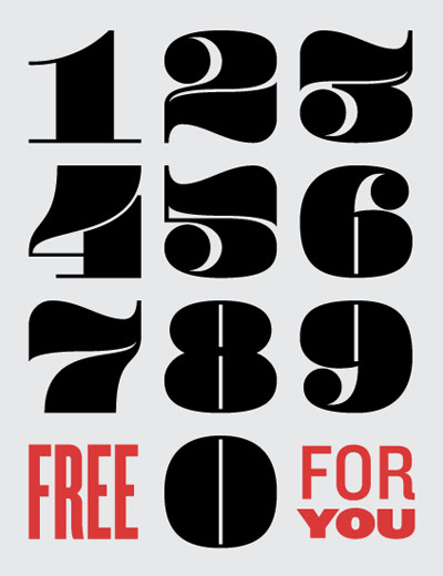
Andy Mangold’s free funky numbers

Andy Mangold’s Pompadour numeral set. Free download here.

Found via Ellen Lupton

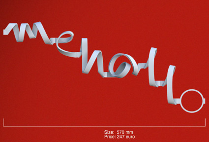
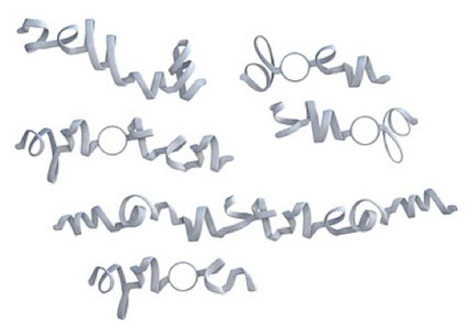
Kasheeda: ‘The world’s first 3D printed typeface’

‘The font is based on the concept of a thin and wide ribbon, bending freely through space’

A new take on the thick and thin strokes of letterforms. Type in your text and a final rendering is fabricated for a fee.

Details here and here. Test drive the Kasheeda font here.

Latin alphabet and Arabic script are both available.

Found via If It’s Hip, It’s Here.

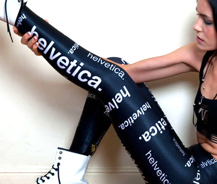
Helvetica leggings

Helvetica leggings by James Lillis. Available here.

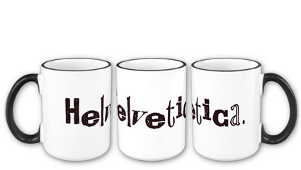
Alta Helvetica mug

Helvetica on a mug, set in my Alta California font.

Dark brown text, vintage baked enamel-like styling. Great for sweet tea, moonshine, or hell, even prison-grade pruno.

Snag it here.

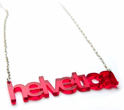
Red Helvetica

Helvetica acrylic necklace, set tight. Available here.

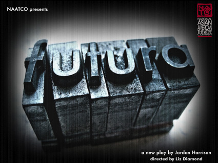
Futura, the play

‘Can a font change the future? On her first day back at the University, a rogue Professor sets out to avenge her missing husband – and the lost art of ink on paper – by conducting a dangerous lesson on typography. When the Professor’s lecture jumps the rails, we peer into a near future where desperate people search for the tangible in an ever more virtual age.’

Futura, as a play, is an interesting concept. It starts with a history of typography lecture – then weaves in its own story about a paperless future.

But is a type history talk good enough to stand on its own – without a play attached? The NYT thinks so. There’s a lot of cool stuff in type history.

The play closed last week, but here’s a few more details.

Found via H&FJ

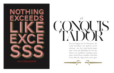
Free Conqueror fonts!

‘Jean François Porchez was approached at the end of 2009 to create a set of typefaces to relaunch the Conqueror papers collection.’

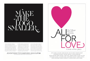
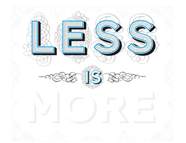
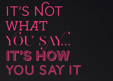
Jean François Porchez’s beautiful Conqueror fonts are based on some great historical design eras – and are available free via Arjowiggins Creative Papers thru end of March 2012.

The fonts themselves are mostly caps and missing a few punctuation marks – but they also have similar widths, cool alternate characters (such as swashes) and 3D carved versions (as extras) – making them vastly interchangeable. And who knows, since they’re free, maybe they’ll conqueror the design world.

A standard commercial font license applies. Grab em here.

More details here.


Creative Commons License

the work at the mehallo blog. beta. is licensed under a creative commons attribution - noncommercial - no derivative works 3.0 united states license.  if reposting, credit must be given to steve mehallo - and if possible, please provide a link back to the mehallo blog. beta.

i include images for the purpose of critique, review, promotion and inspiration - and always make my best effort give credit/link back to the original source.  if i’ve screwed up, please fire me a note.

page layout based on the wordpress 'darkwater theme' by antbag, adapted and redesigned by mehallo.  valuable php assistance from bill mead.