entries Tagged as [fonts]

League Gothic, open source font

This week I gave my design history talk on American Type Founders’ Gothics – a large collection of (mostly 19th century) sans serifs typefaces.

ATF was formed in 1892 by a merger of 23 American type companies – resulting in, literally, a huge pile of metal that had to be sorted, catalogued, duplicates removed and if necessary, redesigned. Morris Fuller Benton (1872-1948) ended up doing a lot of the dirty work – among the results were ATF’s very industrial Gothic series of typefaces.

These types exist today in many digital forms – some with their original ATF names, such as Franklin Gothic and News Gothic – or as revivals, which includes Benton Sans and Jonathan Hoefler’s comprehensive Knockout series.

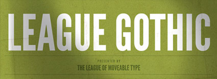
Amidst recent revivals is Caroline Hadilaksono and Micah Rich’s League Gothic (above) – an interpretation of ATF’s Alternate Gothic No. 1 (below).

Snag your own free version here.

And hell, if you see any problems, fix em. The font is open source.


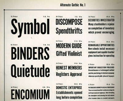
Alternate Gothic No. 1 specimen (cropped), ATF’s Book of American Types, 1934


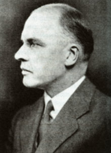
M.F. Benton, read more on Benton here

Basic Gothic, free weight

‘The name says it all: FontFont’s Basic Gothic is a neutral American grotesque for all purposes, something between Gill Sans and Verdana.’

More from Hannes von Döhren: The Basic Gothic types were a joint project with Livius Dietzel. Basic Gothic uses ideas from the 19th Century – resulting in some really nice workhorse fonts for today.

Grab the Regular weight free here. Another limited time offer.

Supria Sans Regular, free for a limited time

‘An extended family of 36 fonts inspired by Swiss type design.’

Released just this year, Supria Sans is an incredible new type family designed by Hannes von Döhren.

And you can snag the Regular weight (+ Italic) free here. Offer ends Monday, February 28, 2011.

Hattenbach profiled

‘it is a passion and a drug’

Swedish type designer Stefan Hattenbach makes incredible letterforms. And his body of typographic work has run the range from experimental to traditional and experimental traditional. They’re always a pleasure to set on a page.

This month, Stefan’s one of MyFonts’ Creative Characters.

Read the interview here.

Check out Stefan’s website here.

mehallo fonts on sale

‘Another inspiration was the film MAX (2002), written and directed by one of Emigre magazine’s founders, Menno Meyjes  . . .  I decided Jeanne would be a fictional typeface that was released in 1918, the timeframe from the movie.’

Ascender is running a little sale on some of my fonts. 25% off until March 5, 2011. Offer only available thru Ascender’s website. For details, go here.

(and watch the trailer for MAX here)


Font sex

‘Unlike conventional fonts, Chan’s Sade fonts are comprised of sexual phrases and sentence fragments rather than letters, so that what is typed on the keyboard is not what appears on the screen.’

Type a letter, get a phrase. Type a sentence, get a story.

18 TrueType fonts by Paul Chan. Download them free here.

Found via Fleshbot

Hadank

‘Hadank is a display typeface developed from hand-lettered words in a German printer’s letterhead from the 1920s’

Andrew Leman makes props for the motion picture industry. And along the way, he’s built a collection of fonts to help with making said props authentic.

Order his Hadank fonts here. Website (with interview video) here.

Bodoni’s Manuale Tipografico

‘Published posthumously in a limited edition of 250, features 142 sets of roman and italic typefaces, a wide selection of borders, ornaments, symbols, and flowers, as well as Greek, Hebrew, Russian, Arabic, Phoenician, Armenian, Coptic and Tibetan alphabets.’

My birthday was last week and to my surprise, my wife got her hands on Taschen’s limited edition reprint of Giambattista Bodoni’s masterwork, his Manuale Tipografico (1818).

Bodoni had almost unlimited funding and resources at his disposal – so the details in his large body of types (he just kept going) is beyond what is seen in most revivals of his work. ITC Bodoni comes damn close, but a lot of Bodoni’s original designs end up on the cutting room floor.

My Jeanne types (named for my wife) have roots in Bodoni – and I used some digital resources to research his Manuale. But it is great to now actually have a print edition in my collection – cause I’m not done with tinkering.

Doret’s type

I have one little parallel with Michael Doret.

I like to do type revivals – interpretations – of vernacular lettering that we often take for granted.

My Martini at Joe’s fonts are all about this. I based them on my favorite restaurants, the Joe’s of Northern California.

And Doret based his fantastic Deliscript on signage lettering of world famous Canter’s Deli on Fairfax in LA. This led to him developing their catering truck. All elements of an incredible body of work. [Read more →]

Cutting Bembo

Student Mike Thomas went back to basics with his work for my experimental type course.

As part of an 11-week study, Mike explored types created by the originator of italics, Francesco ‘Griffo’ da Bologna (1450-1518).

Mike’s work was produced using a stack of 20 year old, aged paper – and involved media ranging from paint to ink to digital.

His final project (above) was realized by cutting Griffo’s italic directly out of pieces of lead and creating a ‘soot proof’ of the carved letters. Not quite to spec, but challenging nonetheless.

John Bell in verse

I teach an experimental typography course at Ai Sacramento. And this past quarter, student Joyce Tabujara ventured into song.

For her final project, she wrote and preformed This Is To Mister Bell (above) – a tribute to typographer John Bell (1745-1831) and his types.

Below, a few of her studies.


Creative Commons License

the work at the mehallo blog. beta. is licensed under a creative commons attribution - noncommercial - no derivative works 3.0 united states license.  if reposting, credit must be given to steve mehallo - and if possible, please provide a link back to the mehallo blog. beta.

i include images for the purpose of critique, review, promotion and inspiration - and always make my best effort give credit/link back to the original source.  if i’ve screwed up, please fire me a note.

page layout based on the wordpress 'darkwater theme' by antbag, adapted and redesigned by mehallo.  valuable php assistance from bill mead.